| Image |
Comment |
| 11/03/2006 02:09:29 PM |
Blue Alleyby The_squirrelComment: The image is really to small to see much of the detail. I thin it is a street lined by trees on each side which would be a nice composition if I could see it more clearly. Sorry. |
| 11/03/2006 02:08:31 PM |
|
 Photographer found comment helpful. Photographer found comment helpful. |
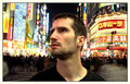
| 11/03/2006 01:52:29 PM |
Alone in Tokyoby TOYComment: Great shot (colors and composition). Very impressive. The only critique I might have and I'm not sure how easily it could be corrected as you don't want to crop any more of that great neon background is that the bright spot on the lower left corner (flare of some type) is a bit distracting.
(btw, this would be perfect IMO for the new Neon sign challenge)
Score: 8. |
| Photographer found comment helpful. |
| 11/03/2006 01:48:58 PM |
"Rosita"by ursulaComment: Great shot. Merely a suggestion, but after the challenge, you may want to clone out the tiny reflective dot on the man's collar. It' probably the zipper top, but it makes it look like there is dust on the lens or some foreign object on the glass. Very nice b/w shot and composition. 8. |
| Photographer found comment helpful. |
| 11/03/2006 01:38:03 PM |
Octoberby militarygirl10Comment: I don't count off for borders but this one really distracts in my opinion. A solid dark (black) border on the edges would help this one. Right now the current border not only separates part of the picture, but it also cuts through part of your subject (the model's right arm). While I don't take off, I would likely give the photo an extra point for those corrections. Score: 6. |
| Photographer found comment helpful. |
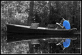
| 11/03/2006 01:34:00 PM |
Quiet Timeby EBJonesComment: Nice use of selective color. I would like to see how it turns out if the boat too was in color (if it is a color that would enhance). |
| Photographer found comment helpful. |
| 11/03/2006 01:32:34 PM |
The Fisherman's Sonby librodoComment: Fantastic colors and overall composition. The bright reflections in the eyes are the only thing in the photo that sidstracts. There may have been too much going on in the eyes to simply clone, but that might be one area to look at to further enhance this nice image. 8. |
| Photographer found comment helpful. |
| 11/03/2006 12:55:01 PM |
|
| Photographer found comment helpful. |
| 11/03/2006 12:53:55 PM |
|
| Photographer found comment helpful. |
| 11/03/2006 12:51:51 PM |
My try at a postcard.by Reedman18Comment: I'm don't deduct for borders, but I think a black border would have been a better choice. The bright white (and thickness) draw my eyes to the outsides rather than to the subject of the picture. Great composition. 7. |
| Photographer found comment helpful. |
Home -
Challenges -
Community -
League -
Photos -
Cameras -
Lenses -
Learn -
Help -
Terms of Use -
Privacy -
Top ^
DPChallenge, and website content and design, Copyright © 2001-2026 Challenging Technologies, LLC.
All digital photo copyrights belong to the photographers and may not be used without permission.
Current Server Time: 07/17/2026 12:54:57 AM EDT.