| Image |
Comment |
| 05/09/2003 11:37:09 AM |
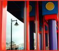
Reflectionsby pitsamanComment: great colour. the perspective is a little hard with a wider lens...the window frame stays vertical, so the pillar distorts a little. your border actually accentuates this. I\'m not a big fan of borders anyway, but if you are going to use one, I\'d have gone with a contrast colour rather than trying to match the paint...it kind of highlightes the perspective thing mentioned above. |
 Photographer found comment helpful. Photographer found comment helpful. |
| 05/09/2003 11:33:52 AM |
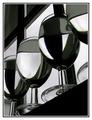
Black and Whiteby JeanComment: I already voted and commented on this one...guess it didn't take. anyway, what I said before is that I really like your setup/composition...it's just too bad thesecond glass from the left has that mark on it...I can't tell if it's a stain or a reflection, but it messes with the otherwise perfect clarity. nice shot. 8. Pedro |
| Photographer found comment helpful. |
| 05/09/2003 11:31:00 AM |
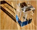
"Pain in the Glass"by sfarrell23Comment: I really like the shadows, but not such a big fan of the flares...I have no idea how you could get one without the other, but I find all the diverging lines a bit distracting. |
| Photographer found comment helpful. |
| 05/09/2003 11:28:01 AM |
|
| Photographer found comment helpful. |
| 05/08/2003 05:04:37 PM |
|
| Photographer found comment helpful. |
| 05/08/2003 05:04:08 PM |
A toast to lightby johnmkComment: salut! I would like to see this with a little more light/detail on your hands. I like the composition, it just feels like it's missing something with you thumb all shadowy. Pedro |
| Photographer found comment helpful. |
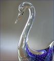
| 05/08/2003 05:00:44 PM |
Ornamental Glassby BitzComment: these birds are hard to photograph becasue of all the hot spots the lighting creates. I might have thrown a little blue into the backdrop if it were my, but that's just an opinion. Pedro |
| Photographer found comment helpful. |
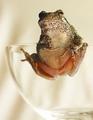
| 05/08/2003 04:59:26 PM |
Sticky Fingersby connieComment: my favourite of the day! this better get a ribbon friend, I really like it. If I'm being reeeeally picky, I'd say a slightly darker backdrop would give some (IMO) needed costrast to the bowl. Go to DCPrints with this. Excellent. 9 (my only vote over an 8 by the way) |
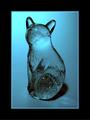
| 05/08/2003 04:57:07 PM |
Wild Blueby #1 Bronco FanComment: I'd like to see kitty's face a bit clearer...i think if you lighted it lower, or used more of a backlight, you could have cleared her up a bit. It'd get rid of that shadow and the little flares too. or maybe you like those :) that's just my opinion. Pedro |
| Photographer found comment helpful. |
| 05/08/2003 04:55:01 PM |
|
| Photographer found comment helpful. |
Home -
Challenges -
Community -
League -
Photos -
Cameras -
Lenses -
Learn -
Help -
Terms of Use -
Privacy -
Top ^
DPChallenge, and website content and design, Copyright © 2001-2026 Challenging Technologies, LLC.
All digital photo copyrights belong to the photographers and may not be used without permission.
Current Server Time: 06/21/2026 09:25:39 PM EDT.