| Image |
Comment |
| 06/17/2003 07:11:24 PM |
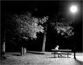
a little noirby ursulaComment: too bad we're not allowed to burn/dodge. lowering th contrast would flatten it out too much, but the light and the woman end up a bit hot for me. beautiful composition and staging. 7 |
 Photographer found comment helpful. Photographer found comment helpful. |
| 06/17/2003 07:09:49 PM |
|
| Photographer found comment helpful. |
| 06/17/2003 02:22:38 AM |
|
| Photographer found comment helpful. |
| 06/17/2003 02:22:03 AM |
Flooded Tunnelby RiderGalComment: he IS off-centre...and out of focus and underexposed. or the background is overexposed. I think I get what you're going for, but it ends up looking like you just missed the shot. I think if you focussed on the background, you'd still get the same effect on the subject. nice idea, in any event. |
| Photographer found comment helpful. |
| 06/17/2003 02:19:35 AM |
Hay Now!!by YomiComment: I don't get a real feel for what the subject is, so I'm not sure if it's off centre. otherwise, it's a nice shot. (OK I know the lonely bale is probably it, but this has a lot of strong features in it, which tend to lead away from it. I think a longer lens, with your focuse on the bale would solve it. (BTW, I'm not one who marks a photo down if it doesn't 100% meet the challenge IMO). your blues are a bit strong in the background as well - did you photoshop this? |
| Photographer found comment helpful. |
| 06/17/2003 02:16:27 AM |
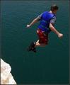
Leap of Faithby rcrawfordComment: the specks of dirt trailing him make the image. hope he landed ok :) great clarity. |
| Photographer found comment helpful. |
| 06/17/2003 02:15:11 AM |
Italian bathroomby GalinaComment: a little more contrast would be nice to separate the garment from the backdrop. decreasing the highlights would likely have the same effect. nice pose. |
| Photographer found comment helpful. |
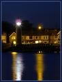
| 06/17/2003 02:13:52 AM |
Lighthouseby marboComment: nice composition. nice exposure (i HOPE you took about 50, because if this only took one, I'll be a bit cheesed). ambivalent on the border, LOVE the flares. |
| Photographer found comment helpful. |
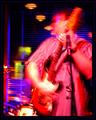
| 06/17/2003 02:12:36 AM |
Jammin'by jmsetzlerComment: I know what you're going for here (I have tried similar things myself), but this one isn't doing it for me. your reds are too strong (i know it was intentional) and your blues blend into everything. composition is very nice...movement works well for the subject as well. i might have cropped the noise on the left a bit...but then he wouldn't be off-centre...quite a conundrum. :)
I'd like to see it with a little less (only a little) on the reds, and a LITTLE less contrast. good effort in any event. I can appreciate taking chances.
Pedro |
| 06/17/2003 02:08:19 AM |
Turbulenceby AaronComment: i'm not one to mark people down for not meeting the challenge (and won't here), but a comment re:composition - the dominating feature of this photo is the clouds...the building almost seems in the way to me. a bit of a distraction. it's nice and all...but your title tells me you feel the same way about your nasty clouds.
i like it...but your subject isn't off-centre, since the subject is the clouds. does that make sense? |
Home -
Challenges -
Community -
League -
Photos -
Cameras -
Lenses -
Learn -
Help -
Terms of Use -
Privacy -
Top ^
DPChallenge, and website content and design, Copyright © 2001-2026 Challenging Technologies, LLC.
All digital photo copyrights belong to the photographers and may not be used without permission.
Current Server Time: 06/22/2026 06:22:23 AM EDT.