| Image |
Comment |
| 07/11/2003 03:28:19 AM |
Somnolenceby ToddhComment: fantastic physique. the lighting is not particularly flattering with the sepia tone. I might have used the free editing clause to level out her skin a bit. What I'm trying to say (without sounding like this will probably sound) is that her white butt (while quite attractive) stands out against the rest of her tanned self. Or maybe it's just the way the lights hit. I'd like to be drawn to her neck and shoulders, but the brightness keeps taking my eye up. make sense? |
 Photographer found comment helpful. Photographer found comment helpful. |
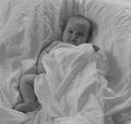
| 07/11/2003 03:24:23 AM |
my boyby jbruno1397Comment: might need a little more contrast for my taste, but a beautiful capture of your boy. |
| 07/11/2003 03:22:59 AM |
Nude in the shadowby AlexysComment: beautiful subject. not so sure i like the lighting. the shadow interferes with the model a bit, both in it's proximity to her, and because it's so dark. softer lighting, or a little distance may solve both issues. |
| Photographer found comment helpful. |
| 07/11/2003 03:12:04 AM |
Not Your Average Supermodel (nude no 3)by SharQComment: I like the comfort in this picture. no fear of the photographer or camera (a self portrait? i don't know) lighting is conventional, but technically very sound. this looks quite professional, though it lacks commercial appeal - by that I mean it would be wonderful if you knew the person in the picture, but beyond that, it's very portrait-like (which is not at all an insult, by the way...just not my style of picture). 7 (a high score for me this challenge) |
| Photographer found comment helpful. |
| 07/11/2003 03:07:07 AM |
Subtleties of Formby gracemarComment: i'd like to see this a little more contrasty...some of the subtleties are lost. seems a little soft focus too, but that may just be the lighting. good composition. |
| 07/11/2003 12:58:55 AM |
Nude Ceramicby barahooComment: nice idea, but the grain doesn't suit the subject to me. the ceauty of a sculpture like this is it's crisp lines, which are lost in the blur. Compositionally, I'd have rotated it, since the shadows give away the fact that it's lying down. |
| Photographer found comment helpful. |
| 07/11/2003 12:37:15 AM |
Body Artby mbardeenComment: like the high-key lighting and composition. the art leaves me wanting - more colour saturation or less. it's hard to tell if it's there or not. I'll look again later on a brighter monitor and see if my opinion changes. 7 |
| Photographer found comment helpful. |
| 07/11/2003 12:35:33 AM |
Shy by mariomelComment: very sexy. love what you did with the border, even though many will chastise you for it. I think it's very appropriate. lighting is a little strong on the left, so it throws the balance off a bit. I like it. |
| Photographer found comment helpful. |
| 07/11/2003 12:34:21 AM |
almost androgynousby grigrigirlComment: the lighting is a little off, and the pose looks quite un-natural (maybe that's what you were going for). I think you either shadow the face or don't - just the arm shadow messes the perspective up a bit.
**edit: still not even close to the best you've done of this subject (no offense intended). Now that I know it's yours I'm taking more time with it, and I still don't like the way that shadow draws a line on his face. The focus is a little soft...intentional to hide some skin imperfections? If I didn't know it was you, I would think some of these things were accidents...but I know your work better than that. As it happens I just don't agree with some of the choices.
P Message edited by author 2003-07-21 21:44:54. |
| Photographer found comment helpful. |
| 07/11/2003 12:32:48 AM |
Mt. St. Judeby fleenkComment: that's hilarious. I don't wanna know how you came up with the idea, but it's brilliant. Hard to give a serious critique, but the contrast could be a bit higher and the front of the boo---mountain is a little soft. soft FOCUS I mean. :) |
Home -
Challenges -
Community -
League -
Photos -
Cameras -
Lenses -
Learn -
Help -
Terms of Use -
Privacy -
Top ^
DPChallenge, and website content and design, Copyright © 2001-2026 Challenging Technologies, LLC.
All digital photo copyrights belong to the photographers and may not be used without permission.
Current Server Time: 06/22/2026 01:34:23 AM EDT.