| Image |
Comment |
| 11/11/2003 11:23:32 PM |
Glen Abbeyby ToddhComment: ahhh the Abbey :) I miss golf already. Stupid Calgary snow oh...the picture..right. your greens seem a little yellow (which may well be the time of year) I'd maybe hue shift a little to green it up (so much cheaper than fertilizer). I like the simple border. might have cropped a little off the bottom to get rid of that tree or whatever it is in the bottom right corner. |
 Photographer found comment helpful. Photographer found comment helpful. |
| 11/11/2003 11:20:42 PM |
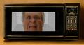
The Book of Christby BigMoComment: the lighting needs work. you can get rid of those hot spots by diffusing your light (or flash) through some tissue paper. a little reflector use from behind, or some backlighting would fill in those shadows as well. lastly, it might look a little softer on a darker surface - the white is overpowering in what i would consider a softer subject. Nice idea, crisp focus.
Pedro |
| Photographer found comment helpful. |
| 11/11/2003 11:17:50 PM |
Lean on Meby moodvilleComment: very nice. feels lonely or something. great tones...sepia is a difficult duptone to pull off well, and you - or your software ;) - did it well.
Pedro |
| Photographer found comment helpful. |
| 11/10/2003 04:41:23 AM |
Just Over the Next Hill by GringoComment: too bad Gringo - 7.5+ almost always gets a win...lots of great shots in this one. Nice processing job - wouldn't mind seeing the original for comparison.
Pedro |
| Photographer found comment helpful. |
| 11/10/2003 04:26:34 AM |
To the Stars by RefractedComment: way to go, Bro. it makes me wanna burst nto a resounding rendition of O Canada. :) great shot - well deserved win.
Pedro |
| Photographer found comment helpful. |
| 11/09/2003 06:39:21 PM |
Idle Handsby PedroComment: Originally posted by smellyfish1002:
Great, fun pic Pedro. I can't believe how close the voting was. they should have just given us both a blue and not have a second place!
JD |
Horseshoes and hand grenades, Bro. a win is a win is a win. you got the extra .007, so you win. :) good show.
P |
| 11/08/2003 06:00:26 PM |
Not So Scary Monsterby smellyfish1002Comment: Great job JD. This was one of three I gave an 8 to on this challenge. As I said before - the lighting in amazing....even if it was only one take :)
Pedro |
| Photographer found comment helpful. |
| 11/01/2003 10:55:20 AM |
Dinner at the Dahmer'sby alanfreedComment: this is in poor taste. you should not have entered this. everyone knows heads taste better on the barbecue. :) nice use of PS.
Pedro |
| Photographer found comment helpful. |
| 11/01/2003 02:59:10 AM |
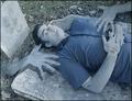
ashes to ashesby SeanachaiComment: a lot of effort went into this. i like that. i looks like you used multiple images of yourself (or the guy in the phot if that's not you). desaturated the yellows and maybe the reds and greens too. you do look a little cyanotic. cool effect. what's with the stuff in your eyes? ah, no matta - i like it. |
| Photographer found comment helpful. |
| 11/01/2003 02:36:58 AM |
DERAC SGNIK CUFby melongrindComment: be a shame to get a dq for a not-very-cryptic title. cool looking shot tho - what's that a little 5 watt bulb or something? i like the pic except for the border. the extra black on either side makes it looks sloppy. good idea either way.
Pedro |
| Photographer found comment helpful. |
Home -
Challenges -
Community -
League -
Photos -
Cameras -
Lenses -
Learn -
Help -
Terms of Use -
Privacy -
Top ^
DPChallenge, and website content and design, Copyright © 2001-2026 Challenging Technologies, LLC.
All digital photo copyrights belong to the photographers and may not be used without permission.
Current Server Time: 06/22/2026 06:23:44 PM EDT.