| Image |
Comment |
| 05/20/2004 05:15:14 PM |
Here's looking at you, kid!by dsa157Comment: cool. that's one ugly-ass spider. looks like he's wearing aviator sunglasses :) love the shallow depth, and you've done a pretty good job onthe lighting/backdrop, though the shadows have a lot of colour noise in them. nice work. P |
 Photographer found comment helpful. Photographer found comment helpful. |
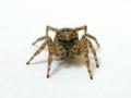
| 05/20/2004 05:06:00 PM |
Self Centeredby arnitComment: love it. great lighting. nice crisp focus. maybe a little shallow depth as the front foot is a little blurry, but no great loss there. I wonder how many of these you took before you got the one you wanted? ;) This should score well. P |
| Photographer found comment helpful. |
| 05/19/2004 12:28:11 PM |
Love & Hateby jonpinkComment: Great Shot Jon. I think the only subtle things that you could have done differently were about balance; the crop and where the light drops off etc are flawless (except for a little 'noise' at the bottom in the middle which is either a reflection off your trousers or perhaps your...erm...never mind)
Anyhoo the balance thing: if your fingers were more level (specifically the e in love) and the lighting were more even between your hands, the image would have a very symmetrical and appealing look (I know...that's a b**ch in basic editing). I think this has a good shot a being a saleable print now that you can edit until your heart's content.
well done.
Pedro |
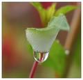
| 05/18/2004 07:05:49 PM |
Eggs and Morning Dewby mocabelaComment: very nice. a bit alien-like, but nice. not contrasty enough for my taste, but fabulous DOF and clarity. well done. P |
| Photographer found comment helpful. |
| 05/18/2004 07:04:53 PM |
Just Me, Myself and Skyby ImagineerComment: a little too high-key for me, but brought down a touch it's my favourite image in the whole challenge. I love it. 9 P |
| Photographer found comment helpful. |
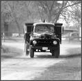
| 05/18/2004 07:04:05 PM |
Old Tyme Truckinby ColeyComment: It looks pretty soft (in a Neat-Imaged kind of way) but it works here. I'd like to see a little more contrast...particularly darker blacks. a little well-placed burning would do famously methinks. great job. P |
| Photographer found comment helpful. |
| 05/18/2004 07:02:33 PM |
Reflection at Duskby dinnComment: I suspect this should do quite well. very sharp for a sunset picture. not too many blown out highlights, which is rare for what I'd guess is a pretty long exposure. Great work. |
| Photographer found comment helpful. |
| 05/18/2004 07:01:20 PM |
Embraceby LucidLotusComment: I think I entered something just like this in the Silhouettes challenge:) nice idea (great minds think alike). it could use a little more contrast for my taste. P |
| Photographer found comment helpful. |
| 05/18/2004 07:00:12 PM |
Wild Life Centreby mrblobbyComment: not sure about the rotation. it actually throws the balance off a little, though i generally like that kind of thing. great image though, nice and sharp, with lots of contrast and detail. P |
| Photographer found comment helpful. |
| 05/18/2004 06:57:50 PM |
In The Redby debitiptonComment: the not-centred police will get you for this, though i think it fits nicely. the background is a little blown out, but there's nothing wrong with a high-key setting when you have a cutie face smiling in it :) P |
| Photographer found comment helpful. |
Home -
Challenges -
Community -
League -
Photos -
Cameras -
Lenses -
Learn -
Help -
Terms of Use -
Privacy -
Top ^
DPChallenge, and website content and design, Copyright © 2001-2026 Challenging Technologies, LLC.
All digital photo copyrights belong to the photographers and may not be used without permission.
Current Server Time: 06/23/2026 03:52:36 PM EDT.