| Image |
Comment |
| 05/27/2003 10:52:46 PM |
|
 Photographer found comment helpful. Photographer found comment helpful. |
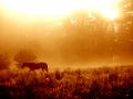
| 05/27/2003 10:51:43 PM |
Headed Homeby drdab99Comment: The light for me is a little to hard on the eyes... When I remove the light by lowering picture with the scroll bar, I can see the horse a lot clearer. A more nice feel to the eyes.... |
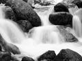
| 05/27/2003 10:49:37 PM |
Alder Creekby SatelliteSpeckComment: Nice water fall effect. Since it was a closeup, the water fall does feel a little abrasive. The way you cropped the picture has me wondering what you didn't want us to see. |
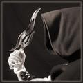
| 05/27/2003 10:46:28 PM |
Looks Can Killby magnusComment: I like the effects the image on the blade has on the picture.
I dislike the wash out on the bottom of the hand |
| Photographer found comment helpful. |
| 05/27/2003 10:42:49 PM |
|
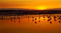
| 05/27/2003 10:32:16 PM |
birds2 copy.jpgby buck4freeComment: Real nice, I'm a little distracted by the amount of birds. (too many darn birds). Did you make post adjustments to your pic? |
| Photographer found comment helpful. |
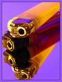
| 05/23/2003 03:16:49 AM |
Yellow and Purpleby CLarson557Comment: First impression:
Nice colors
It definitely meets the challenge
This was pretty clever of you to make 4 lighters out of 2.
The use of the mirror was great.
Lighting may need to have been diffused just a little.
To me, it is washing out the top edges of the top lighter.
The angle may have been the other solution.
Once again, excellent job and my pick this week.
=9 |
| Photographer found comment helpful. |
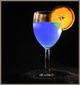
| 05/23/2003 03:02:45 AM |
A Good Mixby RuchartComment: First impression:
Glass filled with blue liquid, I can’t make out if it is an actual drink or not.
The photo meets the challenge with the two colors, blue/orange. Colors are good.
A different border may be needed or none at all.
I think a typical border is larger on the outside and small on the inside. That would have work better for me.
Lighting may need to be diffused. By doing this, you will get less glare on the glass and there will be less highlights on material under glass.
I would have like to see the focus closer to the orange slice.
=5 |
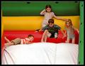
| 05/23/2003 01:04:50 AM |
Jack and Jillby crabappl3Comment: Here is my two cents.
It meets the challenge.
With title and just looking at the picture I focus
on the young boy bouncing.
I think if the focus was more on the colors it may have score
higher with me.
=5 |
| 05/23/2003 12:51:00 AM |
|
Home -
Challenges -
Community -
League -
Photos -
Cameras -
Lenses -
Learn -
Help -
Terms of Use -
Privacy -
Top ^
DPChallenge, and website content and design, Copyright © 2001-2026 Challenging Technologies, LLC.
All digital photo copyrights belong to the photographers and may not be used without permission.
Current Server Time: 04/01/2026 11:00:51 PM EDT.