| Image |
Comment |
| 11/28/2007 04:35:15 PM |
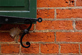
Shutter and Brickby iamkmaniamComment: I love what you were going for here. Old bricks have great texture! I also love the swirl of the shutter holder. The wad of mortar is a major distraction to the image. Also the bricks appear orange here not the red that one would expect. I imagine you are getting a lot of comments to that effect.
This has great potential. |
 Photographer found comment helpful. Photographer found comment helpful. |
| 11/28/2007 04:30:16 PM |
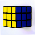
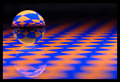
Contrasting Cubeby NullixComment: not a bad attempt. Got the colors well. 1. It doesn't feel like its in focus. 2. remove the corners where you rotated the image. I am guessing you need to adjust your monitor. 3. clean the surface the subject is setting on (black marks on the right side) I like how you rotated the image to give it a floating feel. There is also a hair floating on the top . 3. White balance adjustment or a levels adjustment would bring your background to a more white (less blue). |
| Photographer found comment helpful. |
| 11/28/2007 04:24:03 PM |
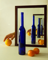
Attempt to Steal Lifeby vaarComment: I have that bottle! Very nice image. I like the bevel on the mirror giving some distortion to the reflection. I'm not real fond of the yellow color cast on the entire image. The more I look at it, the more its growing on me. But I think its going to hurt the outcome. Clone out the white splotches on the background for future use. |
| Photographer found comment helpful. |
| 11/28/2007 04:17:12 PM |
|
| Photographer found comment helpful. |
| 11/28/2007 04:13:30 PM |
|
| Photographer found comment helpful. |
| 11/28/2007 03:57:38 PM |
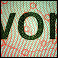
The Color of Moneyby BHusemanComment: A very unique view of someones money. I don't recognize the patterns so I am assuming its not American. I'm curious about which country it is.
The texture and abstract feel is very cool. The diamond maze makes me want to follow them. You got the complimentary colors very nicely in an out of the box image. The cut off letters hurts the image somewhat compositionally. I wonder if it would be better with just the O maybe turned sideways to emphasize the wavey red lines. Good Job! |
| Photographer found comment helpful. |
| 11/28/2007 03:50:39 PM |
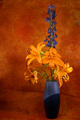
Lilies and Delphiniumby banmornComment: I really like the color scheme and the texture in the background.
The lighting is good. The composition feels a little to tall. It needs a few smaller objects to create a grouping and a visual triangle.
Good Job! |
| Photographer found comment helpful. |
| 11/06/2007 08:38:59 AM |
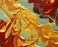
paintby thomaspeopleComment: The colors are amazing. The noise kills it for me though.
|
| Photographer found comment helpful. |
| 11/06/2007 08:36:49 AM |
|
| Photographer found comment helpful. |
| 11/06/2007 08:35:06 AM |
|
| Photographer found comment helpful. |
Home -
Challenges -
Community -
League -
Photos -
Cameras -
Lenses -
Learn -
Help -
Terms of Use -
Privacy -
Top ^
DPChallenge, and website content and design, Copyright © 2001-2026 Challenging Technologies, LLC.
All digital photo copyrights belong to the photographers and may not be used without permission.
Current Server Time: 05/07/2026 02:38:36 AM EDT.