|
|
|
Showing 5101 - 5110 of ~6577 |
| Image |
Comment |
| 12/11/2008 01:23:29 PM | by yankoComment: Fashion mag stuff as I see it. Awesome. I do actually like the heavy border in this. |  Photographer found comment helpful. Photographer found comment helpful. |
| 12/10/2008 01:25:14 PM | | | Photographer found comment helpful. |
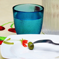
| 12/10/2008 11:12:24 AM | Thank you Lehman Brothersby Rino63Comment: Greetings from the Critique Club
I thought this was a clever concept, I loved the title and thought it very apt for the current times.
I was sorry to see it did not score higher, I believe it was somewhat under rated. I can only assume that you got hit with some DNMC voters who thought it didn't represent a Feast as such. (Reading the comments below would indicate to me that some may have missed the irony in this shot, which is a pity, whereas others clearly go it).
I do find the blue water glass a little distracting, largely I think due to the colour, a non-coloured glass may have worked better. I liked the flower on the plate and felt it blended well with the olive. I thought this was a well exposed shot but the composition could have been improved a bit, as someone suggested, moving the olive a little to the right may have helped, as would either removing the water glass completely or using a different one.
Overall a clever, well excecuted image which I felt should have scored higher than it did. (I gave it a 6 btw).
Hope this was a little bit helpful.
Sarah
| | Photographer found comment helpful. |
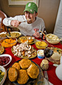
| 12/10/2008 01:08:02 AM | Num Num Yummyby Pipe_DreamComment: Greetings from the Critique Club
First of all well done on 11th place.
My first impression of this pic is that it is very busy. I personally found it had too many things to look at and this made it hard to look at.
So, from a compositional point of view, I feel it would have worked better without so many things on the table. The random wine glass doesn't add much to the composition. If you had taken a step to the right, you may have avoided the white curtain and the pitcher that are creeping into the right frame. By doing that you would also have got more of the cello in the background which would, I think have worked well.
To me it looks like it is not really properly focused and that you have used the clarity slider a little bit too much to try to compensate when converting the file (via ACR). If you haven't done this, then I'm sorry, but this is what it looks like to me. I also am seeing a slight yellow colour cast in the image, but that may just be my monitor.
I think you should be pleased with the score you got. Others clearly disagree with my point of view, which is all this is. :)
Regards
Sarah
| | Photographer found comment helpful. |
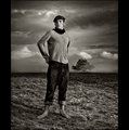
| 12/09/2008 04:07:16 PM | trouble brewingby IraklisComment: Crumbs, this looks menacing and you look awfully close. Take good care of yourself, things look like they have got quite out of hand. | | Photographer found comment helpful. |
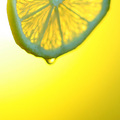
| 12/09/2008 03:01:20 PM | Lemon Dropby photomikeyComment: Greetings from the Critique Club
I like the composition of this pic, the subject is well placed and you have made some good use of the negative space. The graduated yellow background also works well.
I don't think you are going to be surprised to read my comment concerning the focus. Other people have identified this as a problem and you, yourself have said you had a hard time focusing. The image really needs to be very sharp to be effective and this really is not. With some images you can get away with a slightly soft focus, but not with this type of shot. One of the reasons you may have found it difficult to get everything really sharp is the aperture you have used. Using a 1.8 will make it very hard to get the whole subject in focus. Stopping down a few stops should have helped (say around F8). I know this would have affected the shutter speed, but an ISO adjustment could have helped that too.
I think your score was pretty much where I would expect it to be given the subject was not in focus.
Keep trying, I'm sure you will get there.
Sarah
|
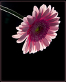
| 12/09/2008 02:04:36 PM | Pink to make the Boys Winkby glenncComment: Greetings from the Critique Club
First of all congratulations on a good score.
I think this is a very well composed photo. Choosing to turn the flower upside down (whether it was flipped in PS or not doesn't really matter here) makes it stand out. The use of negative space works extremely well.
The lighting here is effective and certainly creates some nice backlighting. Personally, I would like, as somebody else has commented already, to see the front of the flower a little brighter, but overall I think this is very well exposed.
One small thing I did notice, and that is perhaps being a little bit nitpicky, but the border you have used appears to be unevenly placed in the frame. The top margin is slightly wider than the other three. I think I would prefer this image without the border.
I got a kick out of the title too!
Overall, a very nice shot and certainly worth the 6+ score you got.
Well done.
Regards
Sarah | | Photographer found comment helpful. |
| 12/09/2008 12:10:43 PM | TAG - your it!by Ecce_SignumComment: Originally posted by andrewt:
Looking at the image , it seems like you applied a gradient from the top left corner down. |
BTW, did you? | | Photographer found comment helpful. |
| 12/09/2008 01:15:32 AM | Fire Powerby DaybisComment: From the Critique Club
First of all, congratulations on the top ten spot.
You don't really need me to tell you that this is a strong image, the voters have done that already with your high score and some good comments.
I think the composition is spot on, the negative space to the right leaves you wondering what is lurking in the background.
Technically this is also a good shot. Yes, the highlights are a little blown and it's possible that may have been the difference between a 6.2 and a 6.4 from a scoring point of view. Aside from this small point, the lighting is excellent.
Overall, a very creative shot that totally met the challenge.
Well done again, for the 10th place.
Sarah
| | Photographer found comment helpful. |
| 12/08/2008 03:18:47 PM | The Sunrise before his weddingby shetlandComment: ha ha, that must have been fun to do..... did you have a crowd watching? I used to use Piccadilly Circus tube everyday for 10 yrs, so I know how busy it gets.... Fun shot (not voting right now) | | Photographer found comment helpful. |
|
Showing 5101 - 5110 of ~6577 |
Home -
Challenges -
Community -
League -
Photos -
Cameras -
Lenses -
Learn -
Help -
Terms of Use -
Privacy -
Top ^
DPChallenge, and website content and design, Copyright © 2001-2026 Challenging Technologies, LLC.
All digital photo copyrights belong to the photographers and may not be used without permission.
Current Server Time: 05/06/2026 05:13:08 PM EDT.
|