| Image |
Comment |
| 06/10/2009 01:06:59 PM |
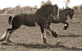
Best friends reliving the days of horse as war machineby snafflesComment: Greetings from the Critique Club
I swear the script is working so that all your images come to me!
This seems to have placed well for you. Very good subject for the challenge topic.
The composition is quite strong, but somehow I wonder if it could have been improved slightly by not having such a tight crop. Perhaps a little bit space to the left of the frame would have helped.
The sort of sepia toning is quite effective. The sky appears quite blown out but I don't think that matters too much. Probably cost you a bit in the score though.
|
 Photographer found comment helpful. Photographer found comment helpful. |
| 06/09/2009 02:37:16 AM |
|
| Photographer found comment helpful. |
| 06/08/2009 03:10:48 PM |
|
| Photographer found comment helpful. |
| 06/08/2009 07:21:40 AM |
Flower Remainsby IWhisperedComment: Greetings from the Critique Club
Congratulations on your top twenty placing.
I liked the bright cheery feel of this image, although I do wonder if you could possibly have brightened it a little bit. It may have made the whites a bit whiter and the colours would have popped a bit more. Not a biggy and I know how hard it is to get it right!
I think the centered composition is quite fine, but I wonder also if perhaps a slight change would have pushed your score over the 6. Possibly moving the flower to either the left or the right may have helped a bit.
Overall though, a very nice image. |
| Photographer found comment helpful. |
| 06/08/2009 01:24:42 AM |
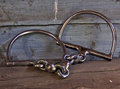
Just a bitby snafflesComment: Greetings from the Critique Club
I'm starting to think that the script that selects the images for critique is set so that all of yours come to me! It's actually starting to be funny now. I have had 3 of your images in the last 24 hours.
I won't give you a very long critique this time around! You probably are tired of reading the same things.
In this image, the subject matter was I guess reasonably unusual, certainly a much better choice than some of the others! Composition is a OK, probably could have been a bit more creative, perhaps taking the shot at the same level as the bits, rather than looking down on them.
The lighting is a bit flat, and that could have been fixed simply in PS. I did a quick levels adjustment and the difference was quite marked. (PM me if you want me to show you). Looks like you may have used the on board flash as there are some shadows. Again, I think if you cranked the ISO to 400 you could have done this without the flash and perhaps got a better overall exposure. Trial and error I suppose with this.
OK, so much for a short critique!
I thought this was quite a good one for the challenge, could have scored better with a slightly different composition and slightly different processing.
|
| Photographer found comment helpful. |
| 06/08/2009 12:22:41 AM |
|
| Photographer found comment helpful. |
| 06/08/2009 12:15:35 AM |
|
| Photographer found comment helpful. |
| 06/08/2009 12:07:55 AM |
|
| Photographer found comment helpful. |
| 06/07/2009 04:07:35 PM |
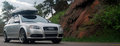
Audi: Coloradoby SoulComment: Greetings from the Critique Club
Looking at the comments below, I see that you have not marked some as helpful. That is very interesting because instead of the normal one or two words, at least two of those comments are extremely helpful as they are explaining to you why you like only scored a 5.00. I am likely to repeat most of what they said in my critique.
The composition is good, you have the car driving into the frame which works well. The choice to use a sort of letterbox crop is interesting and I'm not 100% sure that this works that well. I think I would prefer to see a little more vertical height above the roof of the car.
The focus seems a bit off, the rocks to the right of the frame are sharp but the car is not that sharp (it doesn't really look like motion blur). Also, the image feels a bit flat with regard to the lighting. A boost in levels would likely have helped a bit here, as it seems a bit underexposed.
As this was an advanced editing challenge, you could have selected the car and adjusted the levels (midtones) specifically for the car and then inverted the selection and boosted the rest of the image (highlights). I feel sure this would have helped.
As this was a automobile ad, I think you would have really helped your score by adding some text/graphics to the image. Most of the higher scoring images had texts added.
I was surprised this didn't score higher. It is a good image that could benefit from a bit more advanced editing. Hopefully you understand a bit better now why it only scored a 5.00.
|
| 06/07/2009 03:44:04 PM |
Stand Out!by witt34Comment: Greetings from the Critique Club
I read your photographers notes and noted that you did not shoot this specifically for this challenge. It is a pity that you had not taken the shot just a couple of seconds sooner, so that the car is entering the frame rather than leaving it. This would have given you more space to the left to add your text. The car would also not have been competing as much with the background.
The background is a bit distracting and I do believe it cost you a few points. I notice you are in South Korea, so it is probably not unusual to see the text as written over to the right. Again, I think this probably cost you a few points in the scoring, even though some of your commenters liked it that way.
|
| Photographer found comment helpful. |
Home -
Challenges -
Community -
League -
Photos -
Cameras -
Lenses -
Learn -
Help -
Terms of Use -
Privacy -
Top ^
DPChallenge, and website content and design, Copyright © 2001-2026 Challenging Technologies, LLC.
All digital photo copyrights belong to the photographers and may not be used without permission.
Current Server Time: 08/09/2026 11:06:38 PM EDT.