|
|
|
Showing 4571 - 4580 of ~6577 |
| Image |
Comment |
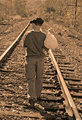
| 06/28/2009 07:22:00 AM | Running Away by JoaniePComment: Greetings from the Critique Club
Your comments are quite defensive, so from the beginning you obviously knew you may get dinged for it not being straight. I have to agree with you, it gets old being told things are not straight! It certainly doesn't affect my view of this image at all.
Obviously this is a set up shot, so it would be interesting to see how it looked in horizontal orientation where the boy may not be so centered in the frame. I think it works as it is, but I'm trying to think of reasons why it may not have scored to it's potential.
One person commented that the boy, clearly the primary subject, is not entirely in focus. On studying the image for a bit longer I think I would agree. It's only ever so slightly off, but enough to make a difference in scoring.
Overall I think the composition and subject are excellent and I like the title.
Coming now to the main reason why I think you did not score as high as you probably would have hoped. I do believe that the toning in this image is a little bit heavy. I think sometimes when doing this type of challenge, the less is more approach is the way forward. Looking at the top 3 images, you will see how subtle the toning is on those. (I could also listen to my own advice on this point!)
Hopefully this is helpful to you.
Sarah |
| 06/27/2009 08:05:32 AM | Waiting for youby CuttoothComment: Greetings from the Critique Club
I have just read the comments on this image, which are actually quite interesting. Of them all, I have to agree with  Zeuszen Zeuszen.
Of course, the subject is a little dark for DPC, and because it requires the viewer to consider it for more than 5 seconds, I suspect you got some low votes from the speed voters, which is a pity, as it certainly an image that tells a story.
I would personally never tell you that you should have cropped out the foreground. However, what I will say is that if you are concerned about your score, then cropping the foreground may have helped you. I have noticed recently that DPC voters don't particularly like shallow depth of field in the foreground. I happen to like it as is, it adds to the overall mood.
I could see this image used as a dust jacket for a murder mystery.
As far as the score goes, I think you knew going in that this may not score so well. The score certainly does not reflect on the quality of the image.
|  Photographer found comment helpful. Photographer found comment helpful. |
| 06/27/2009 07:48:51 AM | Development by aliquiComment: Greetings from the Critique Club
So, now how on earth am I supposed to offer you helpful feedback? :) I think the votes speak for themselves. No 1,2 or 3 votes should say something.
The choice of subject and composition is excellent. Your processing has been done so very well, not a hint of the over the top look that so often is seen when using Topaz.
I suspect this looks excellent in colour too.
Sorry I don't have any pearls of wisdom for you, other than to say, very well done, this is an excellent photograph. | | Photographer found comment helpful. |
| 06/25/2009 03:31:41 PM | Duotone or Bustby robineggComment: Greetings from the Critique Club
I think you did pretty well considering it's your first day with the D700. Usually takes a few days to get the feel of a new camera (at least I find it so). You scored pretty well with this image, so well done. Interesting to note you did not receive any ones or twos, congrats, that doesn't happen often.
The diagonal composition works extremely well for this subject. The duotone conversion is also very well done. I wonder how it would look with the focus on the front bust rather than the middle one? Don't know if it would have helped your score at all. I actually really like it as it is. I didn't vote in this challenge, but would have likely given it a 7.
Have to add the title was really good too!
|
| 06/24/2009 02:11:51 PM | Little Farmerby CassieDoodleComment: Greetings from the Critique Club
You have no idea how difficult it is to provide you with some constructive feedback on this image. As far as I am concerned, there is little to improve upon and I am at a loss to figure out how it didn't score over 6. My only conclusion is that you got dinged because it was just a straight black and white.
The composition is excellent, the tilted angle works exceptionally well here. You have cropped it beautifully, the depth of field is lovely and the catch light in his eyes is gorgeous.
As I said, I don't really have anything to give you in terms of how to improve, as I think this is an excellent portrait.
Well done, I'd be delighted to have such an image in my portfolio. |
| 06/24/2009 01:55:14 PM | A slow dash across the path.by Bill666Comment: Greetings from the Critique Club
Quite a nice choice for this challenge, although I can imagine, as you stated, that the colour version is much nicer, especially given the nice lighting and the time of year.
Excellent choice with the DOF, I think it worked very well with both foreground and background out of focus. I liked the fact you got down close to the subject, so we are almost eye level with the snail.
I think what hurt you in this challenge is the placement of the subject. I feel sure it cost you about 0.5 in points. If you had cropped the image slightly differently so the snail was more to the right of the frame then I think you would have found the image was more appealing to the voters. Not saying I don't like it as it is, but, in terms of why you may not have scored where you thought you would I think this is the reason. Try it with a different crop and see what you think.
| | Photographer found comment helpful. |
| 06/24/2009 12:26:06 AM | | | Photographer found comment helpful. |
| 06/19/2009 12:01:59 AM | Stranger's Feet in Passingby brianlhComment: Greetings from the Critique Club
I have to confess I was a little surprised this did not score higher. I thought it was a pretty strong image for this challenge.
Composition is good, it includes just the right balance of "busy-ness".
One comment I would make is that the image doesn't feel really, really sharp, but looking at your EXIF I can see that maybe a product of the 1600 ISO a relatively slow shutter speed. Without any image stabilisation it is difficult to get things tack sharp at less than 1/60.
Overall, I really like this image and am still surprised it did not score higher. | | Photographer found comment helpful. |
| 06/17/2009 09:40:52 AM | by nixterComment: Crumbs, I don't know how you manage to get so many great images on such a regular basis. Another excellent image. | | Photographer found comment helpful. |
| 06/17/2009 12:05:48 AM | Monolithsby rinacComment: Way to go Rina! Excellent finish. Well done! | | Photographer found comment helpful. |
|
Showing 4571 - 4580 of ~6577 |
Home -
Challenges -
Community -
League -
Photos -
Cameras -
Lenses -
Learn -
Help -
Terms of Use -
Privacy -
Top ^
DPChallenge, and website content and design, Copyright © 2001-2026 Challenging Technologies, LLC.
All digital photo copyrights belong to the photographers and may not be used without permission.
Current Server Time: 05/08/2026 12:54:49 AM EDT.
|