Greetings from the Critique Club
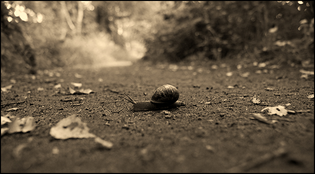
Quite a nice choice for this challenge, although I can imagine, as you stated, that the colour version is much nicer, especially given the nice lighting and the time of year.
Excellent choice with the DOF, I think it worked very well with both foreground and background out of focus. I liked the fact you got down close to the subject, so we are almost eye level with the snail.
I think what hurt you in this challenge is the placement of the subject. I feel sure it cost you about 0.5 in points. If you had cropped the image slightly differently so the snail was more to the right of the frame then I think you would have found the image was more appealing to the voters. Not saying I don't like it as it is, but, in terms of why you may not have scored where you thought you would I think this is the reason. Try it with a different crop and see what you think.
|






 Add photograph to your favorites
 Add photographer to your favorites

 Photographer found comment helpful.

