| Image |
Comment |
| 07/05/2015 08:43:39 AM |
|
 Photographer found comment helpful. Photographer found comment helpful. |
| 07/05/2015 06:42:15 AM |
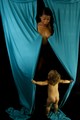
Burlesque Baby Blueby simplerlifeComment: Greetings from the Critique Club
You got a quite decent score for this image, but of course, it probably could have done much better. The idea was great but as 21.gif FromDaRock says, the execution isn't up to scratch. Having read your notes, I understand this was a candid moment and not staged, so it explains the lack of focus. For an image on DPC to do really well, it needs to be very sharp and I think this is what is missing here.
The lighting is quite good, but the left side of the frame is a bit blown out which is distracting attention away from the model.
Overall, well done image, but could have been better with a few minor adjustments |
| 07/05/2015 06:41:42 AM |
|
| 07/05/2015 06:33:33 AM |
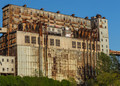
Jakeby clickodakComment: greetings from the critique club
Just short of the coveted 6. I found this to meet the challenge well. The composition is a bit dull, it's a portrait of a building. The images that scored better had a bit more space to let the image breathe.
If you had waited until later in the day to take this picture, when the was just about to set, I think it would have scored a lot better. The lighting is harsh and very contrasty. I think you've slightly underexposed the frame (probably deliberately due to the bright sunshine), but a slight tweak to the highlights would have made the image stand out a bit more.
You did pretty well with this image, I personally gave it a 6 as it clearly met the challenge. Had the lighting been softer, it's probable I would have scored it a bit higher.
|
| Photographer found comment helpful. |
| 07/05/2015 05:36:09 AM |
|
| Photographer found comment helpful. |
| 07/04/2015 05:47:55 PM |
|
| Photographer found comment helpful. |
| 07/04/2015 05:45:32 PM |
|
| Photographer found comment helpful. |
| 07/03/2015 03:51:05 PM |
|
| Photographer found comment helpful. |
| 07/03/2015 04:55:35 AM |
Urho by UrhoComment: Ihana kuva Juha! Onnea. |
| Photographer found comment helpful. |
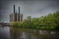
| 07/02/2015 04:18:01 PM |
The Old Coal Plantby TommyMoe21Comment: Greetings from the Critique Club
We have run out of fresh images to critique at the moment, so catching up on some older ones from the queue.
For the challenge topic the building hits the mark, no question there. I find the composition could be improved a bit. The dull colour of the Chicago River does not really add any value to the image. It's not very interesting and I would have cropped a bit tighter to place a bit more emphasis on the building yet still retaining Similarly with the trees, I would have cropped some of those out.
I'm not sure about the grain (and neither I think were most of the voters). I totally get why you added it, but it feels a bit too artificial. Main thing for me is the flatness - I think a contrast boost would have helped a bit, quite often after using HDR software images tend to look a bit "flat" and I think this is one of those cases.
Take this with a pinch of salt, just one person's point of view, but maybe explains the 5.2 score. |
| Photographer found comment helpful. |
Home -
Challenges -
Community -
League -
Photos -
Cameras -
Lenses -
Learn -
Help -
Terms of Use -
Privacy -
Top ^
DPChallenge, and website content and design, Copyright © 2001-2026 Challenging Technologies, LLC.
All digital photo copyrights belong to the photographers and may not be used without permission.
Current Server Time: 04/27/2026 11:19:44 PM EDT.