|
|
|
Showing 2161 - 2170 of ~6577 |
| Image |
Comment |
| 04/17/2011 10:22:52 AM | |  Photographer found comment helpful. Photographer found comment helpful. |
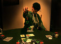
| 04/17/2011 09:08:21 AM | Splashing the potby JoshTComment: Greetings from the Critique Club
I will comment on this photo on the premise that you did, in fact, enter it into the wrong challenge. For surely this does not meet the between the neck and knee challenge.
Had this been entered into the chips challenge, I am not sure it would have done much better to be honest, although you may have gained some points as it does definitely meet the challenge.
Several problems exist with this image from a technical perspective. The very high ISO used has created a huge amount of digital noise. Running it through a noise reduction software programme, such as Topaz Denoise, would have been a good starting point. The white balance is off, giving a yellow tint to the image. This could have been corrected in post processing with a very simple adjustment. The image is not really completely in focus which hurts this.
I think if you were trying to emphasise the chips falling onto the table, then a different angle would have worked better. Right now, the chips get lost against the dark background of her top. I think you know most of this as you have indicated in your notes. I may also have been tempted to get in a bit closer. There's a lot of redundant space on the left of the image.
I think you certainly with a few changes in set up and processing you could have achieved a much higher score. Oh, and of course, entering it to the right challenge may have helped :)
Sarah |
| 04/17/2011 08:35:32 AM | Temptationby stantheman1313Comment: Greetings from the Critique Club
Congrats on the top 20 slot in this challenge.
I think the idea of this is excellent. There's a lot to like about it. I do actually like the horizontal orientation, it's not what one might expect. I noted your comment about the pimple, that is something that the eye is drawn to.
I wonder whether this is ever so slightly underexposed? I somehow feel like the body should be a tiny bit brighter (ok, that's just me nit picking.)
The one thing I would change is the border. Several of your commenters have mentioned it and it bothers me too. I'm not entirely sure how I would feel if it were borderless, but somehow this border really gives the feeling that you have chopped the legs & head off. The use of borders is such a personal thing, but if you belong in the don't like camp, then the score can really take a bit of a hit. I typically like a subtle border, but in this case, I think this would benefit from not having a border.
Overall a very well done image that completely meets the challenge.
Sarah
|
| 04/17/2011 08:22:09 AM | Colour Trends 2011-2012by LawtonComment: Greetings from the Critique Club
First impression: I liked the slightly out of the box thinking using this subject for this challenge. I can see some may have considered it to be not meeting the challenge, but it works for me in that context.
However, what doesn't really work for me is the composition. I feel, however much effort you put into the arranging of the cards, they are just carelessly thrown and then photographed - at least this is my impression. In other words, the best has not been made of the subject material.
The lighting source you have used is also creating a quite flat light (as already suggested by Tanguera). The light source is also messing with your white balance. There is a warm tint to the image which, for me at least, feels quite wrong. If you adjusted the white balance in some post processing software so that the white of the cards is actually white, the image would have a bit more impact.
I also note that the whole image is not sharp. There are parts in the lower part of the frame that are slightly out of focus.
However, in saying all of that, I still think it was a good attempt at meeting the challenge.
Sarah
|
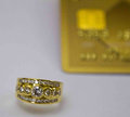
| 04/17/2011 07:09:42 AM | Diamond Chips Need Money Chipsby DiamondsComment: Greetings from the Critique Club
First of all, welcome to DPC and your first challenge and first critique.
I'll go easy on you since you haven't been around long and would hate to put you off. I also note you are new to using a DSLR, so quite a big learning curve after using a point and shoot.
First off, I think conceptually this is a great idea, but is suffering a bit on the technical side (understandable since you have just got the camera). I totally got the reference to the credit card chip (not sure they've caught up with that concept in the US).
Technically speaking there are a few areas you could concentrate on. The subject, the ring, is out of focus. On DPC this will always result in a low score. You have selected to use a shallow depth of field, understandably to keep the credit card nicely blurred in the background. But this has created extra challenges for you when trying to get the diamond in focus.
As far as the exposure goes, this feels a bit underexposed. The white background has been rendered a neutral grey. I took the liberty of opening the image in some editing software and a very simple tweak to the levels resulted in an image with a bit of punch. Brightening the image overall and enhancing the contrast made it feel not quite so softly focused. One further comment, it looks like it may have been quite heavily cropped from a bigger image (this is my assumption based on the look) Please forgive me if I am off base here. There is some digital noise in the background which is more noticeable due to the cropping. Some noise reduction software could help a bit with this.
Overall, I think this is a good first entry. Keep at it.
feel free to pm me if you would like any further comments.
Sarah Message edited by author 2011-04-17 07:12:42. |
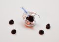
| 04/17/2011 06:49:48 AM | "One day, we will be the world's most famous Chocolate Chip!"by apasciucComment: Greetings from the Critique Club
I didn't vote in this challenge, so this is the first time I am seeing this image.
My initial reaction is, good idea, meets the challenge but is a bit weak technically. You have chosen an aperture that will give you a very shallow depth of field, but maybe for an image such as this, you would have been better using a deeper depth of field. I would have preferred to see the chips in focus. As you took the trouble to shoot on a white background, I'd like it to actually be white. Whatever saturation boost you have done, has given it a slightly reddish glow, coming presumably from the reflected light source.
One of your commenters suggested a different angle/perspective and I think I am incline to agree.
Overall, I think it's a nice take on this challenge subject but just spoiled by the slightly weak technicals. | | Photographer found comment helpful. |
| 04/17/2011 05:51:52 AM | journeyby instepsComment: Love this sort of spontaneous shot. You can never be quite sure how they come out. Sometimes the actual shot is much more effective than the planned shot. | | Photographer found comment helpful. |
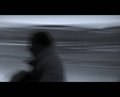
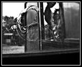
| 04/17/2011 05:38:37 AM | Waiting for the trainby markwileyComment: I love this. looks like you're on the platform of train station. Futile comment, given the title, but I was thinking the El when I wrote it! (Ex-Chicago resident here) I really enjoy the composition. Message edited by author 2011-04-17 14:07:30. | | Photographer found comment helpful. |
| 04/17/2011 03:59:16 AM | Peek-a-Booby garryyoungComment: Greetings from the Critique Club
I didn't vote in this challenge as the topic didn't particularly appeal to me, so this is the first time I have viewed this particular image.
I see you disagree with those folk who thought this didn't meet the challenge. Whilst I personally like the image very much indeed, I can also see where the others are coming from. The challenge description did actually say, take a photo of some chips. So, if one wanted to be very literal, this image could certainly be considered not to meet the challenge. I'm not saying I think it doesn't meet the challenge, but just suggesting why other, more literal minded folk, may think it doesn't. :)
There's a lot to like about this image, it certainly tells a story. I also agree with Brian, putting your daughter's face to the hole would have spoiled this image, at least for me. It would, of course, created a very different image, but to my mind one that would be a bit contrived. This is certainly a shot that works very well in B&W.
A couple of things I may have done differently in presenting the image for voting. I think I would have cropped it so there was slightly less of the pure black under the window showing. Whilst it is clear it adds some context, I think the composition would be stronger without. Also, I may consider leaving the border off. It's a very heavy border and although it in some way works I think a slightly more delicate frame may work better. (The whole border vs no border discussion could take days!) I personally like borders in most cases, but for me, less is more.
I think you were certainly hit by some doesn't meet challenge voters. Despite that, you achieved a very respectable score.
Overall, a very nice image and one I'd be very happy to have in my portfolio.
Sarah | | Photographer found comment helpful. |
| 04/17/2011 03:07:51 AM | Let Them Fall where they Mayby dali_lama_2kComment: Greetings from the Critique Club
Difficult to critique this from my perspective as I found this challenge topic to be very unappealing and didn't vote. However, just because I didn't like the topic, doesn't mean I can't find something to comment.
This must have been quite fiddly to set up and I'm sure you had to do it more than once! I'm not entirely sure if you were really trying to make it look like a space station, but if so then I guess you succeeded, since it's the first thing that popped into my mind when I saw this. Clearly your commenters also thought the same.
I can't quite put my finger on why this scored below 5. Maybe the composition is a little awkward. Surely this was a bit hit and miss if you were dropping the chips. There is a lot of 'lint', fluff or whatever you care to call it in the background. Can't tell if that's meant to be there to enhance the feeling of a moon surface, or if in fact it's not meant to be there. Either way, that may have an impact on your score. DPC voters like things clean and dust free. There is certainly 1 white speck of dust that is standing out. Now, of course, in basic editing you cannot clone the dust out since it is not sensor dust, but real physical dust, so I would have been inclined to therefore use a levels adjustment or something to darken the blacks. The dust would be more concealed this way and would have made the chips stand out a bit more.
Just some thoughts for next time.
Sarah
| | Photographer found comment helpful. |
|
Showing 2161 - 2170 of ~6577 |
Home -
Challenges -
Community -
League -
Photos -
Cameras -
Lenses -
Learn -
Help -
Terms of Use -
Privacy -
Top ^
DPChallenge, and website content and design, Copyright © 2001-2026 Challenging Technologies, LLC.
All digital photo copyrights belong to the photographers and may not be used without permission.
Current Server Time: 05/08/2026 01:01:22 PM EDT.
|