| Image |
Comment |
| 03/06/2007 12:16:14 PM |
not in kansasby skewsmeComment: Very very nice. The use of the frame is exceptional. Great eye movement, nice lines and solid idea. There isn't too much to like about this photo. I think the style is very subjective and pushes the limits as far as artistry. It is great to have those who try new things, but it is also probably what hurt you with the voters. Personally, I like it and think it is a terrific capture. |
 Photographer found comment helpful. Photographer found comment helpful. |
| 03/06/2007 12:11:22 PM |
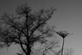
continuumby skewsmeComment: Personally one of the best ideas in the challenge. I always like juxtaposition type images. I think just a little bit of recomposing would have made it sing by having the seedling thingy totally in the gray sky. Otherwise a wonderful stylized shot. I am surprised it didn't do better in the challenge. |
| Photographer found comment helpful. |
| 03/06/2007 12:07:04 PM |
What are you looking at?!by sickdogComment: I think this is one of those pictures where we are just looking the wrong way. A slight tilt to the the photo. However, the moment you captures is very, very well done. Emotion is a key element to photography and you have it here. While not a top 10 photo it is still underrated in my opinion. |
| Photographer found comment helpful. |
| 03/06/2007 12:03:47 PM |
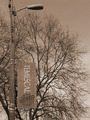
Inner City Treesby sickdogComment: I love the light here, it just kind of moves around the tree and really gives it a nice tone. I'm not sure about the post, I understand it gives interest but it really doesn't seem to work with the tree in the background. They just seem very unrelated, but I think excluding the post/banner would have left you with a very empty shot. I am undecided about it. The composition as a whole is terrific. I might have been improved by being 3 feet taller, but that is a tough one to accomplish without a step ladder. :) Still just minor pickings to a solid entry. It should have done much better at least in my eyes, mostly just for the light alone! |
| Photographer found comment helpful. |
| 03/06/2007 11:59:51 AM |
Partial treeby JerseyGenieComment: Honestly for a minimal editing, I think this is a terrific shot. I see some much potential here, and post would really bring it out. This one should have scored a bit higher. My only suggestion would to have the needles coming toward the viewer in focus. Great shot. |
| Photographer found comment helpful. |
| 03/06/2007 11:57:35 AM |
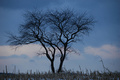
Lonesomeby NikonJebComment: Terrific shot Jeb! Compositional I think the image is near perfect. The texture of the grass, the low clouds, and the branches isolated in the blue sky make for a wonderful scene. The only thing is the slight blur, which detracts from a wonderful image. I think this one is underrated. |
| Photographer found comment helpful. |
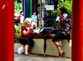
| 03/06/2007 11:54:54 AM |
Lunchby WildcardComment: I'm in the "I like the band-aid" club. I think it gives a little dimension to the photo. I think the photo is too busy though, I would have preferred the girls in the background to be gone and the cars on the left, since in my opinion they aren't adding anything to the photo. Beyond that, it is exception. I like how you framed the women between the two columns, the black umbrella in the middle and the line of the bench the two are sitting on. The expression on the one lady is wonderful. A nice color street shot. |
| Photographer found comment helpful. |
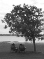
| 03/06/2007 11:49:57 AM |
A Tree For Twoby WildcardComment: A fun capture! Normally, I don't like the backs of people, however this works mostly because they are engaging each other (heads turned to each other) almost as if they are talking about the wonderful view. A good use of the frame as the elements presented move your eye around very well. Great exposure considering the extreme dynamic range involved! A nice shot that I wish would have done a bit better. Congrats. |
| Photographer found comment helpful. |
| 03/06/2007 11:45:21 AM |
Evening Treeby kashiComment: A good attempt Kashi. I do like the blue color cast you managed to capture along with the idea as I am a big fan of silhouettes. While everyone is suggesting to include the whole tree which would improve the composition, the other thing you could try is being directly under the tree looking up. This way you get the branches spreading evenly over the frame in different directions.
The angle you shot at is a tough one, generally it is good if you want to show a sense of scale, however there is no subject reference to give it this feeling as such it loses a bit. As an example, with this angle what would really help would to have a color contrasting object (bright white or something else) that is small in the lower right corner on one of the branches.
Just some ideas, but I am not really saying this picture is bad. The idea is great and silhouettes with textured patterns are always a winner. Hope that helps, feel free to critique me anytime! |
| Photographer found comment helpful. |
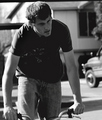
| 03/06/2007 11:32:28 AM |
Rideby seeComment: This is a good action shot with a lot of mood using missing in this genre. I love the expression of the the rider. It gives a moment of reflection. I think just a bit (a very small amount) is needed on the bottom to include the hands fully. Isolating the truck in the background would have helped too, but otherwise the composition is pretty spot on. I like the window as it gives a nice balance to the frame. A good picture in a tough challenge. |
| Photographer found comment helpful. |
Home -
Challenges -
Community -
League -
Photos -
Cameras -
Lenses -
Learn -
Help -
Terms of Use -
Privacy -
Top ^
DPChallenge, and website content and design, Copyright © 2001-2026 Challenging Technologies, LLC.
All digital photo copyrights belong to the photographers and may not be used without permission.
Current Server Time: 06/24/2026 12:44:28 PM EDT.