| Author | Thread |
|
|
03/06/2007 12:07:04 PM |
|
I think this is one of those pictures where we are just looking the wrong way. A slight tilt to the the photo. However, the moment you captures is very, very well done. Emotion is a key element to photography and you have it here. While not a top 10 photo it is still underrated in my opinion. |
|
 Photographer found comment helpful. Photographer found comment helpful. |
|
|
02/26/2007 08:29:04 AM |
|
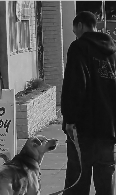
I think the focus is a little soft and you probably should have shown more of the area. The look between the dog and the master is great. |
|
| Photographer found comment helpful. |
Comments Made During the Challenge  |
|
|
02/25/2007 09:16:11 AM |
|
Nice photo, but I wish we could see more of the man's face. On the post-processing side, this probably needs to be rotated slightly clockwise. It also appears to be over-sharpened. Notice the halos around the man and where the dog's back meets the sign. |
|
| Photographer found comment helpful. |
|
|
02/24/2007 08:52:29 AM |
|
it almost looks like a monochrome painting. I like it. |
|
| Photographer found comment helpful. |
|
|
02/23/2007 05:34:56 AM |
|
I took a people photography class some years ago, and the first lesson was geared toward awkward places to chop the human body. Cutting the body off at major joints almost always looks accidental rather than one's compositional intent. Chopping him off at the knees, as well as cramming them tightly into the frame makes this seem like more of a shot-from-the-hip snapshot than a thought-out, composed image. |
|
|
|
02/21/2007 05:13:31 PM |
|
The composition here is alittle tight for my taste, and the photo has a rather washed out appearance. There is something about the texture (or perhaps lack of) of the dog's coat and the boy's hand that bothers me. |
|
| Photographer found comment helpful. |
|
|
02/21/2007 04:35:14 PM |
|
i think there is overuse of a noise reduction program here? i could be wrong mind you |
|
| Photographer found comment helpful. |
|
|
02/19/2007 05:16:09 AM |
|
too much NI maybe? great photo and idea though. probably I would increase the contrast a bit or adjust levels/curves. nice lighting, too! |
|
| Photographer found comment helpful. |
Home -
Challenges -
Community -
League -
Photos -
Cameras -
Lenses -
Learn -
Help -
Terms of Use -
Privacy -
Top ^
DPChallenge, and website content and design, Copyright © 2001-2026 Challenging Technologies, LLC.
All digital photo copyrights belong to the photographers and may not be used without permission.
Current Server Time: 06/29/2026 11:31:47 AM EDT.