| Image |
Comment |
| 10/05/2006 05:51:36 PM |
|
 Photographer found comment helpful. Photographer found comment helpful. |
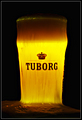
| 10/05/2006 05:49:27 PM |
TUBORGby GautiComment: This would have look 100% better without the beer spilling over. Or, while a much tougher shot, getting the foam of the beer as it is just coming down the edge a bit. The mess on the bottom is distracting. Doesn't make me want to grab a beer, makes me want to grab some paper towels. Lighting is nice in how it makes the beer glow gold. Would like to see the white foam on top as well (spot light from above?). Good luck. |
| Photographer found comment helpful. |
| 10/04/2006 12:48:37 AM |
|
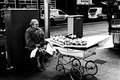
| 10/04/2006 12:47:00 AM |
The Fruitererby aznymComment: Very nice. I love pictures like this where I can think up a story of my own to go with it. nice high contrast processing. Good luck. |
| Photographer found comment helpful. |
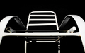
| 10/04/2006 12:45:30 AM |
Lawnchairby jdannelsComment: Tight crop isn't working in your favor here. It makes the photo look very off-kilter. Good luck. |
| Photographer found comment helpful. |
| 10/04/2006 12:44:46 AM |
|
| Photographer found comment helpful. |
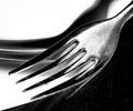
| 10/04/2006 12:44:08 AM |
Forktastic!by moonwellComment: Not sure I care for the effect, but it certainly does keep me looking at the photo. Good luck. |
| Photographer found comment helpful. |
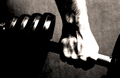
| 10/04/2006 12:41:25 AM |
Gripby JariComment: Excellent. Almost looks like it could be an album cover. |
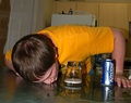
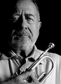
| 10/04/2006 12:40:32 AM |
Mr. S.by rileyComment: nice picture, well shot and nice tones. Unfortunately, pretty much all midtones and almost no darks and highlights. Think you are gonna get some dnmc's on this. Good luck. |
| Photographer found comment helpful. |
| 10/04/2006 12:30:22 AM |
|
| Photographer found comment helpful. |
Home -
Challenges -
Community -
League -
Photos -
Cameras -
Lenses -
Learn -
Help -
Terms of Use -
Privacy -
Top ^
DPChallenge, and website content and design, Copyright © 2001-2026 Challenging Technologies, LLC.
All digital photo copyrights belong to the photographers and may not be used without permission.
Current Server Time: 06/23/2026 02:58:34 AM EDT.