| Image |
Comment |
| 11/26/2006 11:47:43 PM |
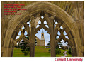
Greetings from Cornellby cresusComment: You left out
"Lift the chorus, speed it onward, loud her praises tell ..."
Cornell '88 :)
So - is this Zeke Smith?
It's a nice composition, but a little low contrast. More importantly, the lengthy text piece is very hard to read because of the red color, the drop shadow, the italics, and the placement. Straight white would work better. |
 Photographer found comment helpful. Photographer found comment helpful. |
| 11/26/2006 11:44:27 PM |
The Last Roseby NikonJebComment: Sorry, this is my first "did not meet challenge" vote. They don't have to be travel advertsiements, but in the title you could've told us what the point of the card would be. Sympathy after a death? Reminder of spring? Faded but still going? What?
Looking at it purely as a photo, it's out of focus and quite low in contrast. Maybe rotating it so the dead head is in the upper left and the bloom is more centered might increase the visual interest. |
| Photographer found comment helpful. |
| 11/26/2006 11:42:05 PM |
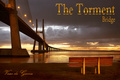
Vasco da Gama Bridgeby De SousaComment: Wow. I'll go so far as to predict a ribbon for this. Lighting, composition, contrast are all perfect. 10. |
| Photographer found comment helpful. |
| 11/26/2006 11:41:29 PM |
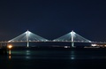
Sweet Charleston Nightsby SunshyneComment: Pretty as is. But if there were stars above, and the bridge were moved down a bit, you'd have a ribbon-quality shot. If you can't find stars, or they don't come through haze, add 'em and sell it as a print. :) |
| Photographer found comment helpful. |
| 11/26/2006 11:40:07 PM |
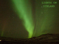
Lights on - Icelandby bogusComment: Oooo pretty. But why is the text blurry? And there's a lot of noise. Try running a noise reduction program on it and adding the text later. |
| Photographer found comment helpful. |
| 11/26/2006 11:38:49 PM |
Great Seats Still Availableby jerseyjimComment: Ooo - alllmost. The idea, placement of the chairs, and sunset are all good. But it seems washed out. Bump up the contrast and I bet you'd have a stunner. |
| 11/26/2006 11:38:00 PM |
Brunswick, GAby Elvis_LComment: Sorry. Although IR can be an interesting technique, to me a postcard is about showing a place off. Here, you make southern GA look like a winter wonderland. I can imagine the tourist who saw this wondering where the snow went. |
| Photographer found comment helpful. |
| 11/26/2006 11:36:44 PM |
|
| 11/26/2006 11:36:13 PM |
by tateComment: Nice and simple! |
| Photographer found comment helpful. |
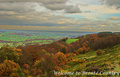
| 11/26/2006 11:35:55 PM |
Welcome to Bronte Countryby obsidianComment: A few problems here, although the view is nice. The greens seem way too saturated. The horizon is tilted, but not enough to show you meant to do that. And the horizon's pretty close to the middle, which makes it less interesting. Finally, my eye yearns for more contrast. I bet you could get those clouds looking pretty dramatic. |
| Photographer found comment helpful. |
Home -
Challenges -
Community -
League -
Photos -
Cameras -
Lenses -
Learn -
Help -
Terms of Use -
Privacy -
Top ^
DPChallenge, and website content and design, Copyright © 2001-2026 Challenging Technologies, LLC.
All digital photo copyrights belong to the photographers and may not be used without permission.
Current Server Time: 06/21/2026 10:06:55 PM EDT.