| Image |
Comment |
| 12/23/2007 12:06:58 AM |
|
 Photographer found comment helpful. Photographer found comment helpful. |
| 12/23/2007 12:00:19 AM |
The Little Match Girlby snafflesComment: I'm not surprised at the score, because it's not sharp and bright. But your story adds so much to my appreciation of this, and of course the voters didn't see that. This is a good example of the blur helping to sell the story, as if you caught her soul as it prepared to depart. As for the composition, I'd suggest cropping out the dark strip on the left. That will help set up her face in the upper left in opposition to the bright light in the lower right. Ultimately, though, as dahkota said, keep doing what feels right and ignore the score! |
| Photographer found comment helpful. |
| 12/22/2007 11:53:37 PM |
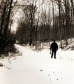
Enter the Woodsmanby posthumousComment: Don, your style and my tastes do intersect sometimes, and this is one of them. :) I like the warp on the left side and the woodsman's pose - they both speak of someone getting ready to face the unknown. Scrolling around, I think the composition would be stronger if you cropped off much of the snow. |
| Photographer found comment helpful. |
| 12/22/2007 11:50:52 PM |
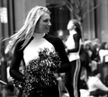
For Saleby JuliBocComment: I voted this a 5, Julianne. Here's why. First, I thought this looked like a pretty empty scene, actually not a crowded one. Second, her dead-center location kept drawing my attention away from all the interesting details in the rest of the frame. So the composition bothered me. Aside from the challenge theme, I think the contrast between her and others would've been stronger without the multiple themes: either the right side to contrast her and the guy or the left to contrast her and the other people. Finally, you've been here long enough to know how true it is that voters, on average, prefer the obvious. |
| Photographer found comment helpful. |
| 12/22/2007 11:47:02 PM |
|
| Photographer found comment helpful. |
| 12/22/2007 11:46:08 PM |
Try Againby CharleneComment: I can see you keeping this forever as a family memory. But until I read your title, I thought the girl on the right was the main subject. I didn't even see your daughter at first. I can see how people didn't vote highly given the challenge, but again, I'm glad you have such a nice shot to hold onto! |
| Photographer found comment helpful. |
| 12/22/2007 11:42:52 PM |
and broaden the horizonsby raishComment: Nice colors, but it looks more like graphic art to me than a photo. I mean, I know it's a photo, of course. :) |
| Photographer found comment helpful. |
| 12/22/2007 11:41:35 PM |
Leaving the Treehouseby posthumousComment: Centered, a tree coming out of her head (well, skewering her right through) - you do like to poke fingers in the eyes of the rulemongers, doncha? ;) |
| Photographer found comment helpful. |
| 12/22/2007 11:40:04 PM |
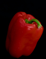
colorful and tastyby griz210Comment: Well, with no prep and no effort, you did okay. I'd suggest brightening it up a bit, but ultimately, the subject doesn't hold my interest long. |
| Photographer found comment helpful. |
| 12/22/2007 11:38:53 PM |
Holiday Glowby colorcarnivalComment: Well, you called it: abstracts rarely do well here. But I LOVE IT. The composition is wonderful, driving me to the one light in front. The colors are fun and bold, and I like the blurry/painterly feel to it. In fact, it's going in my faves. :) I could see this on a card. |
| Photographer found comment helpful. |
Home -
Challenges -
Community -
League -
Photos -
Cameras -
Lenses -
Learn -
Help -
Terms of Use -
Privacy -
Top ^
DPChallenge, and website content and design, Copyright © 2001-2026 Challenging Technologies, LLC.
All digital photo copyrights belong to the photographers and may not be used without permission.
Current Server Time: 06/23/2026 12:04:58 AM EDT.