| Image |
Comment |
| 12/23/2007 07:10:30 PM |
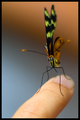
Gentlyby fancypantsComment: I really like the framing and the subject. I think you went a little too far in the aperture, though. You probably didn't need that fast a shutter speed, and you could've bumped the ISO to 400 or maybe even 800, both of which would've let you keep the aperture narrower for more DOF. With the whole butterfly in focus (or at least all of its antennae), I think this would pop a lot more. Of course, you don't get to make those choices when the butterfly lands, so play around a lot while you're in there. Try many different combinations to learn how it all fits together. :)
Or ignore me - look at that average from commenters! |
 Photographer found comment helpful. Photographer found comment helpful. |
| 12/23/2007 07:07:03 PM |
|
| Photographer found comment helpful. |
| 12/23/2007 07:04:53 PM |
The Tulip Lanternby Delta_6Comment: Very pretty shot of this flower. My main suggestion would be to crop out most of the are below and to the right, so only a bit of stem shows and the right edge of the flower is close to the right of the photo.
For the flower itself, it strikes me as kind of caught between glowing softly and being sharp enough to see the texture. Have you heard of the gothic glow action in Photoshop? I recommend trying it. It's usually too strong for me so I drop it over the original and reduce the opacity some. You can download it for free at //atncentral.com/download.htm |
| Photographer found comment helpful. |
| 12/23/2007 06:57:20 PM |
Hope child colourby Delta_6Comment: Nice pose, pretty subject, nice lighting. But (you knew there was a "but," right?) she's pretty pink - a little too pink, it seems to me. Try following the excellent tutorial on removing color casts. If you don't want to spend quite as much effort as that calls for, just eyeball the white, black, and gray points.
Also, she seems a little soft, esp. in her eyes and lips. Was the aperture pretty open, which resulted in narrow DOF? Maybe not - it can be hard to tell in online versions. |
| Photographer found comment helpful. |
| 12/23/2007 06:52:03 PM |
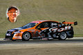
Cleansweepweb.jpgby Delta_6Comment: Wow! You caught a ghostly apparition! ;)
Seriously, this is a nice capture of his car but it's too static - looks like he's sitting still. Race cars are an excellent subject on which to practice motion panning. A blurred background helps convey the sense of speed and power these machines produce. |
| Photographer found comment helpful. |
| 12/23/2007 01:24:15 PM |
Judd's Serious Side - Day 19by sherpetComment: A fantastic expression! You didn't post the detail, so I'm not sure what to suggest to get him sharper. But the general guidelines apply - bump your ISO (I regularly go to ISO 800) so you can narrow the aperture while keeping your shutter speed fast enough. |
| Photographer found comment helpful. |
| 12/23/2007 01:22:48 PM |
Siblings - Day 17 by sherpetComment: A beautiful portrait to keep for your family. Try using a narrower aperture, though - he's nicely sharp, but she's a bit blurred. It's not so much that they both need to be razor sharp as it is I'd prefer them to be the same sharpness, but he looks about right to me. |
| Photographer found comment helpful. |
| 12/23/2007 01:21:14 PM |
Day 17/50 - Australian Reflectionby sherpetComment: I like the colors and shapes, too, and the reflection is nice. But it's kind of midway between being blurred to real abstraction, which I'd like a lot, and being sharp enough to explore details, which I'd also like. Try blurring it a bit and see whether you like it. :) |
| Photographer found comment helpful. |
| 12/23/2007 01:19:42 PM |
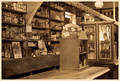
Pioneer Storeby sherpetComment: Shez, this is a nice image. To make it pop a bit more, I'd suggest increasing the contrast so the whites and blacks get in there. Also, I might try cropping out the bright door on the right, which keeps distracting me. That's pull the Havelock shelf out of the center, too. |
| 12/23/2007 01:16:40 PM |
Determinationby Wenders11Comment: I voted this a 7 because I really liked it. I would've voted it even higher if the little guy's nose had been sharp. You didn't post the F-stop, but try increasing the ISO so you can use a narrower aperture, giving your more DOF. |
| Photographer found comment helpful. |
Home -
Challenges -
Community -
League -
Photos -
Cameras -
Lenses -
Learn -
Help -
Terms of Use -
Privacy -
Top ^
DPChallenge, and website content and design, Copyright © 2001-2026 Challenging Technologies, LLC.
All digital photo copyrights belong to the photographers and may not be used without permission.
Current Server Time: 06/22/2026 02:57:32 PM EDT.