| Image |
Comment |
| 11/29/2010 03:31:15 AM |
See youby gwilton111Comment: The top of the iris blends fairly well, but the bottom bit is noticeably choppy. Don't forget to feather selections.
That being said, I don't buy an orange eye even if it is a really pretty shade and nicely in focus. |
 Photographer found comment helpful. Photographer found comment helpful. |
| 11/24/2010 03:41:06 AM |
Narcissaby LevTComment: Originally posted by LevT:
actually, I meant that the girl is looking at her own reflection (hence the title), but I guess this did not come across... |
To be honest I try to not read titles when voting, and apparently when I viewed this image I was very successful in that and completely missed it. Now that I see the title it does make a bit more sense. I think part of why the image didn't convey that is because in the reflection her eyes almost look closed, or that she's looking at the ad. The ad appears to be an important part of the image, so I tried to make a connection between the ad and the model. I think the same pose without anything in the window may have worked better, or a window where the object in the window wasn't as obvious.
I didn't vote, btw. |
| Photographer found comment helpful. |
| 11/23/2010 01:48:45 PM |
Sanctuary Securityby Art RoflmaoComment: Definitely good job with the edit. I never would have guessed that sky wasn't there from the start. Not only is it done cleanly, but it's thought out and believable. |
| Photographer found comment helpful. |
| 11/23/2010 03:46:06 AM |
Crash!by CoryComment: Oh no! Such a new car to be dumped over in a ditch like that. I wonder what the circumstances were.
I really like how the lights of the police car came out. The lights and the sunset almost compliment each other. |
| Photographer found comment helpful. |
| 11/21/2010 07:33:00 PM |
|
| Photographer found comment helpful. |
| 11/21/2010 07:32:14 PM |
595 - Copy - dpc - nov morningby Luci11eComment: I agree that the colors are nice, but it's got some movement. It's not enough movement for me to think it were intentional or for it to add to the meaning of the photo though.
I think that if you want this tree to hold its own as the subject the photo as a whole will need to be simplified. The left side of the image for example has several tops of trees that are budging their way in and interrupting your horizon. I would clone those out so that you have a nice solid (uninterrupted) horizon. |
| Photographer found comment helpful. |
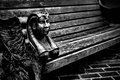
| 11/21/2010 07:27:28 PM |
Supportive Armby dahlinComment: What an awesome bench. I've got nothing to say to help improve this photo really. It looks pretty solid to me.
The addition of some kind of model would take it over the top though. I notice you've got some children in some of your shots. I think this could be really neat if you had a child sitting on this bench leaning back so that you can't really see the child. Maybe just the top of their little head visible, and just the legs and tiny little shoes sticking out over the edge.
|
| Photographer found comment helpful. |
| 11/21/2010 07:14:40 PM |
truck-load-at-duskby clictacameraComment: I can appreciate what you were going for, and what a beautiful sunset it must have been. Unfortunately, if you were to look at a histogram for this shot you'd see that the whites and blacks are both clipped. You've got blown highlights in the clouds, and the much of the foreground goes completely black and lacks any detail.
Is this really shot with a camcorder? For a regular DSLR some would recommend a graduated ND filter. That would darken the sky, while still letting you expose properly for the foreground. You could do essentially the same thing in post-processing using gradient filters. Darken from the top, lighten from the bottom.
|
| Photographer found comment helpful. |
| 11/21/2010 07:05:31 PM |
choosing my favorite seedby clictacameraComment: I agree that it does look like an extreme crop, and it is very noisy. With that said, it's still quite funny! The falling seeds are what really makes this shot. It's one of those photos that doesn't need a title to know what's going on. |
| Photographer found comment helpful. |
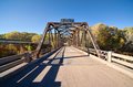
| 11/21/2010 07:02:39 PM |
Old Reserve Bridgeby CoryComment: This location has a lot of potential, but to be perfectly honest there's nothing striking me in this capture. The shadows are distracting, the composition is ho-hum, and the sky is boring. I don't see a point in including that much sky if there's nothing there. This shot to me demands overcast. It would better control the shadows, and maybe add some texture to the sky. I bet it would be a great winter shot. |
| Photographer found comment helpful. |
Home -
Challenges -
Community -
League -
Photos -
Cameras -
Lenses -
Learn -
Help -
Terms of Use -
Privacy -
Top ^
DPChallenge, and website content and design, Copyright © 2001-2026 Challenging Technologies, LLC.
All digital photo copyrights belong to the photographers and may not be used without permission.
Current Server Time: 07/18/2026 11:06:34 AM EDT.