| Image |
Comment |
| 04/21/2007 11:24:06 AM |
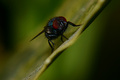
Hiby Rino63Comment: Something about the diaginal presentation of this doesn't work for me. I think horizontal might have more punch. The colors are great, as is the focus. Your sensor is a bit filthy though, heh. |
 Photographer found comment helpful. Photographer found comment helpful. |
| 04/20/2007 12:44:34 AM |
Crib Coiffeby OmanOtterComment: This is one of those classic photos that you see floating around in spam emails for years. Such a hysterical expression! |
| Photographer found comment helpful. |
| 04/16/2007 10:39:57 PM |
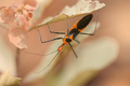
Hemipteraby noranekoComment: I think this would work better flipped 180 degrees (which is legal in minimal editing). I really like the colors. |
| Photographer found comment helpful. |
| 04/05/2007 12:19:01 AM |
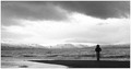
Pauseby sumitComment: I have to agree that without the title this wouldn't represent still, but with the title I think it nails it. Unforunately it looks like not so many people agreed. Definately has that old Hitchcock feel.
You were my #10. Sorry my vote didn't weigh more, heh. |
| Photographer found comment helpful. |
| 04/05/2007 12:15:23 AM |
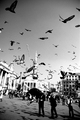
Where time stands stillby litboltiComment: What went wrong?! You were in my top 5!
I can only imagine that people needed to see this photo bigger. If this were to be put in a gallery at full size there would constantly be someone standing infront of it losing themselves in thought. |
| Photographer found comment helpful. |
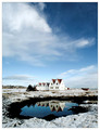
| 03/30/2007 10:17:41 PM |
Pond Placid by HauxonComment: You're my winner.
Love the reflection, the colors, and the stillness. I can feel the crisp cool breeze coming in through the open window as I take an afternoon nap in one of the upstairs bedrooms. |
| Photographer found comment helpful. |
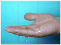
| 03/30/2007 09:55:28 PM |
Drip Dropby Sunshine86Comment: This could be a horrible snapshot very easily, but there's something about it that makes it stand out. I'm drawn to the blues and the splashes. The lighting is well done and the shine on the fingers adds depth. |
| Photographer found comment helpful. |
| 03/30/2007 09:50:03 PM |
Standing stillby TlemetryComment: The colors and balance are great, but frankly I can't say the subject is interesting. |
| Photographer found comment helpful. |
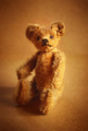
| 03/26/2007 04:15:15 PM |
Portrait of a Toyby HaneckComment: I just read that it was a wee little bear that belonged to your grandmother. Maybe have the bear holding a wee little photo of your grandmother? I think that would be a perfect photo to add to the family album. |
| Photographer found comment helpful. |
| 03/26/2007 04:05:44 PM |
Portrait of a Toyby HaneckComment: I think this shot really did suffer from not exactly fitting the challenge. However it is a very nice photo with a great warm color.
I feel like there's something missing. I can't quite put my finger on it. Maybe if the bear was holding a fresh flower cutting? Something to give the photo just a little more interest and personality. |
| Photographer found comment helpful. |
Home -
Challenges -
Community -
League -
Photos -
Cameras -
Lenses -
Learn -
Help -
Terms of Use -
Privacy -
Top ^
DPChallenge, and website content and design, Copyright © 2001-2026 Challenging Technologies, LLC.
All digital photo copyrights belong to the photographers and may not be used without permission.
Current Server Time: 07/16/2026 04:09:02 PM EDT.