Dear I fear we're facing a problem, you love me no longer.by
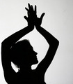
amandapaige119Comment: I'm sure by now you've figured out that your title confused a lot of people, and probably hurt your score a little bit. The first thing that bothered me about this photo from the thumbnail is how close the arm is to the left side of the image. I do this a lot myself, which is probably why it was the first thing to bug me, heh. She looks cramped because of this, I think.
For an image like this to do really well on this site, I think people would want to see something more interesting done with the lighting. I know, I know, it's a silhouette, but the lighting on the background is flat. There's no eyecandy, basically.
Which leads me to something that would have instantly bumped the score. Breasts! For a couple reasons. Firstly just the natural male attraction to them means no male would give you less than a 6, heh. Secondly, your model seems chopped. Maybe if that tidbit of breast on the right wasn't in the photo it would seem more complete.
I'm at work now, so I can't play with the cropping, but I'm curious what it would look like if you actually cropped into the arm. Perhaps started the crop on the outside of her armpit on the left of the photo.... wait!
Okay, bare with me. Actually, I just tried that in MSpaint and I think I figured out what bothers me with the lighting. She's looking to the
right side of the photo, but the light is behind her. Your eye is naturally drawn to the lightest part of the photo. She's looking to the right, the viewer is looking to the left. This creates tension. If the light were on the right, we'd follow her gaze.
(And cropping that little tidbit of breast out helped with the chopped off feeling. That distraction is no longer there.)
Sorry to have rambled a bit. No time to edit! I'm already 15 minutes over my lunch break, heh.
Edit: I thought I'd come back and show you the crop I was talking about.
 Message edited by author 2007-10-06 16:01:21.