| Image |
Comment |
| 01/28/2008 12:42:59 AM |
thing of beauty, joy foreverby zxaarComment: This is absolutely beautiful. Your exposure is dead on.
"Unfortunately this shot is very cliche and nothing special. But it is Taj so it is in." You're insane! You've captured the sheer power and delicacy of an amazing piece of architecture. It's not easy to do what you've done here. Don't short sell yourself. |
 Photographer found comment helpful. Photographer found comment helpful. |
| 01/26/2008 05:23:11 PM |
|
| Photographer found comment helpful. |
| 01/14/2008 03:19:31 PM |
The Lillyby RasaiComment: I really like your lighting, both in the foreground and background. You've captured the colors and softness of the lily nicely. I do notice quite a bit of grain in your background. Nothing a run through Neat Image or similar wouldn't fix.
One thing I struggled with shooting Calla Lilies was composition. It's like photographing a person. If you crop at a joint it looks awkward. Something about your composition here makes it feel like it was clipped at a joint. I think anything without the stem looks unnatural. I took a ton of shots and what I ended up posting still didn't seem right, heh.
I read through a couple of the other comments, and I have to agree with there being too much dead space. I cropped a big chunk of it out in Photoshop, and can't say I missed what was cropped out. The minimalism type feel and contrast was still there. |
| Photographer found comment helpful. |
| 01/01/2008 12:57:07 AM |
Silenced by lovethelightComment: Why am I sucker for this stuff?? This is a very powerful image. I said "wow" right off the bat. I love the flower exploding from her mouth. |
| Photographer found comment helpful. |
| 01/01/2008 12:50:35 AM |
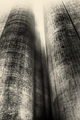
Stuctures in Mistby SanjuroComment: The textures and color of this photo just screams H.R. Giger to me. I don't know if "creepy" was the look you were going for, but it is definitely creepy. I love it, heh. |
| 01/01/2008 12:33:13 AM |
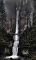
Fairy Falls (not HDR)by ben4345Comment: Very, very pretty. It almost has a dark, Lord of the Rings feel. I think I would have liked to see a bit more saturation in the greens and reds. It's still very beautiful though.
It's amazing that you captured the bridge with no people on it. Every time I've been to Multnomah Falls, it's been packed. Especially with all the rain we've been getting and the obvious size of the falls this year. Maybe all the tourists were too wussy for all the rain... or maybe you just cloned them out, heh. |
| 12/31/2007 12:24:33 AM |
DSC_0445by ryandComment: I like that there appears to be steam coming off the roof of the building. Typically cloudless shots are pretty boring. The clouds in this shot add a little extra something for the viewer to look at. That touch of interest may have scored you better with this shot vs the one you entered in the challenge. |
| Photographer found comment helpful. |
| 12/30/2007 08:10:41 PM |
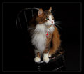
Quick Cat Portraitby timfythetooComment: Such a beautiful cat! Great choice of props too. The paint flecks on the chair really add to the interest of the whole. The lighting and depth of field are absolutely perfect.
My one nit-pick would be the saturation of the red. In the thumbnail the red thing on the collar glows, so when you open the photo that's the first thing you notice. After that I noticed that the kitty's nose looked like it had blood on it. Without blood dripping from the jowls, I don't think blood on the nose fits your intent, heh.
For DPC, I'd tone down the red on both the nose and the collar thing. For a home family photo I'd just tone down the red on the nose a tiny bit, since the thing on the collar is probably something the family associates with the kitty. |
| Photographer found comment helpful. |
| 12/30/2007 06:23:17 PM |
Family Force 5by she_isComment: That's the most intense tambourining I've ever seen!
I think this is perfectly captured. The depth is great. I like that you can see just the teeth. If the whole face was visible, I'd wonder who it was. Since it's not visible I focus on just the intensity. |
| Photographer found comment helpful. |
| 12/30/2007 06:10:05 PM |
Wiiiiiiiii!by alanfreedComment: Uma got her Wii! This photo reminds me of when I was a kid and got my Sega Gamegear. I had that same overly gleeful smile, heh. |
| Photographer found comment helpful. |
Home -
Challenges -
Community -
League -
Photos -
Cameras -
Lenses -
Learn -
Help -
Terms of Use -
Privacy -
Top ^
DPChallenge, and website content and design, Copyright © 2001-2026 Challenging Technologies, LLC.
All digital photo copyrights belong to the photographers and may not be used without permission.
Current Server Time: 07/17/2026 11:07:39 AM EDT.