| Image |
Comment |
| 12/07/2009 01:21:25 AM |
|
 Photographer found comment helpful. Photographer found comment helpful. |
| 12/07/2009 12:59:49 AM |
poxby HipychikComment: I think you accomplished your Norman Rockwell processing. When I first opened the photo I thought it looked very similar to a photo I did that I processed to look Norman Rcokwelly. Either we're both way off the mark or we both did well! |
| Photographer found comment helpful. |
| 12/06/2009 02:35:58 PM |
|
| Photographer found comment helpful. |
| 12/05/2009 11:57:42 PM |
Picby wazzzupComment: Flipping this so the text was readable would probably raised your average score at least .5 overall. |
| 12/05/2009 11:54:05 PM |
Grate Expectationsby klkitchensComment: The lighting, colors/tones, and composition are pleasant.
It's a very typical high scoring DPC shot. While I mean nothing personal, I hope this doesn't end up on the front page. It's very cliche and holds no meaning. It evokes no emotion (other than frustration, because I know it will score high), and to me is nothing other than a pretty stock image. |
| Photographer found comment helpful. |
| 12/05/2009 11:46:06 PM |
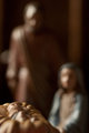
The Giftby dahvedComment: I'm normally embarrassed for the photographer that takes photos of little statue type things found around the house, but this is an exception. It's a story everyone knows, so you can get away with your choice of DOF. Your DOF choice fits the scene well. |
| Photographer found comment helpful. |
| 12/05/2009 11:42:17 PM |
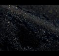
Ooooh, Sparkly!by MaryOComment: I really expected this to be a boring shot, but I agree, "Ooooh, sparkly!" All the different colors are quite interesting. |
| Photographer found comment helpful. |
| 12/05/2009 11:40:37 PM |
MinuteMenby jlt816Comment: Your crop seems too tight on the left side of the image. Normally I'd be baffled by the choice of the green hue, but my guess is that it's to add to the "army men" feel even though they're not the typical army men? |
| 12/05/2009 11:38:04 PM |
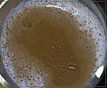
Earthrise Over Coffeeby raishComment: I see camera movement and coffee that has been sitting around long enough to start to form a milky crust. I don't see a purpose for the camera movement, and the crust doesn't add anything to the appeal of the photo.
With the exception of the blown out glare on the lower right, I think your exposure is decent. |
| Photographer found comment helpful. |
| 12/02/2009 03:50:00 PM |
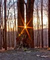
Twin Towers of Faithby degz447Comment: At the base of the left tree appears to be someone facing the camera, knelt down, looking up, and praying. I think your shot was under-scored. I actually kind of like it and would have likely given it a 6 if I had voted. |
Home -
Challenges -
Community -
League -
Photos -
Cameras -
Lenses -
Learn -
Help -
Terms of Use -
Privacy -
Top ^
DPChallenge, and website content and design, Copyright © 2001-2026 Challenging Technologies, LLC.
All digital photo copyrights belong to the photographers and may not be used without permission.
Current Server Time: 07/22/2026 12:54:00 PM EDT.