|
|
|
Showing 3311 - 3320 of ~8163 |
| Image |
Comment |
| 03/08/2010 08:58:43 AM | |  Photographer found comment helpful. Photographer found comment helpful. |
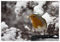
| 03/03/2010 08:31:33 AM | Feeding the Birds by SaraRComment: Sara, huge congrats on the red ribbon for a robin redbreast! Such a lovely capture! See snow isn't so bad after all :-) WTG! | | Photographer found comment helpful. |
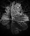
| 03/01/2010 08:11:08 AM | Work Boots by NikonJebComment: Yeah Jeb I guess the joke is on you! Great shot and huge congrats on the blue! :-) | | Photographer found comment helpful. |
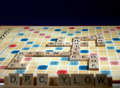
| 02/27/2010 09:45:57 PM | 10 for Focus (x2)by e10icusComment: greetings from the Critique Club!
I grinned when I saw this shot, am a fan of humour and creativity esecially when you really only have desklamps and bristol board to work with. Love to see the amount of work and care put into inserting photography terms into the shots, and the DPC Y LOW is great!
The black at the top is extraneous and just draws the eye back to there, to where there is nothing to see. Cropping it down to just a bare minimum would have helped tremendously. Your shutter speed could have been slowed down and the aperture closed down, too, and added tremendous dof, if a tripod had been handy.
So artistically, what you want to capture is fine, but in shots where it is difficult to tell a story, you want to give a sense of mood. The flatness of the bg and strong lighting both draw attention to themselves and less to the words on the board.
Hope this helps, feel free to PM me with any questions,
Susan
| | Photographer found comment helpful. |
| 02/27/2010 09:20:17 PM | The One Who Counts Mostby sohappy_02Comment: Greetings from the Critique Club!
Cute picture of your baby girl, I suspect she will have to get used to having her picture taken for challenges :-)
Lighting looks to be ambient, composition is pretty straightforward, your settings are fine for the subject. However the choice of blankie in b/w - and contrasting patterns with stripes in foreground and spots in background - lends a coldness to the shot which is at odds with how you feel about your child. A blanket in a warmer tone, even the archetypal soft pink for a little girl, would add both depth and warmth. A more colourful top on her (so long as it didn't have a busy pattern) may have helped too.
So overall a pleasant portrait, good technique, just think a little more in terms of the concept, what you a a proud/loving parent, want to convey to the viewer.
Keep up the good work and keep shooting!
Feel free to PM me with any questions,
Susan | | Photographer found comment helpful. |
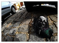
| 02/27/2010 09:11:27 PM | One murder - Three suspects!by duartixComment: Greetings from the Critique Club!
I gave this image a 6 in voting, because I liked the use of fisheye and imagination, and never thought you may have been responsible for the bird's demise. Images of death don't tend to go over well, even if it's fairly clean - ie no blood or gore. Which is a pity, because death is all part of the circle of life, but too many people see death as a negative and will simply give a poor vote based more on sentiment than the shot itself.
The lighting looks a little harsh, I believe the high ISO of 400 shot around what appears to be midday, when shadows are at their strongest, added to this impression. The composition is OK, the cobblestones are great for texture and contrast against the feathers, but try a) removing the border and b) cropping out the top so that only the wheel of the silver car appears. Pigeon also just past the intersection of thirds so looks very tightly cropped.
Overall, a very good try and clearly you had fun playing with the fisheye. Used carefully, lenses like that are a lot of fun, but never rely on just the lens alone to make a shot a good shot. That is still your job!
Feel free to PM me with any questions,
Susan | | Photographer found comment helpful. |
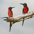
| 02/25/2010 06:27:24 PM | The Perfect Perchby scooter88Comment: Greetings from the Critique Club!
This image made me smile and I can see how it made the top 10. Compositionally nothing to pick at, really. Lovely colours, the bee-eater on the right is showing dominance over the other, and the slant of the dead treelimb shows off their colours beautifully in addition to the dominance of the bird on the right. Had I voted on this image, easily a 7 if not an 8.
There are no editing details listed so I assume it's straight from the camera. The bird on the right looks to have much brighter plumage, but it could be the way the light is catching the bird on the left and making him appear slightly washed out. A tiny bump in saturation may level the playing field a little.
Overall, a sweet shot, and a great finish, well done! Keep up the great work.
Feel free to PM me with any questions,
Susan | | Photographer found comment helpful. |
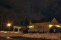
| 02/25/2010 06:19:21 PM | 60 Acre Reserveby lavalComment: Greetings from the Critique Club!
This photo needs quite a bit of work. As it stands it very much has a snapshot feel to it. The sign should be lit up a bit more, to draw attention to it and make the link between photo and title more apparent. Compositionally it's OK, but quite dark, and the light on the left draws attention to itself rather than the building. A much closer crop on the building may have helped a great deal.
Artistically I can get an idea of what you want to achieve. However, night shots are tricky enough as it is, and unless you have a tripod, detail will be lost. Invest in one, then you can play with the shutter and ISO a bit more. The fstop is fine. Slowing down the ISO as much as possible, and leaving the shutter way open - think along the lines of 30 seconds as opposed to 1/30, especially for a night shot - and I think you will be amazed at the difference in depth of field, detail, etc. Try a reshoot and see.
Good luck and keep shooting!
Feel free to PM me with any questions,
Susan |
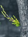
| 02/24/2010 09:29:19 PM | Resilienceby IssusComment: Greetings from the Critique Club!
I can see how some thought you did selective desat here, the tree is scorched enough to give that effect. The dead coals in my woodstove have that same tone to them, if they haven't been reduced to ash. The vibrancy of the green does a lot for this shot.
Compositionally, I feel a lot more could have been done to draw the viewer in. It has a snapshot feel to it, with the crop being quite tight on the left, and the bulk of the tree forms a little bit of a dead end. Also the very high ISO, for a stationary object like a tree, is a little fast. FWIW I notice that I start to get noise at over 400 ISO, so you would want to keep it as low as possible. The aperture is fine, the shutter speed could probably have been slowed down quite a bit.
Artistically it does make a very strong statement, that of rebirth after such devastation, and the other areas of green in the shot give a sense of hope. Overall a pleasing shot but I feel you could have told a much stronger story.
Feel free to PM me with any questions,
Susan | | Photographer found comment helpful. |
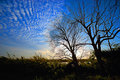
| 02/24/2010 09:15:30 PM | Trees fighting off clouds...by SirashleyComment: Greetings from the Critique Club!
Very nice balance of the elements here, that great mackerel sky really draws you in. Is the sky in Florida really that blue? I have that lens too, great little thing :-)
Compositionally, it could use a little more of a focal point and possibly quite a bit less foreground, as the sawgrass seems to want in on the battle too. Going by your settings I'm guessing you shot handheld. For a landscape it never hurts to pack along a tripod, close the aperture way down and leave the shutter open. That way you get a nice dof and give the viewer a greater sense of place.
Artistically, I can see what you wanted to get and can see that you shot from a fairly low pov. I shot a lot like this in my early days, go have a giggle looking at the stuff I was shooting a few years ago :-) Might I suggest getting even lower, if possible, and make that lens earn its keep by shooting wide open and tilting the angle around a bit.
Overall a pleasant shot. Keep on shooting!
Feel free to PM me with any questions,
Susan | | Photographer found comment helpful. |
|
Showing 3311 - 3320 of ~8163 |
Home -
Challenges -
Community -
League -
Photos -
Cameras -
Lenses -
Learn -
Help -
Terms of Use -
Privacy -
Top ^
DPChallenge, and website content and design, Copyright © 2001-2026 Challenging Technologies, LLC.
All digital photo copyrights belong to the photographers and may not be used without permission.
Current Server Time: 06/17/2026 01:11:18 AM EDT.
|