| Image |
Comment |
| 01/27/2012 08:26:23 AM |
Storm Front by tangueraComment: Wow Joanna, you have the full set now!! Huge congrats on a lovely image :-) |
 Photographer found comment helpful. Photographer found comment helpful. |
| 01/26/2012 12:06:19 PM |
Leavingby jpanguluriComment: Greetings from the Critique Club!
First impression: Love the combination of elements here...the shape of the arches, the blur, yet lot of in-focus areas, and a human element to boot. Very good combination. Gave you a 6 in voting.
Artistic: I think the fact that you were able to get all of the above at such a slow shutter speed speaks a lot for your skill and knowledge of your gear and furthermore, good use of same. It makes a pleasing image
Technical: The lighting in the fg is a bit flat but that's all you had to work with, but that's made up for by the bg light through the structure. The comp isn't outstanding but again, the combination of what you caught does a lot more for me than the boring nitpicky details :-) I agree with Deb (Melethia) that b/w might work a bit better. B/W is the fallback for those days when you have crappy lighting like this and drab tones to work with.
Overall: Very good first entry here, 5.6 is a nice solid base to start from! Please keep up the good work, keep entering challenges and keep on shooting.
Feel free to PM me,
Susan |
| Photographer found comment helpful. |
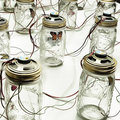
| 01/25/2012 04:17:21 PM |
The architecture of loneliness (24h networked isolation)by mcaldoComment: Greetings from the Critique Club!
First impression: Pity more of the voters didn't 'get' this shot and went with the usual literal interpretation of the challenge. I gave you a 7.
Artistic: Very strong conceptual image but hardly stale. This is a breath of fresh air.
Technical: Lighting is crisp and set is spotlessly clean, and the eye can't help but wander from one jar to the next by the wires. I had no ideas that those were speakers!
Overall: Please please please enter more wildly out-of-the-box images like this, this is exactly the kind of thing DPC in general needs to see more of. And don't worry about the scores; they just prove especially in this case that the voters have eyes of cloth. No point trying to please the capricious DPC voters, so shoot and enter what is true to you and your vision.
Feel free to PM me,
Susan |
| Photographer found comment helpful. |
| 01/24/2012 06:02:05 PM |
Clean Garbageby Dr.ConfuserComment: Greetings from the Critique Club!
First impression: I didn't envy those who chose to enter this challenge! It truly takes guts and then some to try and make a subject with an intrinsic 'Eww' factor, appealing. I gave a 7 during voting.
Artistic: Nice poppy colours help to lessen the basic yuck factor. Looks like two coffee cups from the same place, a jacked-up power drink and can't quite tell what the last one is on the left. But seems to point towards a really souped-up society with no place to go.
Technical: Good sense of flow and leading lines with the straws and angles of the dumpster edges. Ambient light looks fine, and don't think we really need to see what's lurking in that back left corner now, do we? Minor nitpick is the straw on the right, it looks almost fake, but again maybe that's a reflection on society *picking lint from bellybutton*
Overall: For this challenge, a relatively easy shot to look at. The low score is I feel less indicative of your ability and just more an objection to the up-close-and-personal nature of this shot. Doesn't make it bad by any means, but doesn't make any effort to appear sanitized enough to appeal to the voters.
Feel free to PM me,
Susan |
| Photographer found comment helpful. |
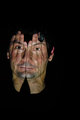
| 01/23/2012 12:48:04 PM |
Visionsby AlynComment: Greetings frpm the Critique Club!
First impression: Definitely a memorable photo, it's very compelling and hard to look at, and away from.
Artistic: The suggestion of blood streaking the face and hand is very powerful. The eye at the right is right at the border which adds to the sense of discomfort, almost to the point of claustrophobia. The catchlight is all there is to tell us that the person is alive.
Technical: The tight crop and darkness of the image probably turned off voters, as this deserved a better score imho. The image also looks smaller than the allowed 800 on the longest side. The slight tilt of the head as evinced in the eyes add to the odd surreal feel that you caught very well. The pp you used is very simple but effective, which I always favour over a photo drowning in obvious pp.
Overall: Sadly the voters tend to favour images that go the opposite direction, but you probably know that already and entered it because you liked it. Good for you!
Feel free to PM me,
Susan |
| Photographer found comment helpful. |
| 01/23/2012 11:54:52 AM |
|
| Photographer found comment helpful. |
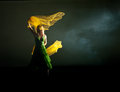
| 01/23/2012 11:49:19 AM |
The Great Gatsby by NeilComment: Great shot but I'd have thought Daisy's hair would be a lot more groomed and not as unkempt. |
| Photographer found comment helpful. |
| 01/23/2012 04:34:01 AM |
|
| Photographer found comment helpful. |
| 01/23/2012 04:31:35 AM |
|
| Photographer found comment helpful. |
| 01/23/2012 04:29:34 AM |
|
Home -
Challenges -
Community -
League -
Photos -
Cameras -
Lenses -
Learn -
Help -
Terms of Use -
Privacy -
Top ^
DPChallenge, and website content and design, Copyright © 2001-2026 Challenging Technologies, LLC.
All digital photo copyrights belong to the photographers and may not be used without permission.
Current Server Time: 05/23/2026 06:19:18 PM EDT.