|
|
|
Showing 2301 - 2310 of ~8163 |
| Image |
Comment |
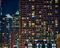
| 03/27/2012 11:24:53 AM | The Lines.by romilComment: Greetings from the Critique Club!
Very interesting shot, the little boxes of humanity inside these forboding towers is intriguing. Feel like I'm looking in on a giant ant farm! Great time to shoot too, late at night to make the subjects pop. The dof you list looks a little extreme, but you probably used a tripod. The predominance of the main building on the left is great, and almost forces us to explore the shot a bit more. Which is good, you want people to look at your images a little longer.
Either way this shot worked and a score in the mid-6s is very respectable. The pp is just enough without being obvious. Good work! Keep on shooting and entering.
Feel free to PM me,
Susan |  Photographer found comment helpful. Photographer found comment helpful. |
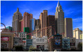
| 03/27/2012 11:19:42 AM | New York-New Yorkby crack_seedComment: Greetings from the Critique Club!
So this is a miniature version of NYC located in the middle of the American desert, eh? Very cool! The colours are almost cartoony, which seems to go well with the illusion here. Looks a bit unreal, the way all those Manhattan-skyline buildings are jammed in so close together. It is a little 'touristy snapshot', but pretty sweet score for a snap! The light is nice and helps give depth to the buildings; the composition is straightforward, a little dull, but the nature of your subject and pp seem to have rescued it somewhat. Wish the top of the Chrysler(?) building was in the shot too, but that's getting nitpicky.
Overall a very decent effort, glad it did so well for you. Keep shooting and entering!
Feel free to PM me,
Susan | | Photographer found comment helpful. |
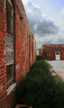
| 03/25/2012 11:00:42 PM | Ruinsby cowboy221977Comment: Greetings from the Critique Club!
This is a decent shot but it lacks the WOW factor to really make it stand out. Good use of leading lines but your comp is very centred, and in this case the ruins in question just aren't prominent enough to show us how ruined they truly are. Those hedges don't look to be in bad shape! Colours are a little drab esp as this is an Advanced challenge. Even in Basic, you're allowed to pop the colours.
I'd suggest shooting from a lower angle to add more impact to your shot, and focusing more on one area to shoot. Here, I find my eye roving a little too much for a focal point. All those nice leading lines just don't lead to anywhere in particular, here.
Overall a very decent effort, I can see what you're trying to do here. Looks like you shot handheld and from average standing-up height; play around with things like shooting from a crouching position and hell, even from flat on the ground. Or even completely blind, with essentially your camera resting at an angle on the ground so low, that you can't even see through the viewfinder.
Hope these suggestions help, if you can reshoot or experiment, it never hurts.
Feel free to PM me,
Susan | | Photographer found comment helpful. |
| 03/25/2012 10:51:53 PM | Unfinished Gateby wehehComment: Greetings from the Critique Club!
This is such a lovely shot. So quiet and serene, the fisherman with his cormorants, the sun and its reflection offering the only colour in a naturally desaturated capture. They balance beautifully against the willow(?) branches on the right framing the awkward skyscrapers leaning towards each other. The contrast of old and new is very powerful here so I am not surprised you finished just out of the top 10 in this challenge. Very well-seen shot and so glad that other photographer made room for you! Your son must have been very well behaved! :-) The pp you did is virtually invisible, good work.
Gorgeous work, please keep shooting and entering what you like. Just be careful, no watermarks or copyrights are allowed on any entries and may lead to a disqualification on that basis alone.
Feel free to PM me,
Susan |
| 03/22/2012 11:53:52 PM | City Shadowsby talzamComment: Greetings from the Critique Club!
A very interesting and reflective with tons of potential. There is a lot going on here but it doesn't feel cluttered, it feels very crisp and clean. The silhouettes work well here as they are almost more revealing than seeing the faces of the people. The rectangles give a nice flow to the shot and continuity. The blurred cyclist is a little bit too centred, about another second later and she's be farther to the right, helping balance the human figures already on the left. However at least she has lots of room to bike into :-)
I wouldn't have minded seeing this from either an elevated or lowered POV. To me those rectangles are almost screaming to be shot from ground level (or as close as you can get). but that's just me. Still, don't be afraid to experiment. Louie (  lobrin lobrin) used some form of elevated walkway to advantage to shoot down at his subject in Memory Lane, which added greatly to the shot; the reverse, in this situation, could make a much more dynamic image. Consider reshooting if feasible, for fun and the experience.
Feel free to PM me,
Susan | | Photographer found comment helpful. |
| 03/22/2012 11:45:54 PM | UrbanLandscapeby dali_lama_2kComment: Greetings from the Critique Club!
This feels almost like a scene from a graphic novel or RAW magazine, with the stark shadows, flat colours, use of angles and grey tones. Interesting use of processing, you could make this your own style if you so choose. Be warned though that such pp is verging more on digital art than photography and voters may take you to task for it.
My main nitpick is the colours versus shapes, the colours are vivid but highlight relatively unimportant areas in the shot. The old corded phone box by the wall is the focal point, but it's fighting for its life! I like the shadow from the phone pole touching it from the left side, it helps to draw attention to it. The red building behind the phone box drives me a little nuts because it does help draw the eye to the phone box but then the colour detracts from it. Argh! :-)
Overall a very interesting shot, the kind of thing that may eventually grow on the dpc crowd in time. In the meantime continue to shoot and enter what you like.
Feel free to PM me,
Susan | | Photographer found comment helpful. |
| 03/21/2012 05:18:05 PM | Memory Lane by lobrinComment: Greetings from the Critique Club!
I laughed when this image popped up on my screen - not at the image but because it's your first ribbon and far from the first critique I've written for you! Sadly, Louie, there isn't a lot here to pick apart...it's always a little tougher to critique a ribbon winner, so bear with me :-)
This is a wonderful capture of this old soul shuffling along, against a very powerful backdrop. Those lines on the ground all lead away from him and further isolate him, even though he is present there in body, he isn't in spirit and it shows. His slumped shoulders and whole demeanour speak of sadness and perhaps even dejection, like he isn't looking forward to giving that bouquet to the recipient. Wonder why?
And I think that's why it's here on the homepage. This is such an achingly telling moment taking place, that we want to know more of the story. The capture itself is crisp and detailed, the dof is perfect for this shot and we're also looking down on him, as he in turn is looking down; he is literally below us. We've all seen this faceless man and I bet more than a few of us fear being him, someday.
Finally, your pp is just spot on, as is the title. The pp is just enough, the title is simple and says volumes, and that's all you need.
Feel free to PM me,
Susan Message edited by author 2012-03-21 17:23:38. | | Photographer found comment helpful. |
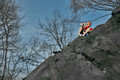
| 03/21/2012 05:06:39 PM | A Reader On A Rockby EssAreDubyaComment: Greetings from the Critique Club!
I like the angle of this shot, it looks like there's a coil of mountaineering rope(?) in roughly the middle of the shot. I really do enjoy the POV and the precipitous angle of the rock, and the trees peeking out from behind. The vivid colours make her pop out and it's a nice sunny day, if I were her I'd be reading while waiting on you, too! :-)
And the fact that she isn't curled up in an angsty, moody ball is fine by me, too. After all the challenge descrip is: A single object or subject, composed and shot to give a feeling of loneliness or solitude. Solitude is sought by many and here she is perfectly content, she's having a fine old time. A closer crop to show us more of her may have helped your score, here she is almost too much just an element as opposed to the focal point.
Overall, a nice shot, keep shooting and entering what pleases you.
Feel free to PM me,
Susan Message edited by author 2012-03-22 09:34:41. |
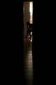
| 03/21/2012 04:57:26 PM | I cant 't believe she left.by PhilthyComment: Greetings from the Critique Club!
This would have got a 6-7 from me in voting. It's a very strong shot, showing just enough to get the point across without being overdone. I do side with those that suggest clearing up the counters in the future, it's too easy to forget about clutter in the bg! It's often tiny things like that, esp in a challenge about isolation, that hold voters back from giving a stronger vote. You may have been able to clone some items out, but imho it's best to get the shot in-camera than rely on pp later.
The backlighting is great, I like the POV and the use of the floor tiles to lead to the desolate figure. You could have gone for an even longer exposure as you were using a tripod and remote or timer to get the shot. B/W might have also worked well and added to the sense of desolation.
And you finished just below a 6, which is very respectable, so don't be too hard on yourself! If you can, mess around with the setup a little more and reshoot. Try opening the door a little more, play with your position, etc and see what shakes out :-)
Feel free to PM me,
Susan |
| 03/21/2012 04:44:48 PM | True colors by lola72Comment: Greetings from the Critique Club!
I like this colouful, poppy shot. This is a very tough shot to get especially if you're just learning about lighting, and that is a lot of work, so I appreciate that you did a very decent job here. There is a nice flow through the pic here, the lights/coloured glasses are all evenly distorted. The crop may be a little tight at the top, I know this is an Abstract challenge, but even so it never hurts to include a teeny bit more to give people a chance to get it :-)
Feel free to PM me,
Susan | | Photographer found comment helpful. |
|
Showing 2301 - 2310 of ~8163 |
Home -
Challenges -
Community -
League -
Photos -
Cameras -
Lenses -
Learn -
Help -
Terms of Use -
Privacy -
Top ^
DPChallenge, and website content and design, Copyright © 2001-2026 Challenging Technologies, LLC.
All digital photo copyrights belong to the photographers and may not be used without permission.
Current Server Time: 05/23/2026 02:17:22 PM EDT.
|