|
|
|
Showing 2181 - 2190 of ~8163 |
| Image |
Comment |
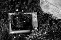
| 05/17/2012 12:09:40 PM | nothing onby posthumousComment: Greetings from the Critique Club!
Oh Don, you cruel person you...stealing an old man's TV set and bashing it up all for a challenge entry...but indeed it does convey that there is nothing on, so you succeeded that way. Your technicals for the shot are fine, the b/w gives a sense of time and age, and the askew angle at the top right of the pavement/road adds to the sense of isolation.
Good work, keep it up! :-)
Susan |  Photographer found comment helpful. Photographer found comment helpful. |
| 05/16/2012 07:38:43 PM | californiaby disassociationComment: Greetings from the Critique Club!
Hmm California is meant to be an altered state of mind, is it not? The amazing flatness interspersed by the tiny little car/truck, dwarfed by gigantic hydro towers...and the heavy looking haze hanging there, held down by the clouds and huge empty sky...yep...it's an OK shot but just doesn't have the mind-blowing colours or super-fascinating subject matter voters love...
...sorry, drifted off for a second there...y'know, the whole uberchill CA thing ;-) Even PS agrees that the horizon is level! Who can argue with that? Definitely not what I think of when I automatically think CA, but maybe it's all for the better.
Meantime this looks like a last-minute shoehorn. A kinda freakily cool shoehorn, but I know you can do a lot better than this.
Feel free to PM me
Susan | | Photographer found comment helpful. |
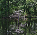
| 05/16/2012 07:18:19 PM | The Empty Treeby cowboy221977Comment: Greetings from the Critique Club!
Very good subject matter, the dead cypress does indeed look very empty of any life. I like too how the dead twig on the right seems to be reaching to the dead tree, so that adds some interest to the shot.
However...you know what I'm going to say....too centred!!! You can move around the focus areas in your camera, you don't have to have it on centre point all the time. Either bump it over a little, or just as you have things lined up and set to shoot, lean over a little. Shoot off centre. Create a little unbalance. There's nothing wrong with that, in fact it's pretty much expected in photography. Again, as I'm a low POV kinda person...yep, getting down there in the sawgrass/mud/cypress knees and shooting up, esp against such a dark bg, could have made a world of difference here. Never take just one or two shots for a challenge entry; take a whole whack of them. Try to take the time to do so. This challenge's winner shot over 1200 frames for her capture.
I'm not saying you need to shoot that many, but at least try to shoot a couple dozen or so. That'll give you more to choose from, and the opportunity to chimp through what you already have and go, 'OK, I have 4 really great shots from this angle. Now what other angles can I try?' and go from there.
Feel free to PM me
Susan | | Photographer found comment helpful. |
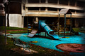
| 05/16/2012 07:02:14 PM | forgottenby lobrinComment: Greetings from the Critique Club!
This image got a rueful smile from me, I once did a shot very like this, trying to convey the same feeling and only got puzzlement in return. So I have an idea as to what you're trying to convey here...the playground is empty, devoid of life. But I find my eye swimming around a bit looking for a sense of flow and story, which is usually very rich in your recent work, and just come up short. The structure in the bg looks like a parkade and is simply there, it doesn't add and only detracts from the playground.
If you had been able to isolate the bench in the lower left and the playground a little more, I think this could have been a very strong contender. Especially if you stuck with the processing you used, which works well at creating a sense of isolation. Instead it just comes across as a little ho-hum, but we're all entitled to that every so often...like the Dire Straits song goes, sometimes you're the windshield, sometimes you're the bug.
But cheer up, Louie, I have no doubt at all that we'll see you on the front page yet again. It just won't be with this image! :-)
Feel free to PM me,
Susan | | Photographer found comment helpful. |
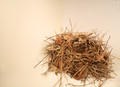
| 05/16/2012 06:53:57 PM | Nobody's Homeby jadaigle88Comment: Greetings from the Critique Club!
This image is only OK. The actual concept is fine, but the execution needs a lot of work. The first thing I noticed was the background, where there is a very obvious split down the middle with the left side being much warmer than the right. That needs to be seen, and fixed, long before it reaches the stage of being chosen as the best shot to enter.
Next, I feel this shot loses a lot by having being brought into a studio. IMHO a long exposure, with the nest in the shed (if moved from its original location) would have added a whole 'nuther dimension and a sense of story. You don't need fancy lighting, just a tripod and a long enough exposure.
Feel free to PM me.
Susan | | Photographer found comment helpful. |
| 05/16/2012 06:42:18 PM | stillness_at_the_edge_800by rathomasComment: Greetings from the Critique Club
This image is only OK in that it does manage to convey some sense of emptiness. The wb is unappealing. The comp is OK, the wb is unappealing and the image is far too small.
Once again, you are shooting wide open with an ISO of 100, changing only your shutter speed. You have a ton of homework ahead of you, starting with learning how to shoot on Manual mode. Message edited by author 2012-05-17 12:05:30. |
| 05/16/2012 01:20:54 PM | Womanby pearlseyesComment: Greetings from the Critique Club!
Love this image, with such a vibrant and dynamic image, it looks like it should be a poster. So glad to see someone making good use of a remote release, tripod and long exposure. Great use of colours and above all the KISS principle, makes this more than deserving of its top 10 finish. Frankly, I think this should have finished a lot higher if not in the ribbons.
And as an aside, very glad you didn't go hog-wild in the pp department. Especially in a challenge like this, with an image like this, just a tad too much post work could have easily killed this shot.
Overall lovely work, please keep up the good work!
Feel free to PM me
Susan | | Photographer found comment helpful. |
| 05/16/2012 12:51:52 PM | Spring_to_lifeby rathomasComment: Greetings from the Critique Club!
The bokeh here is indeed very pretty, and the comp is OK - I like that she is looking to the left and you've given her the room to do so - but this image finished where it did for a reason. It's a snapshot of a mannequin in a store. Camera shake is evident, and choosing to shoot wide open at a very slow shutter speed, with even a fast lens will not help.
Ryan, I feel it's time that you stepped out of your comfort zone in all senses of the word. You need to learn your camera, your glass's capabilities, learn a lot more about composition, play around with angles, and pay a whole lot more attention to a challenge description if you want to do well on this site.
As always, feel free to PM me.
Susan Message edited by author 2012-05-16 13:12:33. |
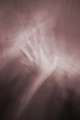
| 05/16/2012 12:43:58 PM | erasureby posthumousComment: Greetings from the Critique Club!
Ooh I can see this getting a posty blue...oh waitaminute...;-)
This really does do the challenge and your own particular style justice, Don. The floating hand(s) against an amorphous background, which looks a bit like rafters or a parquet floor, ha angles that lend dynamism and a sense of the chaotic. Makes for a somewhat unnerving image if you look at it long enough!
And you got a good score and nice finish, so well done, O mighty leader!
Feel free to PM me
Susan | | Photographer found comment helpful. |
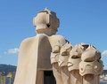
| 05/16/2012 12:36:53 PM | Gaudi's Peopleby tripodmanComment: Greetings from the Critique Club!
This image has nice lighting on it, but says snapshot to me, and it seems many others felt the same way. It's always a loaded situation, entering photos of existing artwork; it's generally discouraged, as first of all the artwork is not yours, and you can't rely on voters to know who Gaudi is or be familiar with his style. I suspect many see only sculptures and not the human forms; they are looking for humans with a pulse.
On a technical basis there appear to be sharpening halos around the sculpture. The POV and composition are uninspired; a tighter crop and some people in the shot would have helped a lot.
I've seen your portfolio and know you can produce much stronger images, so I do hope you take this critique as useful and continue to enter challenges.
Feel free to PM me
Susan | | Photographer found comment helpful. |
|
Showing 2181 - 2190 of ~8163 |
Home -
Challenges -
Community -
League -
Photos -
Cameras -
Lenses -
Learn -
Help -
Terms of Use -
Privacy -
Top ^
DPChallenge, and website content and design, Copyright © 2001-2026 Challenging Technologies, LLC.
All digital photo copyrights belong to the photographers and may not be used without permission.
Current Server Time: 05/23/2026 10:38:43 AM EDT.
|