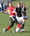
Snohomish Invitational GU-13 Finalsby
margiemuComment: First Impression - the most important one:
It's a nice action shot, you've caught the play of the game well, but some technical details, such as a bit soft focus is distracting.
Composition:
The crop works well, this is a typical composition for a newspaper shot. The fence line at the very top is a bit distracting though. Also, DoF is quite deep. I'd like to see a bit shallower depth of field to blur the background. This would help with my earlier comment of the people and also my issue with the fence line.
Subject:
Subject matter was good for this challenge. Almost any photog that has ever worked for a newspaper has shot sports. So, I think you made a good choice.
Technical (Color, focus, and light):
Focus issues, I feel hurt you the most.
Color is ok, but not vivrant. Playing with curves (or at least boosting saturation) would definitely add points.
Sports shots are tough when it comes to lighting and yours is not bad, considering the dynamic range it had to cover (black and white uniforms).
From a photojournalism standpoint
Minus the focus issues (which may be able to be fixed with USM) this shot would run in most small local newspapers easily. You could do these with a litle practice. But, try more with the longer lens, the DoF and being able to reach into the game will give you more of what viewers and editors are used to seeing.
Well, I hope this helps. I hope to see more from you in the future. :-)
Leroy
Message edited by author 2006-05-09 00:45:18.