|
|
|
Showing 2061 - 2070 of ~3441 |
| Image |
Comment |
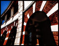
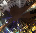
| 06/06/2006 04:54:34 PM | Escher Tributeby xXxscarletxXxComment: ::: Greetings from Critique Club :::
Hi, as requested, here is an indepth critique of your submission.
First Impression - the most important one:
Interesting image, but comes across as over-processed.
Composition:
I'm not liking the fish-eye look on this image. Using the fisheye is fine, but should later be de-fished in PS with this type of shot.
Subject:
n/a
Technical (Color, focus, and light):
Color is a bit over-saturated, also seeing some artifacting in the sky.
Focus: Could be a bit sharper, details just aren't coming through for me. Isuspect you sed a fish-eye adapter in front of a P&S camera and has probably hurt the focus some.
Lighting: seems like it was nice, but over-processing has lost a lot of detail inside the arches.
To grow its vote?:
A little less processing probably would have helped on this one. Also, the defishing that I mentioned earlier.
Summary:
Overall, interesting shot. Keep at it. :-)
Hope to see more from you soon,
Leroy |  Photographer found comment helpful. Photographer found comment helpful. |
| 06/06/2006 04:46:04 PM | | | Photographer found comment helpful. |
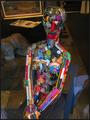
| 06/06/2006 04:45:01 PM | divine freedomby saintaugustComment: Love the lighting on this photo. Definitely defines her shape well. Nice subject too ;-) | | Photographer found comment helpful. |
| 06/06/2006 04:42:38 PM | City Architectureby DigiFotoBuddyComment: ::: Greetings from Critique Club :::
Hi, as requested, here is an indepth critique of your submission.
First Impression - the most important one:
Overall, it seems to be more of a cityscape shot than an architecture shot to me. But, I do like it as a cityscape.
Composition:
A typical architecture shot should draw ones eye to the details of a building. This really has more of a composition that one would see in a subjectless landscape. Compositionally, the yellow cab in the foreground becomes more of a subject than the buildings.
Subject:
The way you have composed this shot puts more emphasis on the taxi in the foreground than the architecture of the city.
Technical (Color, focus, and light):
Focus looks sharp. Color and lighting are both nice. Nothing wrong with the technicals.
To grow its vote?:
Meet the challenge in the eyes of more voters. If the challenge had been cityscapes this shot would have done really well. But, just seems out of place in this challenge.
Summary:
This shot does show competence on the part of the photographer and overall is a good shot.
Hope to see more from you soon,
Leroy | | Photographer found comment helpful. |
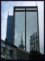
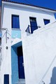
| 06/06/2006 04:30:45 PM | Reflecting on Architectureby adjustabletoolComment: ::: Greetings from Critique Club :::
Hi, as requested, here is an indepth critique of your submission.
First Impression - the most important one:
Decent shot, but it could be improved in post.
Composition:
This is where I have some issues. The vertical lines at the top of the building lean inward. A bit of perspective change in photoshop could have fixed this and made this shot a lot better compositionally.
Subject:
It's there and in your face. Can't miss it :-)
Technical (Color, focus, and light):
Focus looks sharp. Lighting is pretty good, but may be a very little under-exposed. Color could use a bit of saturation boost.
To grow its vote?:
Good starting shot, but needs a bit more processing to make it pop.
Summary:
Not bad overall, I do like the shot.
Hope to see more from you soon,
Leroy |
| 06/06/2006 03:59:41 PM | Tower of Restraintby danw791Comment: ::: Greetings from Critique Club :::
Hi, as requested, here is an indepth critique of your submission.
First Impression - the most important one:
It's a neat shot but greyscale comes out a bit flat in the midtones.
Composition:
You used the rule of thirds pretty well and the leading lines help to make a good composition.
Subject:
Subject is clear and composition helps to bring the eyes to it.
Technical (Color, focus, and light):
Color: As I said in my first impression, the greyscale conversion looks a bit flat to me. I really think a color version of this would have worked better.
Focus is sharp and not over-sharpenened in Post.
Light: Other than the highlights teetering on being blown at the bottom of the tower, lighting is pretty good.
To grow its vote?:
There were a lot of highly colored images in this challenge. I think the grey-scale hurt you in the voting.
Summary:
Overall a well compossed shot and interesting photo.
Hope to see more from you soon,
Leroy |
| 06/06/2006 03:44:45 PM | | | Photographer found comment helpful. |
| 06/06/2006 03:43:05 PM | Contrastby MatthewComment: ::: Greetings from Critique Club :::
Hi, as requested, here is an indepth critique of your submission.
First Impression - the most important one:
Wicked shot! Definitely deserves the top ten finish :-) Congrats! This shot is AWESOME!
Composition:
It there anyway to make the composition work better? No, I don't think so. This works well for you.
Subject:
This is one of those photos where the whole photo becomes the subject. Good work on achieving that.
Technical (Color, focus, and light):
All spectacular and show competence on the part of the photog. I can tell this wasn't just a snapshot.
To grow its vote?:
Get a few others photos DQ'd ;-) No seriously, I don't think there is much you could have done to improve this AWESOME shot.
Summary:
AWESOME< AWESOME, AWESOME!!!!!
Hope to see more from you soon,
Leroy | | Photographer found comment helpful. |
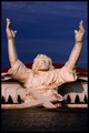
| 06/06/2006 03:14:21 PM | It Is Finished...by Nikonian NinjaComment: ::: Greetings from Critique Club :::
Hi, as requested, here is an indepth critique of your submission.
First Impression - the most important one:
That is one awesome Jesus statue :-) I like this photo, definitely stands out.
Composition:
I like that you centered the compostion horizontally. I think your choice of composition works here.
Subject:
Right there in your face. Not hard to miss.
Technical (Color, focus, and light):
Focus is good, but it looks like you may have over-sharpened a bit in post-process.
I like the color of the image, especially the blue sky and red roof.
I'm not real fond of the lighting though. The shadows are kind of harsh. I'd like to see this shot at a different time of day or at night (if there are any spot lights on the Jesus).
To grow its vote?:
I think you may have over-processed the image. It comes off as a bit dark.
Summary:
I like the photo, a few minor improvements could elp it, but overall it's COOL!
Hope to see more from you soon,
Leroy | | Photographer found comment helpful. |
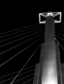
| 06/06/2006 02:12:56 PM | No nameby facesastheycomeComment: ::: Greetings from Critique Club :::
Hi, as requested, here is an indepth critique of your submission.
First Impression - the most important one:
AWESOME exposure. Love the vivrant blue sky, only wish I could see more of it.
Composition:
It's not bad, but I think a slight perspective change in post-process to straighten up the verticals could have strengthened it.
Subject:
Really can't miss it, it's right there in your face :-)
Technical (Color, focus, and light):
All exceptional!
To grow its vote?:
As you mentioned being able to clone out a few wires would have helped a lot. I think straightening the perspective would have helped a lot too.
Summary:
Great shot. I wish you had been able to process it, I really think you'd have a stunner. You should post-process it more when you get the time and post it for us to see.
Hope to see more from you soon,
Leroy |
|
Showing 2061 - 2070 of ~3441 |
Home -
Challenges -
Community -
League -
Photos -
Cameras -
Lenses -
Learn -
Help -
Terms of Use -
Privacy -
Top ^
DPChallenge, and website content and design, Copyright © 2001-2026 Challenging Technologies, LLC.
All digital photo copyrights belong to the photographers and may not be used without permission.
Current Server Time: 06/21/2026 06:20:26 PM EDT.
|