|
|
|
Showing 861 - 870 of ~3250 |
| Image |
Comment |
| 11/21/2008 08:29:14 PM | Surprisiumby posthumousComment: Hello from Critique Club :)
I am not sure what to say about this picture. I checked your website and you do have good stuff, natural and good stuff but I must say this doesn't look like one of your work.
but anyway, let's get down the business.
I have no idea Surprisium, I think it means something about surprise?
I like 1 quarter of this photo which is standing out pretty good. I don't like the way sky, clouds and wires on the window but only the face. I am not even sure if that's your place, or someone else's, if you did have chance, I would suggest you to wait a bit more, have sun go down a bit more, darker outside and lighter inside... even a little spotlight on the face could be pretty interesting.
This photo looks like entered just to see what people would say rather than competing in the challenge.
Keep up the good work (not this, this is horrible) and show us better work of yours :)
and thanks for the great work you have done for DCP community :) we all appreciated.
Leo
Edited to fix a Word character in here :P Message edited by author 2008-11-22 03:17:14. |  Photographer found comment helpful. Photographer found comment helpful. |
| 11/19/2008 05:18:26 PM | I N S P I { R E D } by Breeee123Comment: Here I say it, this is too much even for DPC... too good... excellent, and needs to go higher contests to win better prices... I mean it.
Congratulations from bottom of my heart. As soon as I saw this I had no doubt in my mind it would be winner, and be winner big...
Leo | | Photographer found comment helpful. |
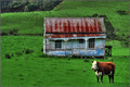
| 11/16/2008 02:06:52 AM | Somebody forgot to cancel the lawn mooing serviceby NuzzerComment: Hello from Critique Club :)
In this photo, I love the old house and where it stands. It sure is an abandoned building. I am not too sure about the cow though.
Technically, perfect. Very sharp. Colors are perfect.
Compositing, is not bad at all, I would get rid of the cow and get a little closer to the house. After all, what you are trying to say is the house itself. The paint and the old structure is already giving us the story, surroundings and the cow a bit more stuff than I would like to see here.
I would give 6 to this photo, because there is no 5.5 in voting. Don't be mad at me but in my opinion, this is around 5.8, 5.7 photo rather than 6+. I would say 6 if I can see more cropped version even with the cow...
I checked your work, and you seem like know what you're doing, so keep up the good work. Here is one advice, don't enter an image if you have even little doubt in your mind. I said that because you are a very good photographer, you can do much better work. Trust your instincts :)
Good luck,
Leo | | Photographer found comment helpful. |
| 11/16/2008 01:56:09 AM | Solidarityby Rino63Comment: Hello from Critique Club :)
I think the story here if you abandoned a dog, there will be another one who will be comforting it.... which is a nice story, I can see it from the first look.
Technically, nice exposure, only white dog's tail is over exposed, but it's normal. I wish you would wait for the sun go down a bit more, or hurry up before sun goes up that high, I don't know the time, so basically the sunlight here bit harsh.
Composition is pretty good. The other dog far side is taking a bit more attention, although I couldn't see it at first, I know it's there. The road itself is very nice; DOF is very nice, not too harsh, meaning not too tight.
I personally would crop this a bit more to bring out the "feeling" of the story. I would bring them to middle; keep it bit more tight...
I checked your work... Good stuff you have there. I think you are pretty close to get your first ribbon ;) Just keep trying. I always tell everyone to check out the previous winners, they are very encouraging bunch of samples.
Good luck
Leo | | Photographer found comment helpful. |
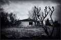
| 11/16/2008 01:41:27 AM | Once a garden now ...by JohannesFrankComment: Hello from Critique Club :)
The drama is right there front of me. I like the way you did this picture right from the start.
Technically, nice exposed, clean, sharp image. F stop right on the money :)
Composition, very well. Some photos like this one need subject on the middle because of the surroundings. You did cover-up some stuff with post process which is good because it brings the old house more to our attention. Here is one little thing that I would do, crop it more and bring the whole building a bit closer. Not much, but just a little bit. First look, I can't see the broken wall, it would be nice to see it closer.
Overall it is a very nicely done challenge photo. I would give 7, 5.8 probably little low, should be around 6.1 in my opinion. This doesn NOT deserve 2s or 3s at all... Damn trolls LOL
I checked your work, you know what you are doing, keep it up. Very good photos, I am sure you will be winning another ribbon soon :)
Good luck,
Leo |
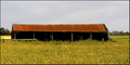
| 11/16/2008 01:31:20 AM | Abandoned To The Elementsby TerComment: Hello from Critique Club :)
This is a nice, ordinary some sort of an "animal barn" photo. From where I stand, I can't see any abondancy but I see a structure in middle of a field.
Technically, exposure is right on the money for outside lights. You did not want to show inside the structure anyway, you thought just to show empty black interior and the long uncut field should do the job... but, it seems like didn't work well.
Composition, I do like the way it is, although I personally crop it bit more and have that barn a bit closer without eliminating the plants and sky.
I visited your page and checked out your work. I see you do have the eye, nice compositions, clean images.. you are on a right road :) If you want to be more successful in DPC, advice 1-Check out previous winners 2-keep your images simple 3-sharp and good contrast images most likely the winners.
and the rest, practice practice and more practice. Don't be discourage if you don't win anything for a long time and keep trying :)
Good luck
Leo | | Photographer found comment helpful. |
| 11/16/2008 01:14:02 AM | abandoned house...by mbrutus2009Comment: Hello from Critique Club :)
Let's take a look at your photo and try to understand why did you get such a low points and last place.
Technically, it is a nice exposed photo with some over exposed front yard.
Composition is nice. I like the way you had house up front and still kept the palm tree in the back and the yard up front to show the abandoncy(!).
Post process, is nicely done. This could be a nice photo for "digital art" challenge. You saw a house, with lots of plants front that tells us it was abandoned. Probably there were some other cracks or broken windows but post process is hiding all that and giving us a clearer image.
I don't know the surrounding of this house, but if you did go back a little more and took a bit more of the house with more plants, and instead of digital work, change the colors a bit faded, and let us see more damage on the house you would not be at last :)
It's a nice photo, it came last because didn't match to challenge subject in my opinion.
I checked your other photos. You do need some practice on finding more interesting and colorful subjects. Everyday and everyone's shot won't do in DPC, you have to be unique. Make sure your focus is correct, contrast and colors are alive... and try to tell stories with your photos, if not be artistic, but not with post process, with your compositions :)
Good luck,
Leo | | Photographer found comment helpful. |
| 11/14/2008 10:49:12 PM | Winter sunby gisliComment: Hello from Critique Club :)
This photo definitely doesn't deserve 2... but hey, there are all kinds of "people" in dpc unfortunately.
Well deserved 6.6 I think right on the money. I would give 9 personally or 8 but not 10.
Technically very nice photo, with perfect exposure. I like the way you put the sun on the middle and kept more earth and less sky. Nothing against the sky. I think my only complain would be the reflection on the water being a bit harsh, and maybe on the ice itself right under the sun. But that's about it. The rest is perfect.
Very sharp photo, colors are very good, post process is done right on the money. I would do something about the bright areas in post process though.
I checked your other photos. You are from Iceland, no more to say :) we know that area is a ribbon machine :D
I feel like I shouldn't even critique your photo, since you are superior to my level, although sometimes it is nice to know what other ordinary earthlings think about masters work LOL
Very nice... keep up the good work :)
Leo | | Photographer found comment helpful. |
| 11/14/2008 10:37:15 PM | SAM The Record Man - We will miss youby Shutter-For-HireComment: Hello from Critique Club :)
First impression is good. I like the sharpness, color... composition, although I wish you had stepped to your right a little more to make other lines on the other turntable more visible. With that angle, second one looks a bit bright.
Technically very nice exposed photo. Even with all that city movement, you captured pretty fast shutter speed somehow. Fisheye is a very good choice of lens for this shot, very well composed as I said, the angle of the road is just right. I like the way other side looks, very clear up to the girl on the billboard :)
I would give 6+ maybe around 6.3, 6.5 to this photo. Don't make your judgment with 5.5, I think it's a very low score for this picture.
I checked your photos. You are very creative photographer. More of a story teller than artistic way.. Keep up the good work.
Good luck :)
Leo | | Photographer found comment helpful. |
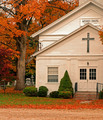
| 11/13/2008 10:46:37 PM | Morris Chapelby Ja-9Comment: Hello from Critique Club :)
Let me start saying, nice photo... Colors are giving the "wow" thing when I see it first time. Why this photo didn't do better? Let's analyze,
Paint on the building, some of the panels are whiter than others, the top roof is cut off a little. I think there is too much road on the bottom. Colors are good, could be bit sharper and cropped a bit more. Also if you did stepped to your right more, you could get rid of the wire pole top of the first roof.
You did capture the colors though, very bright and nice. If technically be better, you probably could get around 5.5 or 5.8 for this one :/
I checked your photos, for a first challenge, very nice. Mine was around 4 :/ also, I see you are trying to develop a better photographer's eye, just make sure the backgrounds will be jumk free... and keep them tight and clean :) of course I am talking about your photos LOL.
Good luck
Leo | | Photographer found comment helpful. |
|
Showing 861 - 870 of ~3250 |
Home -
Challenges -
Community -
League -
Photos -
Cameras -
Lenses -
Learn -
Help -
Terms of Use -
Privacy -
Top ^
DPChallenge, and website content and design, Copyright © 2001-2026 Challenging Technologies, LLC.
All digital photo copyrights belong to the photographers and may not be used without permission.
Current Server Time: 07/23/2026 10:04:37 AM EDT.
|