|
|
|
Showing 831 - 840 of ~3250 |
| Image |
Comment |
| 12/15/2008 02:10:40 AM | |  Photographer found comment helpful. Photographer found comment helpful. |
| 12/13/2008 07:41:38 PM | Bright red trashby momentaryaweComment: Hello from critique club :)
Hi there. First I saw this I went "Man... what a waste" and that's not the whole photo, but only the background of the photo wasted big time. The sky is very nice, the sea and the sand is very nice. You had things going there until you showed us the trash :\ Even fill light here looks extraordinary, very well done. Put a woman with bikini there, or even a crab that is walking on the sand, you would be cruising between 60th and 70th places.
Nice composition. Technically very good, composition as well... geeesh... the garbage! I tell ya, couldn't you find a driftwood or something LOL
Good luck on your next one :)
Leo |
| 12/13/2008 07:35:02 PM | Water Meets Waterby Joker1114Comment: Hello from critique club :)
Hi there. I don't have any problems with the droplet shots. I think they are very nice, even I saw maybe 45 millions of them, still amaze me.
I think you have something here which is hidden. You could score a lot better, even with those people who got sick and tired of seeing these kinds of shots, you would still get something better out of it.
Technically is good. Nice lights, nice exposure, sharp and clean.
Composition is the one you lost big time, more than what it is. Your angle is not necessary, you should have kept straight photo. I think around 2 to 3 degrees leaning to left. And because of your tight DOF, top drop throws everything out in this photo. First one I see, because it's brighter, and yet the worse drop in the photo. Second little drop on the bottom should be cropped out. As a matter of fact, you should crop this to the one drop only, the middle one. I can see very clear focus on that and with the background, you could be looking like IreneM LOL
Anyways, you have a very nice portfolio, you seem like love photography, and please keep on shooting. Copy other people as much as you can, that's how you learn, even if you enter challenges, but don't forget to put your own style in them... trust me, people will notice.
Good luck :)
Leo | | Photographer found comment helpful. |
| 12/13/2008 07:24:33 PM | Heartbreakingby scooter88Comment: Hello from critique club :)
Hi there. This is one of the masterpieces of photojournalism. Your low scoring (unfortunately) could be because of your post process? Some colors are not fitting well here, i can't figure it out
The emotion that flying from this photo really goes through my eyes to my heart. I love it.
Technically very good, composition very good. I actually like the way the kids is slightly to the left. Shoulder is completing the picture.
I never understood DPC, voting wise. I am not sure who and why those 1's 2's and 3's all about but you should not have anything less than 6 for this photo, for some hard-voters maybe 5 or lowest 4.
I would give you 9 if I did vote. And one more thing, I think this is the best kid photo you have on your first page, even better than the ribboner.
Keep up the good work,
Leo | | Photographer found comment helpful. |
| 12/13/2008 07:16:23 PM | Dunkin Donuts!by mbrutus2009Comment: Hello from critique club :)
Hi there. Your estimate for this photo about right but a bit much. What you got is probably would be dream if I took this photo. You did ok because of the composition and the frame most likely.
I can say, the white portion of the photo burns my eyes, not pleasant to look at it. Is that the faucet in the drop? I can't even see the whole brand name in there, which would also be "score dropper"... Post process a little harsh. Not much, but sharpening or something got a little out of control.
Ok, because you had 70s ish look on this one (like a lava lamp) some folks gave you pretty good sores. If I voted, which I didn't, I would definitely get you either 3, tops 4.
(Oh gosh, I just checked your site, I remember giving you another critique before... Sorry, I hate to be rude to your photos, but please don't take it the wrong way. By the way, angle of the drop here looks better than the "Dripping from what??? Hmm...." photo.
I see you are trying though, please do keep up :)
Good luck on your next one :)
Leo | | Photographer found comment helpful. |
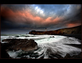
| 12/13/2008 07:02:58 PM | Tsunami Coastby orvaratliComment: Hello from critique club :)
Hi there. It is always nice to critique a Pro ;) I checked your site, I probably did many times before, you do have tons for good work there. Here I think you did try something new. This is a mixed photo of two. One that got you better scores, the bottom of the photo and the top portion of the photo, which might gave you some bad scores.Why is that?
First of, whoever gave you 1 is a jerk. Totally troll, and don't worry about it. Your better portion of the photo has a very nice color scheme, shades of blue. Exposure is very nicely done to get that kind of feeling from a sea. If you had only that portion with a half naked woman sitting or standing top of those rocks... well, enough said I guess.
The top portion, I think I have seen this about everywhere... Not much going on, jut to give some extra colors to this photo, I think it's ok for some.
Composition is very good. 2/3 is the sea and the rocks, the main attraction, and the rest to give some flavor.
Well done. If I did vote, which I didn't, I would give you 6 or 7 for this photo.
Please do keep up the good work. Trying new things always good, you should check the voters, and other people what they think about the new ideas such as this one.
Leo | | Photographer found comment helpful. |
| 12/13/2008 06:50:04 PM | sofiaby b0gdanComment: Hello from critique club :)
Hi there. It's a cute family photo, one you would take in a little family meeting with a P&S camera.
I like the lighting here with one little exception, some of the areas on her face and on the Christmas balls are burned out. If you did keep the exposure a little less time, I think it would be nicer lighting wise.
I like DOF this really could be a very nice photo if you crop her and get rid of the red ball on the right. For the others, I would keep the yellow, and the one on her head, I would move that probably close to the yellow ball. Keep her closer but not too much.
Composition is a bit off too... ok, way off on this one :\ She is right middle of the photo, there is to much empty space on top right.
Let me seeee. if I did vote, which I didn't... this photo would get around 4 from me. because she is cute and I liked the DOF on her.
I see you are not too active, but you seem like trying whenever you have time. Keep on going, enter more challenges; I am sure you will do much better for the next one or two :)
Leo |
| 12/08/2008 12:11:31 AM | Spin Cycle by NeilComment: Congrats, this is a really an awesome photo :) | | Photographer found comment helpful. |
| 12/08/2008 12:10:16 AM | | | Photographer found comment helpful. |
| 12/08/2008 12:05:27 AM | | | Photographer found comment helpful. |
|
Showing 831 - 840 of ~3250 |
Home -
Challenges -
Community -
League -
Photos -
Cameras -
Lenses -
Learn -
Help -
Terms of Use -
Privacy -
Top ^
DPChallenge, and website content and design, Copyright © 2001-2026 Challenging Technologies, LLC.
All digital photo copyrights belong to the photographers and may not be used without permission.
Current Server Time: 07/22/2026 07:13:23 PM EDT.
|