| Image |
Comment |
| 10/01/2008 01:43:09 PM |
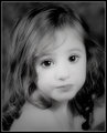
At Peaceby shalrathComment: Wonderful placement of the model in the frame. Love the white space.
There are subtle geometries that come to light after studying this shot - a slight convex in the shape of her eyebrows becomes a bit more pronounced in her eyelashes and even moreso in the joining of her lips. This is accentuated by the incredible smoothness in her skin. These curves are offset by the concave neckline of her top. Also, length of her neck carries similar soft curves on either side. This pattern is carried through the tips of her hair.
The lighting on the skin is superb as the highlights and soft shadows blend very well and are very balanced.
Personally, I like the fact that her eyes are closed as this allows for a broader area of attention - as opposed to the eyes being a focal point. |
 Photographer found comment helpful. Photographer found comment helpful. |
| 09/29/2008 09:39:10 AM |
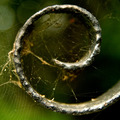
Iron Work in "e"by dsternerComment: Deb
Congrats on this excellent image and on the 12th place finish. The detail is excellent and the ironwork appears to be consuming the spiderweb and growing from it. The shallow DOF and the amount of noise you left really complement the shot. Message edited by author 2008-10-11 21:40:25. |
| Photographer found comment helpful. |
| 08/28/2008 07:33:45 PM |
His Roadby Dmosier21Comment: I'm not sure I can agree with the assessment that Christianity is a "road less traveled", if that is the correlation you are making. I think Exodus would be a more symbolic chapter to have the book opened to as it, in name and content, allude to a road less traveled - a road out of bondage and into an unknown world, yet one of hope. The shallow DOF is well done to focus on the word "road", but that is a bit shoehorned and obvious. The blue page marker with its bit of color actually pulls the eye away from the focal point. Message edited by author 2008-09-03 13:35:12. |
| Photographer found comment helpful. |
| 08/28/2008 07:21:18 PM |
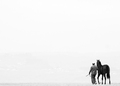
where to by whiteroomComment: This a tremendous and successful use of white/negative space. My screen is lighter than many so the image looks totally white except for the subjects. if I tilt my screen, I see a hint of a horizon... but I like the pure white that I initially saw. The concept of a man and his horse is very symbolic of the bond between man and nature and of man's journey through life. The latter is very strong here and the vastness of the path/trek/world ahead is immense as are the eventual discoveries as well. The word is theirs to discover. The hint of the grass adds an element of the two subjects being grounded... to a point, yet still untamed and care free. The reigns reaching out in front of the two gives off the feeling that they are pulled, unknowingly, into the quest that lies ahead of them. Brilliant! |
| Photographer found comment helpful. |
| 08/19/2008 05:57:17 PM |
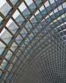
Arcsby banmornComment: The unique perspective in this image keeps the eye actively seeking a focal point - and in a very good way. The reflections in the glass adds a counter-motion to the wave-like movement of the grid. The image feels almost as though it is animated. The contrast between the blues and the browns define a spatial separation throughout the entire image. |
| Photographer found comment helpful. |
| 08/08/2008 06:52:54 PM |
|
| Photographer found comment helpful. |
| 08/02/2008 12:06:59 AM |
Nataleebwforweb1.jpgby gwe21Comment: The catchlights are excellent here and I personally like the blownout face. It allows the eyes to really stand out. The lighting is rather harsh and uneven on her hair and due to this lighting she begins to blend into your backdrop - losing separation. |
| Photographer found comment helpful. |
| 07/28/2008 04:07:22 PM |
Don't touchby evanescenteComment: This image is very dramatic in its simplicity. The electric burners are very recognizable to just about everyone and an object many see everyday. This high-contrast representation certainly portrays Hot. The balanced composition leaves me with the feeling that this is one segment, the lower right corner, of a four panel poster that together would complete the circle(s). A bulls eye! |
| Photographer found comment helpful. |
| 07/28/2008 09:35:18 AM |
---Mmmmm---by KelliComment: I agree with the previous comment, but would also add that there is an strong amount of noise around the models eyes that doesn't exist in the remainder of the photo. Being drawn to the eyes immediately when viewing this image, the noise really jumps out.
Beyond that, this image is not without merit, even given the low score. The color of the ice cream and is a perfect match with the colors of her blouse, which adds a lot of interest. Also, the processing on her skin is quite good - or she really has amazing skin. Message edited by author 2008-07-28 12:00:54. |
| Photographer found comment helpful. |
| 07/27/2008 12:49:48 AM |
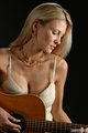
Bethanyby printer4uComment: I just stumbled across this image while doing some recon for a guitar shot of my own. This is an excellent portrait, even without the guitar. I really like the model's pose and the lighting. There is an intense concentration in her eyes, without looking uncomfortable. The overall tone of the image is perfect and the subtle tones of her hair, skin, jewelry, makeup and top are very complimentary to one another. I also like how you left the texture in her skin and didn't smooth that out. The reflection on the top of the guitar so eloquently extends her chest, cleavage and blouse in a very seductive and eloquent way. Outstanding. A new favorite. |
| Photographer found comment helpful. |
Home -
Challenges -
Community -
League -
Photos -
Cameras -
Lenses -
Learn -
Help -
Terms of Use -
Privacy -
Top ^
DPChallenge, and website content and design, Copyright © 2001-2026 Challenging Technologies, LLC.
All digital photo copyrights belong to the photographers and may not be used without permission.
Current Server Time: 06/21/2026 01:36:21 PM EDT.