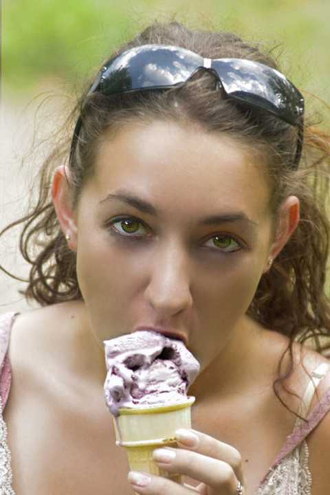
I completely agree with violinist123. I would add, though, that the main thing I notice is that the ice cream is out of focus, so my eyes are drawn to her eyes, which are in better focus. For a sugar challenge, voters will want the sugar to be the focus of the image, not the model's eyes.
The other thing is a lot of voters don't read past the title of the challenge. If the title says sugar, you better give them sugar, not just something sweet. regardless of the challenge description. Unfortunate, but true.
For a purpose other than DPC, it's a pretty good shot, though.
I agree with the previous comment, but would also add that there is an strong amount of noise around the models eyes that doesn't exist in the remainder of the photo. Being drawn to the eyes immediately when viewing this image, the noise really jumps out.
Beyond that, this image is not without merit, even given the low score. The color of the ice cream and is a perfect match with the colors of her blouse, which adds a lot of interest. Also, the processing on her skin is quite good - or she really has amazing skin.
- Focus. I can tell your focus was on the spot, but it looks like either she moved or your hands were shakey because it's just a tad on the blurry side. Probably could have been tightened up in smart sharpen or usm.
- Saturation. This is DPC, what the real color of something happens to be is irrelevant. I want that ice cream to be so colorful my eyes start to melt when I look at it!
- Contrast. The overall image is a bit flat and washed out. One spot this really hurts is the reflections in the sunglasses. Those would really jump out if the blacks were more black in the photo.
Things that worked
- Pretty model. It never hurts.
- Natural pose. She doesn't have a deer-in-the-headlights stare, nor is she giving the ice cream a im-a-pornstar lick. It has a nice, natural feel.
- Reflections. You can never go wrong with reflections on DPC. Not taken full advantage of here as discussed above, but present and in your favor.
Also since it was advanced editing, you could probably have sent this into 6+ range by spending time enhancing the eyes and skin in photoshop. Brad (I think it was brad) has a decent tutorial on photoshopping models into magazine quality creatures of beauty. Wouldn't take a lot of work in this shot, and would have lifted it above the realm of casual photo.
The crop doesn't do much for me, it leaves the composition too centered. I think you may have gone overboard on post-processing her eyes, and the whole image seems to lack contrast. If you were post-processing in Photoshop, try playing around with the "curves" adjustments.