| Image |
Comment |
| 05/03/2004 11:42:04 AM |
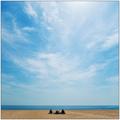
Mixedby jrs915Comment: Very nice color abstract. I especially like the subtlety of interplay between primary and secondary colors. Nice focus and decent technical quality. |
 Photographer found comment helpful. Photographer found comment helpful. |
| 05/03/2004 11:37:07 AM |
Plastic Flamesby shardyComment: I'm pretty sure this is a hair clip. :) I like your idea and it is composed well. Your choice of background to support it is the strongest feature of this composition. Since this is a member challenge I would have cloned out most of the white specs to give it a cleaner look. Nice job. |
| 04/30/2004 11:58:00 AM |
Painting the Corners by toddheadComment: I suspect this is a completely fabricated image with a ball held in place and a picture of a pitcher pitching in the background, but you pulled it off very well and deserve a good score. |
| Photographer found comment helpful. |
| 04/30/2004 11:52:29 AM |
2 geese, different proportionsby lightpro1Comment: Nice composition, especially with the nice background but it suffers from the old digital camera ploy of focusing on the background and not the main subjects in the foreground. That is too bad. It would be a great pictures. |
| Photographer found comment helpful. |
| 04/28/2004 02:12:54 AM |
Unexpected Invitationby ZoomdakComment: Congratulations on a well deserved win. Nice to see an Oregon boy do good with a great Oregon landscape. :) |
| Photographer found comment helpful. |
| 04/26/2004 03:54:25 AM |
|
| 04/26/2004 03:51:08 AM |
|
| Photographer found comment helpful. |
| 04/26/2004 03:33:46 AM |
|
| Photographer found comment helpful. |
| 04/26/2004 03:18:16 AM |
Village Shopsby OlyuziComment: Well composed and good perspective. Curved walkway and differing storefronts adds considerable interest to the image. Since the foreground flowers hold such a prominent place in the composition they should be in better focus. That can easily be accomplished by selecting just the flowers only and applying a little unsharp mask to them. |
| Photographer found comment helpful. |
| 04/23/2004 04:15:27 PM |
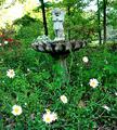
In the Gardenby boyte1Comment: This is such a nice scene. This image could be improved a lot in several basic ways. First, it probably should be made level. It may have been your intention, but the amount of angle just makes it look unintentionally crooked. The daisys and the background on the upper left are badly overexposed. It appears the image is oversharpened. What might work better for this shot would be to take the picture from near ground level looking up with one or two of the daisys prominent in the frame and the statuary big in the background. Using shallow depth of field where the daisys were in sharp focus but the statuary in much softer focus in the background would make a good effect. |
Home -
Challenges -
Community -
League -
Photos -
Cameras -
Lenses -
Learn -
Help -
Terms of Use -
Privacy -
Top ^
DPChallenge, and website content and design, Copyright © 2001-2026 Challenging Technologies, LLC.
All digital photo copyrights belong to the photographers and may not be used without permission.
Current Server Time: 07/26/2026 09:34:10 AM EDT.