|
|
|
Showing 521 - 530 of ~977 |
| Image |
Comment |
| 06/15/2006 01:41:02 AM | |  Photographer found comment helpful. Photographer found comment helpful. |
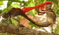
| 06/15/2006 01:38:25 AM | Smoke Rings - No Cigarby B74AComment: oh, wow, this picture is awesome! I think the air rings are perfectly in line and the colors are really good too, the only thing is that I wish there were more negative space on the left and bottom sides, other than that, nice work! | | Photographer found comment helpful. |
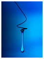
| 06/13/2006 12:56:25 AM | Water Drop Revisitedby RikkiComment: Congratulations Rikki! Awesome photo, I love it (and so did everyone else apparently) : ) | | Photographer found comment helpful. |
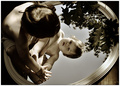
| 06/13/2006 12:52:10 AM | Child in Nature ~ Mirrors Redux by jenesisComment: wow, congratulations! This image is so beautiful... (and the improvements you've made from the original are a landslide) hope you don't mind if I add it to my favorites, *wink* : ) | | Photographer found comment helpful. |
| 06/13/2006 12:43:03 AM | Out from somewhere by LalliSigComment: wow, congratulations Larus! nice work, and sorry, but I can't decide which one I like better, they are both fantastic! | | Photographer found comment helpful. |
| 06/12/2006 08:26:37 PM | Yesterday´s Architecture by StructorComment: I love to see my favorites win ribbons... nice work! I think the best part was that this wasn't such a mainstream architecture shot, excellent (btw, gave you a 9) I love how the clouds seem to be swirling out from the house | | Photographer found comment helpful. |
| 06/12/2006 02:18:54 AM | the empty combinationby gocComment: Critique Club Comment
Initial thoughts: wow, nice colors and great symmetry
Visual appeal: yes, the colors of the wood are dark and rich, and the lighting seems to give a nice moody feeling,
Subject & background: I think that you must have been one of the people who didn't read close enough to see that you were supposed to have a "thing" in the room, of course, your thing could have been the door or something, but I'm guessing DPC probably wouldn't have gone for that either. I also noticed some comments about it being a hallway, and not a room, but personally I think that it works fine for the challenge, how many people have a big empty photogenic room? but yes, you would have done much better with something in the room to focus on for this challenge specifically, for your other photography interests, I would leave it as is; it would also be very hard to find a subject to put in here that wouldn't detract from its surroundings.
Angle, framing & composition: I think the perspective is just awesome, I love how you managed to get the symmetry just about spot on. The only thing I notice is that the left side is a little distracting, I would try cropping it a bit, I tried cropping it and liked it cropped just barely outside the little black "bar" you see between the edge and the beam (so that you can still see the "bar"). This seemed to be the most pleasing.
Focus, clarity & DOF: Seems pretty good to me, I would try to get your camera to focus on the beams as well as the door and see what you get. You also might try just a little more sharpening, probably selectively to the beams so as not to hurt the rest of the picture. Also, I think that the wood floor looks fine how it is.
Lighting & exposure: I think the lighting is just right. You might try getting rid of the lighting spot on the floor since this is advanced editing and the reflection to the right side on the floor. I tried using the burn tool and it seemed to work, also try messing with the exposure on the burn tool.
Post processing: I like what you've done, no obvious editing mistakes or anything that I can see. I did take your photo into PS and messed with the colors a bit. I changed the hue of your cyan to more of a blue and darkened it and played around with the saturation level. I think that it gives it more of a dramatic feel than the bright cyan. It also gave the beams more of a steel color.
Overall, my opinion: I think this is an excellent photo, maybe not for this particular challenge, but a really great execution nontheless. Great work, and I look forward to seeing more of your stuff in future challenges!
If you have any questions regarding this critique, feel free to PM me
Amanda | | Photographer found comment helpful. |
| 06/12/2006 01:51:40 AM | The Pedestal: Default Storage For D.P.Challenge!by 777STANComment: Critique Club Comment
Initial thoughts: Very bright, nice idea and it meets the challenge.
Visual appeal: I like the colors, and I've noticed that some people have mentioned oversaturation, and the colors look a little oversaturated in some places and somewhat washed out in other places. The room has a clean fresh look to it and the pedastal is a nice subject.
Subject & background: The door is distracting and then upon further inspection, so is the electrical outlet on the right side wall. This was an advanced editing challenge, so the outlet imo is a small enough element that could have been cloned out.
Angle, framing & composition: now, for this shot, I would try a vertical orientation, because it would both cut out the door and add some much needed space above the pedastal to give it more of that "expanse in a small space" feel you were going for. I would also pull the pedastal out from the back wall a bit to give it some more space. I think that you did a great job balancing the photo as it seems very level to me.
Focus, clarity & DOF: The focus seems to be pretty good, you might try selectively sharpening the pedastal (since this is advanced editing) to really help bring it out against the yellow wall. I like how the rest of the photo has a kind of soft glow to it.
Lighting & exposure: I think that you did a fairly good job at lighting the area --I see some shadows behind the pedastal and a slightly blown out area above it-- but for a very pale pedastal on a yellow background, I think that you could have used the shadows to your advantage. I think that maybe you could try messing around with pulling the pedastal out from the wall a bit and try casting a sharp shadow to add interest and depth to your photo and also bring it out from its surroundings. Also, you could try some moody, dramatic lighting, maybe a single spot light from above. Just a few suggestions :)
Post processing: This photo doesn't seem to have any obvious editing errors. Like I said earlier, I would try selectively sharpening the pedastal and cloning out the outlet. You also might try messing with contrast to see what you get
Overall, my opinion: I think you have a great idea going here and I would love to see you try this shot with different types of lighting and different lighting techniques to add some more interest. I also wanted to say that I am also confused by your title, I'm not sure how the pedastal is DPC's default storage... but overall, nice job, glad to see that you are experimenting with mirrors and different lighting placements
If you have any questions regarding this critique, feel free to PM me
Amanda
| | Photographer found comment helpful. |
| 06/12/2006 01:17:40 AM | by fotomann_foreverComment: well, don't know why you did it, you must have expected a ton of DNMCs, but maybe you were just going for the comments? welp, I would say that I like the pink background and the softness... even the wrinklyness of the fabric would be ok to me if she weren't pushing it around with her body (feet, arms, etc) does that make sense? if not, let me know, I'll try to clarify. I like the framing, at least knowing that this was intended as a portrait, not a DPC pic, you might try the third line thing, but sometimes I think that rule is over-rated. also, that necklace looks familiar to me and I'm guessing it had meaning to her and that she probably doesn't take it off or at least especially isn't going to take it off for pictures, I think it looks finel
Other than that, she's very pretty and I think that this shoot of yours turned out pretty good. | | Photographer found comment helpful. |
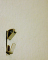
| 06/12/2006 12:32:04 AM | Where Have All The Pictures Goneby jerryc12Comment: Wow, I gave this a 7. it made me think empty room immediately. dpc voters are weird that way though. good luck in other challenges... the only thing I would have suggested is a little bit sharper and better focus and maybe more wall around the hook would've made people think empty room a bit more |
|
Showing 521 - 530 of ~977 |
Home -
Challenges -
Community -
League -
Photos -
Cameras -
Lenses -
Learn -
Help -
Terms of Use -
Privacy -
Top ^
DPChallenge, and website content and design, Copyright © 2001-2026 Challenging Technologies, LLC.
All digital photo copyrights belong to the photographers and may not be used without permission.
Current Server Time: 07/21/2026 04:16:12 PM EDT.
|