| Image |
Comment |
| 07/30/2002 11:52:00 AM |
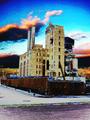
Doesn't Make CENTS But Doesn't Losa Any Eitherby CPatteeComment: Very topical for the challenge. I don't see the detail I would expect for this image, did you use any sharpening in your post procesing? When I read the title with a heavy Italian accent, I hava to maka one'a my top a' picks. |
| 07/30/2002 12:23:00 PM |
|
| 07/30/2002 12:20:00 PM |
|
| 07/29/2002 10:29:00 AM |
Corporate Takeoverby Palli747Comment: This kid SCARES me!! I am assuming the redeye was accentuated to make the point. Did you try different backgrounds or no background at all, this one is too busy for my tasts? When using flash as the main light source pulling the subject away from anything behind them puts the background into darkmess and reduces that glair I see off the back wall of the cabnet. One of my top picks. |
| 07/30/2002 11:59:00 AM |
Retirement Nest Eggby camelotnorthComment: Very on topic, many lost everything for the gain of a few. IMO great use of the required blank space, would you have used a square format if it were allowed? One of my top ten picks this challenge. |
| 07/30/2002 11:39:00 AM |
Corporate Leftoversby gigageekComment: Very colorfull save for what I am guessing was a rather dull pictrure. Could you send me a 'how to', most of my pictures could benifit from this technique. :-) I like it, one of my top picks. |
| 07/24/2002 01:07:00 PM |
A Crystalline Wonderlandby dequinixComment: I realy do not know what I am seeing in this image. The forground, which is more than a third of the picture, appears out of focus to me and the rest is too lacking of detail. I just do not see texture. |
| 07/23/2002 05:45:00 PM |
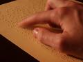
Dark and stormy nightby jkirkla1Comment: Braille, cool, this picture is totally appropriate and the motion blur makes perfect sense. The cropping is a little too tight for my tastes; I want to see all of their middle finger. I am also a little uncomfortable with the levels and color balance, almost as if the white balance was set to daylight when indoors. Overall a good photograph, one of my top ten picks this week. |
| 07/24/2002 02:23:00 PM |
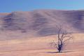
Dry.by lennierComment: That has got to be a very desolate place. One of my tens. |
| 07/22/2002 05:56:00 PM |
|
Home -
Challenges -
Community -
League -
Photos -
Cameras -
Lenses -
Learn -
Help -
Terms of Use -
Privacy -
Top ^
DPChallenge, and website content and design, Copyright © 2001-2026 Challenging Technologies, LLC.
All digital photo copyrights belong to the photographers and may not be used without permission.
Current Server Time: 07/16/2026 06:01:33 AM EDT.