| Image |
Comment |
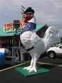
| 08/26/2003 04:43:15 AM |
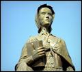
Site of the First Chicken Sandwichby rooComment: Funny statue :-) The background is a little too busy though. Maybe you should have tried to shoot this from a different angle. A good idea might have been to get down a little and shoot upwards so that you get more sky in the background and less building and power lines. |
| 08/26/2003 04:41:24 AM |
monument to freedom by magnetic9999Comment: That's a beautiful monument which you've portrayed excellently. I guess this is the late evening sunlight you've captured there? Your monument is bathed in such a soft soothing light, it gives off a serene feeling, especially with the added bonus of no people being in the image. The decision to leave the trees in the pic only does this justice. This is good work! |
 Photographer found comment helpful. Photographer found comment helpful. |
| 08/26/2003 04:37:40 AM |
|
| Photographer found comment helpful. |
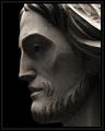
| 08/26/2003 04:26:51 AM |
How Great Thou Artby jmsetzlerComment: I particularly like the play of light and shadow in this photo. It's one of those images where you can't decide if it is too dark or not, so I guess if I have to ask myself that, then it must be spot on. The contrasting is pleasing to my eyes, especially the darker shadows in the chiselled out areas compared to the lighter flatter areas. The pure black background brings our the contours of the face more prominently. This is very good work. |
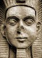
| 08/26/2003 03:31:38 AM |
Sphinxby PaulMdxComment: Now I know you didn't go all the way to Egypt to take this photo :-) The left ear seems to be lower than the right ear, is that just me or is it really like that? I like the courseness of the stone which you've brought out very well - 8. |
| Photographer found comment helpful. |
| 08/26/2003 03:29:17 AM |
Life and Deathby bdshortComment: This is a very classy photo. I especially like the way the reds of the leaves stand out by choosing such a shallow DOF. The border is very fitting and the composition is spot on in my opinion. The only thing stopping me giving this pic a 10 is that the main subject is the tree and not the monuments in the background. Still worth a 9 though. |
| 08/26/2003 03:26:34 AM |
Dedicated to the Women of......by kebmod54Comment: Very sharp and focused. The light blue sky in the background contrasts very positively with the color of the statue, and makes the yellow tones stand out more prominently. |
| 08/26/2003 03:25:06 AM |
By Any Other Nameby sherComment: I can almost feel the roughness of the surface with my fingers. I like your idea here, especially using a shallow DOF to bring out the foreground more. |
| Photographer found comment helpful. |
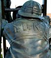
| 08/25/2003 08:35:25 AM |
Two Outs, Bottom of the Ninth by EddyGComment: This is very good. The whole composition is ideal. The gray tones of the statue are highlighted extremely well through the background and shallow DOF |
| Photographer found comment helpful. |
| 08/25/2003 06:02:15 AM |
|
Home -
Challenges -
Community -
League -
Photos -
Cameras -
Lenses -
Learn -
Help -
Terms of Use -
Privacy -
Top ^
DPChallenge, and website content and design, Copyright © 2001-2025 Challenging Technologies, LLC.
All digital photo copyrights belong to the photographers and may not be used without permission.
Current Server Time: 11/22/2025 01:43:53 AM EST.