| Image |
Comment |
| 07/05/2006 04:25:48 PM |
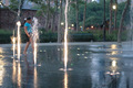
lightby mrsamsaComment: lacks focus. I do like the idea of the water looking like jets of light. The girl in the background takes away from the photo. Too much negative space on teh right side. |
 Photographer found comment helpful. Photographer found comment helpful. |
| 07/05/2006 04:24:15 PM |
|
| Photographer found comment helpful. |
| 07/05/2006 04:22:29 PM |
|
| Photographer found comment helpful. |
| 07/05/2006 04:20:33 PM |
The Swimming Holeby L1Comment: The extra red lines take way from the photo. Because he is swinging into it( and it's right in the center of the photo), your focus is brought to the extra swing. I'm bumping it up 1 point though. |
| Photographer found comment helpful. |
| 07/05/2006 04:17:32 PM |
Old Cannonby FocusPointComment: The background subject is too blurry. Your foreground subject has great focus but not enough of it is captured to know what it is. |
| Photographer found comment helpful. |
| 07/05/2006 04:16:31 PM |
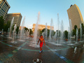
Seagulls Over Grassy Dunesby james_soComment: I'm assuming you were gonig for more artistic here? Seems like its just a little too busy with no clear idea of what you were aiming for. |
| Photographer found comment helpful. |
| 07/05/2006 04:15:29 PM |
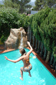
Pool Party Plungeby weiszComment: This photo would have been better if you oculd have gotten a different angle. Maybe one showing her face and/or where she is jumping from. There is too much wasted space in the top of the photo, that could have been used to capture more of the pool. Placing her near the top right corner would have given the photo more effect by showing more of the pool and giving more of a sense of depth. |
| Photographer found comment helpful. |
| 07/05/2006 04:12:35 PM |
|
| Photographer found comment helpful. |
| 07/05/2006 03:50:52 PM |
The wild childby ergatesComment: The childs face is turned way so that you don't see any facial expressions. But the body is cut off so you don't see hand gestures or body posture. So now I'm left wondering what the purpose of the shot was. |
| Photographer found comment helpful. |
| 07/05/2006 03:49:12 PM |
|
| Photographer found comment helpful. |
Home -
Challenges -
Community -
League -
Photos -
Cameras -
Lenses -
Learn -
Help -
Terms of Use -
Privacy -
Top ^
DPChallenge, and website content and design, Copyright © 2001-2026 Challenging Technologies, LLC.
All digital photo copyrights belong to the photographers and may not be used without permission.
Current Server Time: 06/25/2026 02:52:02 AM EDT.