| Image |
Comment |
| 01/29/2007 10:32:00 PM |
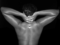
Nude Beautyby TerminatorComment: The left elbow looks a bit unnatural. It should be blended in more. Also you have a harsh light hitting the hands and glass. Other than that nice job. |
| 01/11/2007 07:39:30 AM |
Mermaids BEWARE!!!by abroken1Comment: Very cute picture..but slightly over exposed on the right side. Very nicely done in the eyes though. |
| 01/10/2007 09:16:02 AM |
"Hey. How you doing?"by IceZeroComment: I hate to be the one to do this....especially since I considered a similar idea with my photo, but was advised against it....but I'm sure you already have comments saying this is a black, white, and blue portrait (with a touch of green) and not a black and white portrait.
Technically, it's a great capture. Perfect lighting, great focus, good shot. It pains me to vote this slightly lower for not meeting the challenge (don't worry not that low.) |
| 01/10/2007 08:24:16 AM |
I kissed a girlby clixographerComment: slightly disturbing, but funny.
I don't mean this in a bad way at all, but this looks like a snap shot, not in quality of photo but in composition. the two guys in the background really add to that effect, along with the bar scene. And then you can see that the flash was on and that you were slightly too close. One girl has her eyes closed, while the other one is looking at the camera. Either both looking at eachother, both looking at the camera, or both eyes closed would have been better. |
 Photographer found comment helpful. Photographer found comment helpful. |
| 01/10/2007 08:18:46 AM |
|
| Photographer found comment helpful. |
| 01/10/2007 08:16:05 AM |
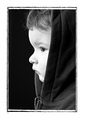
Contemplationby mia67Comment: Nice photo. There is slightly too much light/exposure on the bridge of the nose and under the eye. The border takes away from the quality of the photo. But the softness works well. |
| 01/10/2007 08:13:37 AM |
|
| 12/28/2006 05:03:07 PM |
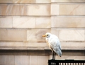
scared of patternsby j_nusratComment: The photo could use a little more focus. The bird isn't in much focus and the wall in the background (your pattern) is completely out of focus. |
| Photographer found comment helpful. |
| 12/28/2006 05:01:45 PM |
|
| Photographer found comment helpful. |
| 12/28/2006 04:59:22 PM |
Zebra patternby KismetComment: Nice portrait and great color scheme. Your model, though, grabs your attention and takes away from the pattern grabbing our attention. |
| Photographer found comment helpful. |
Home -
Challenges -
Community -
League -
Photos -
Cameras -
Lenses -
Learn -
Help -
Terms of Use -
Privacy -
Top ^
DPChallenge, and website content and design, Copyright © 2001-2026 Challenging Technologies, LLC.
All digital photo copyrights belong to the photographers and may not be used without permission.
Current Server Time: 06/26/2026 04:32:15 PM EDT.