| Author | Thread |
|
|
02/22/2007 02:11:28 AM |
|
all those comments and none of them useful? |
|
|
|
02/10/2007 09:05:02 PM |
*Critique Club*
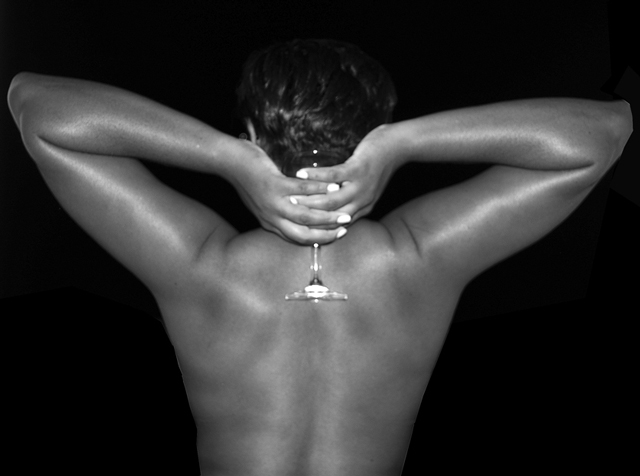
"Nude Beauty" is a good entry into the Nude IV challenge, l like it because it is something different. I am really impressed how creative everyone was during this challenge.
I think it is very interesting that you commented that you had taken this shot at night. I am just wondering if maybe you stated that because you would have shot it differently during the day. I really like the shape that has been created in this shot, the lines draw you in towards the center. The focus looks like maybe you were focusing more on the elbows, I think even if you used a shallow depth of field and focus on the glass it might have drawn in more voters. I like the glow that was created by the light, it feels like it is the lines are moving us into the shot. The over framing of the subject is very good, it doesn't feel over cropped.
Nice work!
|
|
Comments Made During the Challenge  |
|
|
02/04/2007 07:31:55 PM |
|
The use of the black background really helps accentuate the body, really nice. |
|
|
|
02/04/2007 04:25:53 PM |
|
not a bad idea but the top of the glass is hard to make out which makes the bottom of it look weird. could be sharper. |
|
|
|
02/03/2007 05:31:57 PM |
|
I really miss some real focus here |
|
|
|
02/02/2007 09:16:39 PM |
|
lighting and focus seem off. not sure what the glass adds to the composition. |
|
|
|
02/02/2007 08:27:36 AM |
|
the top of the head is very hard to make out and kind of hurts my eyes when trying. Interesting idea though! |
|
|
|
02/01/2007 08:57:19 PM |
|
The focus on the fingers, hair and wineglass seems very soft. I think your DOF was simply too shallow because the focus on the elbows seems pretty sharp. |
|
|
|
02/01/2007 02:39:38 PM |
|
I don't think I understand this shot. The lighting doesn't look quite right. On the top right, around the elbow there is either some bad editing or the background isn't covering the whole area the model took up. Also, for me, I would like to see the whole of the model in focus, as it is I am struggling to find a point of focus (just my humble opinion) |
|
|
|
02/01/2007 08:44:13 AM |
|
very strong subject, i think i would have done something w/ those wrinkles, but nonetheless, a breathtaking image. i like it a lot :D |
|
|
|
01/31/2007 07:23:06 AM |
|
nothing sharp here, the chest and right arm look cut-out from the background |
|
|
|
01/31/2007 12:22:19 AM |
|
|
|
01/30/2007 06:51:17 PM |
|
I'm not sure on this one. Glass dosn't quite make since to me. I also wish the subject was sharper and balenced. |
|
|
|
01/30/2007 05:55:27 PM |
|
The lighting is good but your photo appears out of focus. |
|
|
|
01/30/2007 02:13:04 PM |
|
Focus seems off, either from camera shake of missed focus. |
|
|
|
01/30/2007 12:43:46 AM |
|
Needs to be much sharper, and it looks like parts (namely the right elbow) were cropped or something in photoshop poorly. If that's not the case, something is giving it that effect. The lighting could also be much better, and the glass should be more visible if that's what you're going for. |
|
|
|
01/29/2007 11:08:51 PM |
|
I think the focus is a bit off, and there is something going on with the right elbow. I will give a 6 for the composition and lighting. |
|
|
|
01/29/2007 11:08:17 PM |
|
|
|
01/29/2007 10:32:00 PM |
|
The left elbow looks a bit unnatural. It should be blended in more. Also you have a harsh light hitting the hands and glass. Other than that nice job. |
|
|
|
01/29/2007 05:32:37 PM |
|
I don't like the straight on lighting here. the white finger nails also don't work for me. More side lighting to bring out more shadows and details would work much better. |
|
|
|
01/29/2007 03:06:27 PM |
|
the lighting needs to be more dramatic to do this |
|
|
|
01/29/2007 01:22:45 PM |
|
You've lost the right elbow, the fingernails seem an odd colour, and the glass is lost against the hair. Bu tth eactual idea is nice and straightforward. |
|
|
|
01/29/2007 01:19:41 PM |
|
could use a little more depth as the only thing I can tell thats in focus is the elbows. |
|
|
|
01/29/2007 08:58:56 AM |
|
|
|
01/29/2007 04:19:28 AM |
|
it's not sharp, the nails are strangely white, skin looks too shiny. nope...not the one for me. |
|
|
|
01/29/2007 02:58:24 AM |
|
Seems out of focus and flash is very harsh. |
|
|
|
01/29/2007 12:45:17 AM |
|
|
|
01/29/2007 12:42:37 AM |
|
|
|
01/29/2007 12:20:05 AM |
|
the glass being oof is distracting,also the right arm crop looks really bad nice idea though.....4 |
|
Home -
Challenges -
Community -
League -
Photos -
Cameras -
Lenses -
Learn -
Help -
Terms of Use -
Privacy -
Top ^
DPChallenge, and website content and design, Copyright © 2001-2026 Challenging Technologies, LLC.
All digital photo copyrights belong to the photographers and may not be used without permission.
Current Server Time: 06/28/2026 04:37:35 PM EDT.