| Image |
Comment |
| 08/14/2006 08:54:36 PM |
|
 Photographer found comment helpful. Photographer found comment helpful. |
| 08/14/2006 08:54:04 PM |
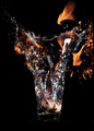
Dining with the Devilby PeterPicComment: Interesting color in the flame, and the etched design adds an interesting refractive detail, but I'm missing the stem of the glass. It feels unbalanced somehow without it. |
| Photographer found comment helpful. |
| 08/14/2006 08:52:33 PM |
Cocktailby DjabordjaborComment: I'm not sure what's going on here, exactly, but it's very chaotic. The clarity of the stopped motion is nice, but I'm just not sure what I'm witnessing. |
| Photographer found comment helpful. |
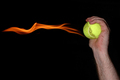
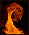
| 08/14/2006 08:51:26 PM |
The Actby fotodudeComment: I'm always impressed by this trick, but have no desire to learn it myself. The color of the flame is nice, but the rest of the photo is rather dull. And the top of his head is cut off. My advice is to loosen the crop by a good margin and include a bit of the setting. |
| 08/14/2006 08:49:49 PM |
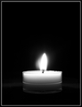
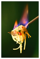
Solitaryby LucidLotusComment: A very nice, simple composition, but perhaps one more click to the right would bring out a little more detail along the rim and give the flame a little dimension. |
| Photographer found comment helpful. |
| 08/14/2006 08:48:55 PM |
Hot Pasta!by h2Comment: Mmmm, pasta, but pasta flambe? I've never seen that before... That's the only thing that puts me off a bit for this photo, the fact that one would not normally light spaghetti on fire. |
| 08/14/2006 08:47:49 PM |
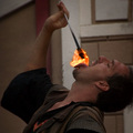
Portrait of the Demonby EricMGB1974Comment: There are just too many contextless, dismbodied flame shots in this challenge, and to be honest none of them are terribly interesting. This is much like the Fireworks challenge, where the photos that scored best actually placed them in some kind of context. That said, I think this is one of the better versions, with nice clarity in the upper right. |
| Photographer found comment helpful. |
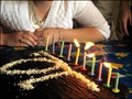
| 08/14/2006 08:44:53 PM |
Make a Wishby GunnsiComment: Nice to see an original concept in the challenge, congrats on being the only one to think of it, obvious though it may have been! The composition is a bit cluttered, I think. The person standing behind her is distracting, the angle isn't the best. I would like to see her face as she's blowing the candles out. |
| Photographer found comment helpful. |
| 08/14/2006 08:42:53 PM |
Flaming Swordby talikfComment: Nice idea, but a bit dark. I would like to see the model better lit. |
| Photographer found comment helpful. |
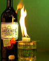
| 08/14/2006 08:42:12 PM |
Burning the green fairyby bryantbusComment: This would have done better if it had more space on the left edge and showed the entire bottle. It looks rather shoved into that left corner. |
| Photographer found comment helpful. |
Home -
Challenges -
Community -
League -
Photos -
Cameras -
Lenses -
Learn -
Help -
Terms of Use -
Privacy -
Top ^
DPChallenge, and website content and design, Copyright © 2001-2026 Challenging Technologies, LLC.
All digital photo copyrights belong to the photographers and may not be used without permission.
Current Server Time: 06/25/2026 12:48:18 PM EDT.