| Image |
Comment |
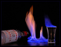
| 08/14/2006 09:32:22 PM |
Flaming Good Shot!by taljComment: This would be much better without the bottle. It doesn't match, is rather dull compared to the flames on the table and in the shot glass, and is a distraction from the main event. |
 Photographer found comment helpful. Photographer found comment helpful. |
| 08/14/2006 09:30:15 PM |
Cool Infernoby codezionComment: I like the idea of the abstract here, but I think the mirror is complicating things by making it looks softer that I would like. I'm also missing the top of the flame to complete the mirror image above as it is below. |
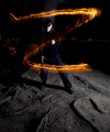
| 08/14/2006 09:29:12 PM |
"Z"by graphicfunkComment: I think this would be better if the lighting were more multidirectional and a touch more subtle. It's creating a harsh shadow and is itself quite white. |
| Photographer found comment helpful. |
| 08/14/2006 09:26:34 PM |
Chasing Demonsby labudsComment: Fantastic clarity here! Overall I think this is a bit dark, but what you can see has excellent detail and color. |
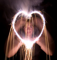
| 08/14/2006 09:25:56 PM |
The Fire in My Heartby scarbrdComment: So nice to see an original thought here! Nice mirroring of shapes... I do wish there was more shadow on the model's face to make it more mysterious and eliminate the problem of whether or not the face should be in focus. the glare from her earrings is a little distracting. |
| Photographer found comment helpful. |
| 08/14/2006 09:24:32 PM |
Toastedby TonyTComment: The marshmallow looks totally flat and a bit green against the supersaturated orange of the flames. I'd like to see warmer tones and more clarity on the marshmallow to bring out the texture and make it look more inviting and appetizing. |
| Photographer found comment helpful. |
| 08/14/2006 09:22:46 PM |
|
| Photographer found comment helpful. |
| 08/14/2006 09:21:44 PM |
Since 1932by andy74Comment: Nice photo, but not extremely interesting. The "1932" in your title implies that it's an antique while the Toyota logo is plainly visible. |
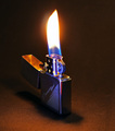
| 08/14/2006 09:20:47 PM |
Fiery Cocktailby dfstevensonComment: The idea is excellent, but the execution is sloppy. the visible line across the bottom and through the middle of the table near the glass kill your surface, and the flames look totally overprocessed. The processing brought out a fair bit of noise, and the whole image needs sharpening. This would have been excellent done much more subtly - keep the glass of peppers as is, fix the surface, tone down the flames (put a but more darkness behind the peppers in the glass), pay more attention to clarity, and keep the photo looking more real. |
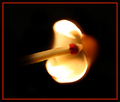
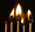
| 08/14/2006 09:20:41 PM |
playing with matchesby margiemuComment: In a fire challenge, to stand out, a match photo needs to be really special and do something truly creative - more than just lighting them. The execution here is okay, though a bit unbalanced with it being off center, and I don't think this goes far enough into that creative territory. |
| Photographer found comment helpful. |
Home -
Challenges -
Community -
League -
Photos -
Cameras -
Lenses -
Learn -
Help -
Terms of Use -
Privacy -
Top ^
DPChallenge, and website content and design, Copyright © 2001-2026 Challenging Technologies, LLC.
All digital photo copyrights belong to the photographers and may not be used without permission.
Current Server Time: 06/25/2026 06:51:53 AM EDT.