| Image |
Comment |
| 04/21/2006 09:35:18 PM |
|
| 04/21/2006 09:31:42 PM |
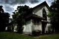
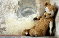
Old Stressesby MeGoobieComment: The title doesn't make much sense of the photo, even if it was designed to squeeze it into a category where it clearly does not belong. |
| 04/21/2006 09:23:40 PM |
|
 Photographer found comment helpful. Photographer found comment helpful. |
| 04/21/2006 09:22:21 PM |
|
| Photographer found comment helpful. |
| 04/21/2006 09:20:26 PM |
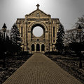
Basillicaby ronnytComment: This would work better if the building were more centered. The building isn't tilted, but I think the off-centeredness of it makes it look like it's leaning to the right. It's a weird optical illusion. |
| Photographer found comment helpful. |
| 04/21/2006 09:17:15 PM |
|
| 04/21/2006 09:15:10 PM |
|
| Photographer found comment helpful. |
| 04/21/2006 09:13:20 PM |
solitudeby riderComment: Needs to be sharper, more color saturation. |
| Photographer found comment helpful. |
| 04/21/2006 09:11:31 PM |
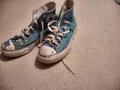
Old Kicksby fauxphenomenaComment: The toe is too close to the left edge. There's something to be cropped out of the upper right corner. Needs to be brighter, sharper, more contrast. As is, this looks like nothing more than a bad snapshot. |
| 04/21/2006 09:10:17 PM |
|
| Photographer found comment helpful. |
Home -
Challenges -
Community -
League -
Photos -
Cameras -
Lenses -
Learn -
Help -
Terms of Use -
Privacy -
Top ^
DPChallenge, and website content and design, Copyright © 2001-2026 Challenging Technologies, LLC.
All digital photo copyrights belong to the photographers and may not be used without permission.
Current Server Time: 06/24/2026 01:48:35 PM EDT.