| Author | Thread |
Comments Made During the Challenge  |
|
|
04/25/2006 06:01:44 PM |
|
Impressive. A bit less of USM would have improve it. |
|
 Photographer found comment helpful. Photographer found comment helpful. |
|
|
04/21/2006 09:20:26 PM |
|
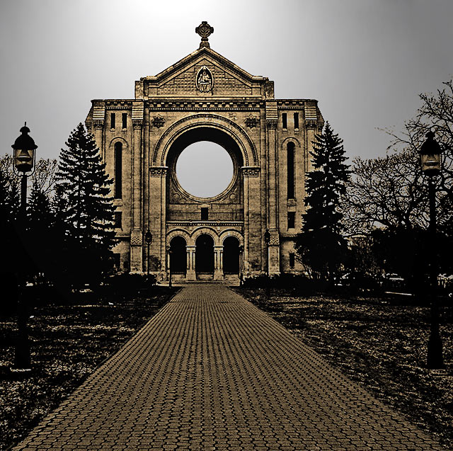
This would work better if the building were more centered. The building isn't tilted, but I think the off-centeredness of it makes it look like it's leaning to the right. It's a weird optical illusion. |
|
| Photographer found comment helpful. |
|
|
04/21/2006 06:57:03 PM |
|
wow, i love this, the pathway draws you into it, the only thing is the circle in the middle, i can't take my eye off it, it distracts you from the rest of the photo, its a 9 from me |
|
| Photographer found comment helpful. |
|
|
04/21/2006 11:25:51 AM |
|
| Photographer found comment helpful. |
|
|
04/21/2006 02:27:19 AM |
|
| Photographer found comment helpful. |
|
|
04/20/2006 08:53:46 PM |
|
Horizon a bit tilted by nicely processed. Sky seems a *bit* flat maybe |
|
| Photographer found comment helpful. |
|
|
04/20/2006 07:57:02 PM |
|
Good subject and composition. A bit to heavy on the post processing. |
|
| Photographer found comment helpful. |
|
|
04/20/2006 07:22:22 PM |
|
I love the DOF that you created using hyperfocal distance. It colors are a little weird on my computer but then again I have not calibrated my monitor this month. |
|
| Photographer found comment helpful. |
|
|
04/20/2006 01:03:29 PM |
|
I'm a big fan of these sharpened type images. It really brings out the detail in the intricate work on buildings and walkways, especially in this image. Very beautiful. A 9 for me! |
|
| Photographer found comment helpful. |
|
|
04/20/2006 11:17:43 AM |
|
Would like too see the main object more centered. |
|
| Photographer found comment helpful. |
|
|
04/20/2006 07:28:53 AM |
|
Wonderful leading lines and what a gorgeous building! There seems to be a lot of post-processing here - I can't decide if I like that or not, hmmm. I guess I would prefer a bit less post-processing. Otherwise though, I like this image very much for the reasons stated above. Good luck with the challenge! |
|
| Photographer found comment helpful. |
|
|
04/20/2006 04:59:49 AM |
|
BEAUTIFUL PP on this one! Love it! I hope you'll tell us what you did in your notes. |
|
| Photographer found comment helpful. |
|
|
04/19/2006 10:46:51 PM |
|
A little too "over cooked" for my taste. |
|
| Photographer found comment helpful. |
|
|
04/19/2006 04:04:33 PM |
|
Very impressive, love the lighting and composition. |
|
| Photographer found comment helpful. |
|
|
04/19/2006 12:20:57 AM |
|
I like the artful approach. The first thing that jumps out to me is the tilt. It is blatantly tilted to the right and that really hurts it for me. I love the rich tones of black and golden brown. Nice detailing on the brick path and the church itself. The blackened trees work as well. |
|
| Photographer found comment helpful. |
Home -
Challenges -
Community -
League -
Photos -
Cameras -
Lenses -
Learn -
Help -
Terms of Use -
Privacy -
Top ^
DPChallenge, and website content and design, Copyright © 2001-2026 Challenging Technologies, LLC.
All digital photo copyrights belong to the photographers and may not be used without permission.
Current Server Time: 06/28/2026 09:31:50 PM EDT.