| Image |
Comment |
| 05/01/2002 09:32:00 AM |
Together We Stand, Divided We Fallby akcoffeeguyComment: Since you had to do it from the ground up (couldn't shoot from the side), I'd have made the trinity more balanced. Really good tones here. Probably won't score well, but I like it. |
| 05/01/2002 10:22:00 AM |
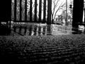
asunderby lauComment: Not that it bothers me, just trying to be clever, but I'm pretty sure the camera was pointed down for this one since the 'horizon' of the porch is more than halfway up the frame. I guess the reflections are the bit that addresses the challenge, but what's reflected isn't really apparent. |
| 05/01/2002 03:43:00 AM |
Cylindricityby Ricky CleaveComment: You chose the tilt for a reason, I guess. Don't know if I'd like it better straight or not. Not the most interesting subjects, but good colors and you got the camera pointed skyward - seems like the most important thing. |
| 05/01/2002 03:35:00 AM |
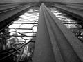
Stained Classby jmsetzlerComment: Very nice B/W tone, and well sharp. The leading lines do draw the eye away from the nice reflections and up to the less-interesting top of the frame. Maybe a couple of steps further back would have let the glass up top show a little better. Just an idea. Nice work. |
| 05/01/2002 09:48:00 AM |
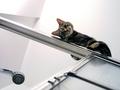
Get Me Down! by joebarComment: Nice angles, and just the right ammount of environmental detail to set the scene. |
| 05/01/2002 08:33:00 AM |
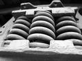
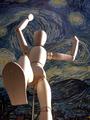
Prepare to be Squashed: Giant Dummy on Rampage!by magnetic9999Comment: I'm all in my tuck and ready to roll out of the way at the last second, then clamber up that pole he's got in his butt and give him a kicking. Good choice for the bg. I think a little more light back there would give the image a better tonal balance, that or toning down the sidelighting on the figure. This could really pop. |
 Photographer found comment helpful. Photographer found comment helpful. |
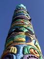
| 05/01/2002 08:43:00 AM |
Spirits In The Skyby ShiiizzzamComment: Nice colors and shapes. Personally, I think you need a more atypical image when the subject is OPA (other people's art). The flat blue sky and late afternoon (mid-morning?) light don't really add anything that wasn't already there. I guess the low angle is something, but IMO not really any kind of photographic "interpretation" of the sculpture. Maybe on a rainy day with a dramatic sky or something in that vein would at least place it in time. This looks to me like what anyone would see by just walking up to in on a nice day. This is just my opinion, and you've done what you've done here well, so I won't drop a low score on you. |
| 05/01/2002 03:16:00 AM |
Evening Starby hokieComment: Good stuff! I'm not wild about how the detail is lost in the ULHC, but that's fixable. This up on a mountaintop somewhere? Fantastic angles, and I really like the sepia treatment. |
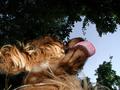
| 05/01/2002 03:32:00 AM |
Flea's Eye Viewby shortredneckComment: Something to soften the flash (Stofen or Lumiquest) would have been nice, or even just turning it down a notch if that's an option. Great textures throughout, and the tongue... what can I say? |
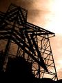
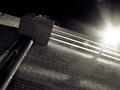
| 05/01/2002 08:46:00 AM |
Towards the Lightby greenem2Comment: Something from nothing. Quite a trick! This could have been a mind-numbingly dull image, but the sharpness, shadows, angle, and that great flare from the floodlight (six-bladed aperture, I see) keep the eye moving around. Nice work. |
| Photographer found comment helpful. |
Home -
Challenges -
Community -
League -
Photos -
Cameras -
Lenses -
Learn -
Help -
Terms of Use -
Privacy -
Top ^
DPChallenge, and website content and design, Copyright © 2001-2026 Challenging Technologies, LLC.
All digital photo copyrights belong to the photographers and may not be used without permission.
Current Server Time: 07/16/2026 02:43:49 PM EDT.