|
|
|
Showing 261 - 270 of ~707 |
| Image |
Comment |
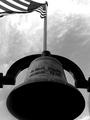
| 06/09/2002 04:33:00 AM | Time Marches On...by AleciaComment: A reall killer to expose correctly. I'd have gone under just a bit more to keep the sky from blowing out quite so much, then used a positive gamma adjustment to retrieve the shadow detail. The flagpole emerging from the bell is a little weird - might work better if you'd gotten it perfectly centered on the round bit of the bell's yoke and avoided the bit of the column at R. |
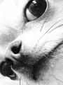
| 06/06/2002 01:05:00 PM | The Lookby RemieComment: So in-your-face. I'd blow out the highlights even more, and just keep the detail in the darks. Upgraded on 2nd look. |
| 06/06/2002 12:55:00 PM | Smileby jhcrossComment: Skin tones could be just a little bit lighter, but good control of the flash overall. For the print, you could black out the stuff in the background. Kid looks sharp! |
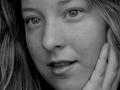
| 06/05/2002 11:04:00 AM | |
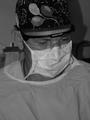
| 06/04/2002 03:19:00 AM | Intensityby jasonmccarthyComment: Good B/W (an all photography, really) is all about light, and the ugliest light known to man (except possibly flourescent) is, for some reason, built into most cameras. It's very hard and directional, which flattens textures, and casts horrid shadows nine times out of ten. The party headwrap would have me worried if this were my surgeon, unless I was 7. For intensity, maybe you could zoom in on his eyes. |
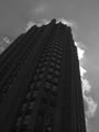
| 06/04/2002 03:26:00 AM | Dark Towerby eddyComment: Glad there's a little detail (windows) in that black. The sky is nice and dramatic, almost as if the bldg is giving off steam or getting ready for ignition. IMO, some positive gamma adjustment to bring the windows out just a little more (you could always punch up the blacks if they lose density), would make the big dark area a little more interesting. |
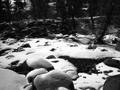
| 06/04/2002 11:35:00 PM | The Creekby freetimeComment: Needs a positive gamma adjustment to make the snow at LLHC whiter and bring out some detail in the bg shadows. A tighter composition on the play of light on the snow and a few stones might have been more effective than the wider, scenic view. |
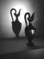
| 06/09/2002 04:25:00 AM | Cleopatra's Vaseby BNCComment: Good use of light and shadow, but I do have a couple of suggestions. Don't know how much control you had of the setup, but it might have been nice to have the bottom of the shadow connect with the bottom of the vase. The edge of the platform at bottom doesn't do much for me, and I'd like to see the people on the front of the vase arranged so that the light falloff doesn't cut anyone in half (while maintaining that perfect profile shadow, of course). You obviously know what you're doing - just my thoughts. Nice work. |
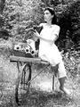
| 06/06/2002 12:50:00 AM | back in the dayby connieComment: She really looks the part. Nicely composed, and pretty good tones. The overexposure on her foot and dress is a bit of a negative, and the wheelbarrow, though it's a nice prop, doesn't really fit for me (especially missing the tire), but the latter is really reaching. I expect this to do very well. |
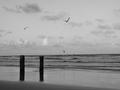
| 06/09/2002 03:47:00 AM | Tranquilityby JTMediaComment: Nice, tranquil scene. Wish you'd panned left just a little, as the R side is a bit empty. You could crop most of the R side and the leftmost seagull to make a nice vertical comp. A little more density to the blacks would make the gulls stand out from the sky better, as well. |
|
Showing 261 - 270 of ~707 |
Home -
Challenges -
Community -
League -
Photos -
Cameras -
Lenses -
Learn -
Help -
Terms of Use -
Privacy -
Top ^
DPChallenge, and website content and design, Copyright © 2001-2026 Challenging Technologies, LLC.
All digital photo copyrights belong to the photographers and may not be used without permission.
Current Server Time: 07/17/2026 03:15:34 AM EDT.
|