|
|
|
Showing 201 - 210 of ~707 |
| Image |
Comment |
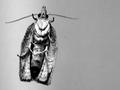
| 06/05/2002 11:02:00 AM | Mothraby mciComment: I wonder if that's his best side. Don't know if the space at right adds anything worthwhile. Nice contrast, but sharpness could be better. |
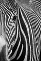
| 06/06/2002 12:09:00 PM | |
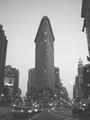
| 06/09/2002 03:56:00 AM | Flatironby pauldComment: Great subject - recalls the classic takes on this unique building. The billboard, cars, lights, encroaching bldg at URHC detract, though. Maybe getting closer and shooting up would minimize these nits. |
| 06/06/2002 06:18:00 AM | Mommy!!by timj351Comment: Gooood. They eat these where I live. Great textures, and a very compelling subject and composition. The little tufts around his head seem to have gotten lost on the way to the web, and I'd crop the bottom where the light starts to fall off. Otherwise, hot stuff! |
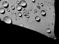
| 06/05/2002 06:41:00 AM | Foliage by jmsetzlerComment: Sure glad I didn't submit my water drops this week. This is just about perfect - the detail, tonal range, clarity and composition are all first rate. Top 3, IMO. |
| 06/06/2002 12:44:00 PM | |
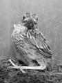
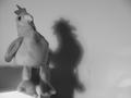
| 06/04/2002 03:32:00 AM | Lone Roosterby ChrommonkyComment: Looks to me like he's got an evil twin. I think you could have spread the contrast around a little better here. The black eye and white highlight in it show that you do have a full range here, but the rest of the subject is kind of clumped in the middle gray range. I'd increase the gamma, then punch up the blacks a lot and the whites a little. |
| 06/09/2002 04:50:00 AM | risky businessby mikeflowersComment: Cropped just slightly too tight for my taste. I'd like to see the bottom of her lower lip and the tops of her frames. Gamma needs a boost, too (my monitor calibrated to 2.2). I do like the focus on just her features, and the shades are a plus. A polarizer to cut the reflections there might be worth trying. |
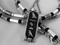
| 06/04/2002 11:29:00 PM | kartoucheby magnetic9999Comment: Nice and sharp, and pretty well exposed (gamma could go up just a little, IMO). The necklace (which, to my eye, doesn't match the kartouche - SE asian?), competes for my attention. The texture on the fg is a minor distration. |
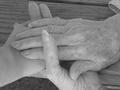
| 06/09/2002 04:10:00 AM | grandma's handsby sammi68Comment: The low contrast works here, IMO, although I wouldn't mind the blacks just a touch denser and a positive gamma adjustment to bring more area into the lighter range. The one dark area at LL is a little jarring, as the rest of the image is all on one plane. Not a big deal, just though I'd mention it. Good work. |
|
Showing 201 - 210 of ~707 |
Home -
Challenges -
Community -
League -
Photos -
Cameras -
Lenses -
Learn -
Help -
Terms of Use -
Privacy -
Top ^
DPChallenge, and website content and design, Copyright © 2001-2026 Challenging Technologies, LLC.
All digital photo copyrights belong to the photographers and may not be used without permission.
Current Server Time: 07/17/2026 12:20:00 AM EDT.
|