| Image |
Comment |
| 11/28/2002 01:23:00 PM |
|
 Photographer found comment helpful. Photographer found comment helpful. |
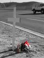
| 11/28/2002 01:14:00 PM |
Roadside Remembranceby myqylComment: I'm not sure the selective color was necessary here, as there isn't much to draw attention away from the subject as it is. Composing the image from the other side, to include the long shadows of the cross and candle, mioght have been a good idea. |
| Photographer found comment helpful. |
| 11/24/2002 10:49:00 AM |
|
| 06/04/2002 03:40:00 AM |
Altarby TSaylorsComment: This would probably work better as a vertical composition. The black areas at L and R don't really do much for me. The interest is in the candles (did you get any closeups?), the great play of light on the wall, and the cross. Needs some CCW rotation as is, and seems a bit soft. |
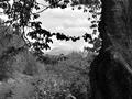
| 06/04/2002 02:43:00 AM |
Mountain Through Treesby janfriesComment: Sometimes framing a scenic image this way can work, but more attention needs to be paid to the placement of the frame. I find the leaves at center very intrusive. Additionally, including the black tree greatly reduced the ammount of contrast available to the rest of the image. I'd have tried for another location where I could get more of the river in the foreground, or gotten closer to the tree to push the frame out to the edges of the image. |
| Photographer found comment helpful. |
| 06/04/2002 02:37:00 AM |
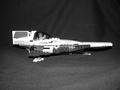
No titleby tacoComment: The different colored legos make nice, distinct blacks and whites, with a couple of gray shades between. This could be a good subject, but I'd like to see it from an angle that's more interesting. Maybe turned toward the camera, but on a bit of an angle sot hat the pilot's face showed. You wouldn't necessarily have to include all of the ship in the image - might make it look less toylike. The composition, as it is, is very static and centered - not what you want for your starfighter. Whites seem blown out, as well. |
| 06/05/2002 12:14:00 AM |
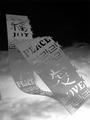
C'est La Vieby hokieComment: Interesting mirror work. Don't know how well a neutral subject like that works against such a contrasty background. Tape shows at bottom. |
| 06/04/2002 11:59:00 PM |
Space Capsuleby brumosComment: Looks like it's sprung a leak. This kind of thing, IMO, demands more contrast. I'd increase the density of the darks. Nice. |
| 06/06/2002 12:44:00 AM |
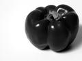
red pepper on whiteby dmwardComment: Hey. Nice. That's truly black and white. My only suggestion is slightly more depth of field to include the bottom and back of the pepper in the field of focus. Really excellent tones, with detail in all but the darkest shadows. |
| 06/04/2002 03:16:00 AM |
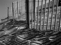
Duneby welcherComment: My dad made a bunch of dune fence pictures back in the early 70s. They make a great subject - geometrical blended with the organic curves of the dunes, good shadows, textures of wood and sand, etc. To work really well, though, it's important to isolate a pattern and focus on that. The houses in the bg and second fence just draw the eye away from what you're trying to show here. |
Home -
Challenges -
Community -
League -
Photos -
Cameras -
Lenses -
Learn -
Help -
Terms of Use -
Privacy -
Top ^
DPChallenge, and website content and design, Copyright © 2001-2026 Challenging Technologies, LLC.
All digital photo copyrights belong to the photographers and may not be used without permission.
Current Server Time: 07/16/2026 09:07:15 AM EDT.